(this is chapter 12 of John White's "Birth and Rebirth of Pictorial Space".
Quoted text is in YELLOW.
Text quoted from other authors is in GREEN)
Quoted text is in YELLOW.
Text quoted from other authors is in GREEN)
Pictorial space is so characteristic a feature of fifteenth century painting, and its forms so varied, that it would require a treatment as exhaustive as exhausting to ensnare and label each new compositional element, each new progress, each success and failure. But since this age was also increasingly one which looked above all things for harmony in nature and in art, it may prove revealing to examine further some of the most characteristic visual methods of creating space harmoniously upon the surface. Donatello’s exploitation of the threefold value of each individual formal feature is only a single method. His concentration upon linear perspective must be partly due to the limited colour range available to a sculptor. Even so it is hard to over estimate the importance of his use of gold. In the following pages it will be feasible to do no more than enter upon the fringes of the vast question of the role of colour in fifteenth century painting. This will at least, however, partially redress a balance which has, up till now, been tilted so as to include little beyond the subject of perspective line. Since, moreover, in analysing Filippo Lippi’s paintings, his compositional exuberance makes it necessary to touch on nearly all the points that are most relevant to the problems of pictorial space, it is through such an analysis that the various topics will be broached.

An interesting starting point is provided by the small, Masacciesque panel of ‘The Virgin and Child with Angels and Saints’. Datable in the early 1430’s, it is closely connected with the small group of works which precede the formation of Filippo Lippi’s personal style towards the end of the decade. Its simple pattern is the prelude to the compositional complexities of works such as the Barbidori Altarpiece from Sto. Spirito . The clear space enclosed within the perfect circle of the figures is paced out by the climbing horizontals of the steps that lead up to the platform of the throne. The position of the figures is simply, and quite logically explained, whilst the spatial circle is tilted so that they also climb upwards over the surface, making the pattern fill the entire rectangle with colour.

Coronation of the Virgin (Louvre, 1434
An earlier, and less complete compromise between the renaissance desire for spatial clarity and the Gothic, surface-filling figure pattern is to be seen in Fra Angelico’s Frankfurt ‘Madonna and Angels’, and the theme is fully orchestrated in his great ‘Coronation of the Virgin’ in the Louvre.
In this altarpiece, the patterned floor and the alignment of the inwards turning figures tell of the new distance to be travelled before reaching the now monumental flight of steps that leads to the high throne. The low viewpoint gives a stronger space, clearer support for the new weight of figures. On the other hand the colour underlines the interest in the over-all surface pattern with which the climbing composition fills the panel. Circling downwards on the left the colour runs from lilac to a pale pink, almost shell, and then on the right runs upwards from vermilion, through soft pinks, and back to lilac. But whilst this circling range of pinks harmonizes with the spatial content, without in any way expressing it in naturalistic terms, cooling, and softening as it recedes and climbs, it is everywhere associated with a bright, pale blue. Unlike the pink, this endlessly repeated blue is quite unvaried from the figures in the very foreground to the distant sky. It has no spatial function other than to unify the colour pattern with the flat pictorial surface. The separate roles of the two dominant elements in the colour are as clearly distinguished as the dual intention of the architectural construction.
Whatever happened to White's promise to "base all arguments, as far as possible, upon the analysis of the treatment of rectangular solid objects"?
If he's going to abandon that focus to discuss local colors, can't he allow himself to discuss their emotional effects?
And why doesn't he note the prominent, recurrent, and magical effect of placing blue objects in front of red or pink ones ?
That effect is absent in Lippi's version.

White would probably consider the above version of the same theme as an example of the "Gothic surface filling figure pattern"
But it's also quite spacious, isn't it ?
It's just that it's space is not architectural so no one has a place to stand on the floor.
Limbourg and Fra Angelico are more about heaven - Lippi is more about earth.

In Fra Angelico’s work this composition undergoes its final metamorphosis in ‘The Virgin and Child Enthroned with Saints’ in S. Marco, which he painted between 1438 and I440. Here, in the figure design the original compromise has been resolved, and space is dominant, whilst the surface filling is achieved by purely decorative elements such as curtains and garlands. Nevertheless the circle still retains its power to carry the eye smoothly round rectangular space, turning the contrast between orthogonals and transversals into a continuous movement that flows evenly in space and on the plane alike. The design forms, in fact, an interesting contrast with Filippo Lippi’s almost contemporary Barbidori Altarpiece. In themselves the compositions are quite similar, for both contain the circle in a square design, with kneeling figures in the foreground. The fact that they were each preceded by a similar compromise adds further interest to the comparison.
Fra Angelico has certainly changed in the 4 years that separate his two versions of the same theme - consequent to his move to Florence.
Meanwhile, as we can see below, Filippo Lippi's vision has gotten less sedate and more tumultuous, as if the figures were trying to burst out of the scene.

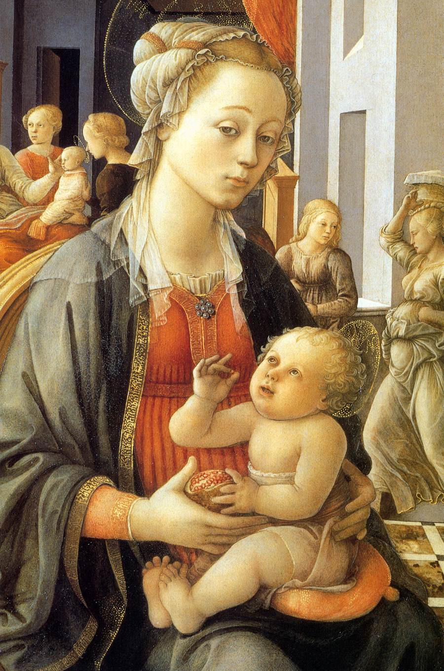
In the Barbidori Altarpiece the figures are brought up close to the spectator, and the viewpoint is lowered so that the main semicircle of the angels’ heads falls slightly as it runs into the background. Despite the hieratic change of scale between Virgin, Saints, and Angels, the viewpoint remains consistent for the entire figure composition. The interior itself is a simple rectangle, with the front plane clearly marked by the railings that run in from left and right. All the principal figures are placed in an even circle round the Virgin at the centre. Yet the result is not the clear space of the Fra Angelico composition or the early Empoli Madonna. It is instead a space filled up to overflowing, full of complex detail. The pattern of the different levels of the floor, the knobs, the bosses and deep flutings on the central throne and canopy; the broken shapes of the two ends of the low enclosing wall that separates the semi-circle of angels from the small onlookers beyond; all these add to the sense of crowding. In small reproduction the effect is one of clutter, almost of confusion, as so many objects catch the eye, distracting it from the over-all design. A slight feeling of uncertainty is greatly increased by the columns on either side of the Madonna. They do not exactly coincide with the pendant bosses of the frame, so that there is no actual ambiguity in their position, no conflict between their bases, behind the forward figures, and their capitals which would then be in the foremost plane of all. Structurally it is clear that they belong to the pictorial space, and are cut by the Gothic frame as casually as the horizontal of the cornice at the back and sides. But columns and frame so nearly meet, and the former so nearly carry out the archsupporting function of the clustered columns that formerly divided up the Gothic triptych frame of which the separate compartments have here flowed together, that it is impossible to dissociate them. By so much, the certainty, the element of illusion weakens, and the crowded space contracts and flattens. Indeed, the final effect of the design is noticeably different from that made by almost any of its details. The Madonna and Child framed by the shell-niche of the throne, or the kneeling saints, for example, have a solidity, a quality of illusion, that is absent from the composition as a whole, in which the three’ dimensional compulsion has been neutralized.
Within this scheme the colour plays a vital role. It injects a clarity that is lost in reproduction. The glittering, disruptive highlights are replaced by colours that develop and repeat each other, bringing unity to the whole composition. It is a unity not of figures only, separated from their architectural surroundings, but one which embraces both. Not only the variegated marbling of the floor, but also the general greys that run from a near white down to deep and sombre darknesses and tinge with pink and violet; the light grey blue of the ceiling that echoes out beyond the open window, and catches in the Virgin’s cloak; all these provide an intimate connection between figures and surroundings. This unifying process carried out in terms of colour seems, as can be seen in the single instance of the blue, to be quite independent of the spatial placing of the objects it defines and brings together.
This is true in one sense, but not in another. The play of colour in the figures shows that there is a delicate balance between space and colour. The latter is not brightest in the foreground, toning down towards the back. Its function is not primarily realistic. The angel looking from behind the column on the left is bright vermilion over gold, which blends into the yellowish vermilion that appears above the Virgin’s breast. It then sinks to dull vermilion, this time flecked with gold, in the angel’s wings on the far right, and sweeps across and forward to the left-hand kneeling saint in whom vermilion cools to cherry, drops to a dominant, deep crimson. Next it crosses back, and sinks to a dull bluish red, running greypurple, in the righthand angel’s cloak; returns to the grey-purple wine of the hem of the Virgin’s under’ garment, to be echoed softly in the pinktinged grey of the shell-nicie above her head; and finally fades forward into the dull grey violet of the left-hand angel’s cloak. At this point the entire colour cycle that began in bright vermilion starts again, this time developing in grey. The colour does in fact move to and fro across the spatial circle of the figures, each nearest echo pulling back and forth across the space, with intense, bright colour often in small background patches, and muted tones filling broad foreground areas. Where
there are actual repetitions these too frequently run counter to the spatial piay, weaving a pattern on the surface, tying the space-separated strands together.

Here's a color de-saturated version of the Barbidori altarpiece.
Is lack of unity a notable problem?
Is it solved when the colors have been added?
White cautions us that the effect from the original is substantially different from these small reproductions - so maybe there's no point in continuing this discussion.
But if we do continue -- it does appear, at least to me, that the de-saturated version is better composed, resulting in a more stately, profound feeling.
Without color, the back feels deeper and the two kneeling figures in front feel more connected to what's behind them.
With the color -- the scene feels more turbulent, as if the figues in back were clamoring to come forward -- a feeling which I do not get from the earlier piece shown at the beginning, which feels more settled and stately even in a color reproduction.

In the slightly earlier Tarquinia ‘Madonna’, dated 1437, the crispness of the folds, and the dramatic presentation of the plastic detail are even more noticeable, The dark chasm in the draperies between the Virgin’s knees, and the Christ child’s outflung leg, are as expressive as the dramatic closeness of the throne and the steep inrush of perspective lines. Nonetheless it is quite difficult to realize how far back this narrow space extends. The abrupt cutting of bed and window, and the half-closed door, prevent a clear perception of the distance to be travelled before the wall beyond the sunny caurtyard in the background is attained. Again the crowded forms are tied together by the colour. The pink and grey tones of the flesh are echoed every where, and the colour of the wall seen through the doorway at the back repeats the pink found in the highlight of the Virgin’s sleeve. But if the crowding of the forms within the narrow confines of the frame, and the play of colour link this panel with the Barbidori Altarpiece, the high viewpoint and the steep perspective lead towards ‘The Coronation of the Virgin’, painted between 1441 and 1447, but belonging in conception to the earlier date.
Filippo Lippi doesn't invite you into his space - he tumbles his figures out into yours.

In Fra Angeico’s ‘Coronation of the Virgin’, as in Filippo Lippi’s own small panel at Epipoli , the architecture was used to extend the figure pattern over the whole surface. Now, in Lippi’s Coronation, the throne once more stands on a raised platform, whilst the foreground wall, which was a feature of the Barbidori Altarpiece , is used to carry the spatial design forwards and downwards as far as, and, by implication, even beyond the lower border. It also helps to spread the figure pattern from the top down to the very bottom of the panel. In this respect, however, it is the extreme height of the viewpoint, situated well above the Virgin’s head, that is by far the most important factor. Taken in conjunction with the architectural design, the latter also has a number of other significant effects upon the composition.
The raising of the vanishing point gives the long orthogonals of the floor, left unencumbered by the artist, great extension on the surface, as well as a great power to create depth. Moreover, since there are absolutely no opposed orthogonals descending from above, except for the minute lengths in the central niche, there is no formation of a spatial tunnel. The eye is not forced inwards willynilly, and the surface pattern element in the space-creating lines is heavily accented. Earlier this same surface-skating quality that accompanies a high viewpoint was observed in Cimabue’s compositions. It was then contrasted with the inwards thrust obtained by the addition of down- sloping roof orthogonals in all the buildings by the Isaac Master. A similar comparison is valid here. It is even noticeable that the light and dark blue background stripes, which contract the depths of sky into an opaque, patterned surface reminiscent of Ottonian miniatures; these stripes slope in the same sense as the rising floor orthogonals and reinforce the pattern they create.
The high viewpoint also puts particular emphasis upon the hanging arches of the now vestigial triptych. All the perspective draws the eye into the area they enclose. The odd, transitional shape is underlined, not minimized. In detail the result almost exactly repeats that obtained in the Barbidori Altar- piece, for the pendant forms are brought into close contact with the marble shells marking the forward ends of the arms of the throne. In this way an architectural form set deep in the pictorial space is inextricably associated with parts of the frame. The latter become two planar promontories jutting into the world of picture to question the existence of the whole extensive space inhabited by the foreground figures. Yet whilst the framing questions the entire, elaborately constructed space, it also accentuates the spatial tunnel of the throne itself, considered as a self-sufficient detail. Within the central area, which it isolates, the short orthogonals wield an influence that they do not have within the context of the composition as a whole. This intensifies the perspective stress upon the focus of the action. The ‘archaic’ survival, visible in the shaping of the frame, plays in this later altarpiece a more, and not a less important role than in its forerunner from Sto. Spirito.
Another most unusual feature of the composition is that Filippo Lippi nowhere shirks the structural implications as regards the figures. Throughout the design they are shown foreshortened in complete accordance with the rules of unified perspective. The only limit is the artist’s own ability. Even when, as in the figure of the donor on the right, the near birds-eye view is startling in its consequences, there is no withdrawal. The partial applications to figures of the foreshortenings implied by a low viewpoint have already been seen in the works of Masaccio and Donatello. Nevertheless, Filippo Lippi’s faithful elaboration, throughout a complex, crowded scene, of all the consequences of such a high viewpoint is so rare as to be nearly, if not quite, unique in what survives of fifteenth-century Italian art.
As a result of the architectural setting of the scene, and of the kneeling pose of the foreground figures in the partly isolated central group, there is a wide range in the degree of foreshortening that the figures undergo. The onlooker looks down so steeply on the kneeling saints, for example, that when he focuses on them, and not upon the composition as a whole, his eye runs down towards the floor, and tends to stop against the base-wall of the throne. Some effort is required before it can refocus and move on towards the scene above. All the inter-connected points that have been raised contribute, each in their own way, to the repetition on a wider scale of a phenomenon already visible in the Tarquinia panel and the Barbidori Altarpiece . This time it is not the parts of figures as in the first case, or whole figures as in the second, but groups of figures, that give a much stronger impression of space than the picture as a whole. The isolation of the throne, or of the kneeling central group, shows this most clearly. This cumulative effect of all the formal factors that have been discussed is very obvious in reproduction, and the great increase in the size of the constituent elements of the conflict draws attention to it. The coagulation into groups may even to a great extent obscure the skill with which the compositional connecting links are handled, since it is only through the colour that the unity is re-established. On this occasion the reintegration is not brought about by colours placed in balanced opposition to the spatial thrust. Instead, they are used to strengthen and to emphasize the unifying force of the perspective space enclosing the massed groups of figures.
Strong colour is reserved, amongst the figures, for the central group of kneeling saints. Here are forceful reds; dark grey-blue beneath a honey cloak; deep green running to yellow; damasked green and gold. Above them, and beyond, the Virgin pales to a soft bluegrey, or greyish blue linked with pale cherry, and blends with the deep greyblue and pale greyrose of the Eternal. In the figures on the wings the colour drains away in paler greys, touches of quiet greyblue, pale green, and rose and yellow, with the strongest accents in the subdued, greyrose, shot material of the standing figures on the extreme left and right. Finally, strong areas of light are to be found in the two half’ length figures placed in the most forward plane of all.
The distribution and graduation of the colour in the figures therefore emphasize the perspective concentration on the centre by expressing, in their own terms, the movement into depth towards the focus of the action. They also draw attention to the care with which space is developed on the wings, where largescale foreground figures blend into the crowds beyond, and even the white, decorative pattern of the lilies has its spatial message told in terms of careful diminution. Indeed, so nicely calculated is the range of colour and of diminution in the figures that, in front of the original, the sense of unified, deeprunning space is actually stronger if the main orthogonals of the floor are hidden from the eye. Nothing could reveal more clearly the complexity of the compositional balances by means of which the artist has built up this most ambitious scene.

Here's a version without color.
And again, it does not seem to be lacking balance.
I also question whether balance can be discussed without any reference to narrative.
White should have stopped after describing the space, which he seems to have done quite succinctly.
Is this painting really unique in its century for it's consistent fore-shortening of figures seen from above ?
Perhaps that's because it makes the figures more stumpy and less majestic.


It is only in ‘The Annunciation’ in S. Lorenzo, however, that Filippo Lippi reaches what appears to be an absolutely harmonious solution to the problem of composing deep, pictorial space. His interest in the maintenance of harmony with the plane is unabated.
White now launches into the most detailed analysis of space and harmony that he has yet attempted - all without reference to how narrative might function for himself or the patron.
And also without having previously established how earlier examples of Filippo's work were less than "absolutely harmonious solutions" to the pictorial space that they created.
Here the frame is almost square. No hanging arches point back to a Gothic past. But, as has been seen, the function of these archaizing elements was as important to the artist as several of the old-fashioned elements in Donatello’s earlier reliefs had been to him. The frame is modernized, and yet the feature has not been discarded. Painted pillars and painted arches now play, in fully pictorial terms, the role that was formerly shared between internal and external elements. The vanishing point, upon which all the deep pictorial space is centred, only lies a matter of two inches to the right of the bright central pillar in the foremost plane of all. The eye is called back to the surface at the very point of greatest penetration.
It is only with the advent of the powerful, and potentially disruptive space- creating ability of artificial perspective that such a compositional pattern takes on its full significance. Where no space, or little, is intended, such a central arch is merely part of a coherent surface design. It has no balancing function because there is no balance to restore. It is noticeable that the interposition of a foreground column actually between the Virgin on the one hand and the angel on the other only becomes common with the advent of the new ideas of space.
A deep space can be suggested without artificial perspective.
Much more has been balanced than just surface and depth - which would be evident if White ever offered an example of a painting that lacked it.
Filippo Lippi now makes full use of the organizing power of artificial perspective in order to control the complex cubic patterns of the floor and parapets in the foreground of his picture. The planestressing qualities of the undistorted forward planes, which are an integral feature of the method, are exploited in the same way for artistic ends. Immediately at the bottom border a step rises parallel to the surface, and each short orthogonal is balanced by another firm transversal. The solidity of the forms and the reality of the space are asserted whilst the thrust of the sharply foreshortened receding elements is slowed. Similarly all the action of the figures takes place in the foreground, moving the attention back and forth across the surface.
Would those cubic patterns be necessarily less controlled if their receding edges were not observing a single vanishing point ?
What about their relationship to each other and the rest of the painting?
White may be sensitive to visual organization, but he doesn't write as if he were.
The concentration of the figures in the foreground, and the increased planes stress of the central pillar and the arches which connect it to those closing either side of the design, are balanced by the creation of a space far deeper than anything attempted elsewhere in Filippo Lippi’s early work. The movement of the action and attention of the figures runs from left to right, and it is at the point of concentration in the figure of the Virgin that the strongest spatial thrust originates. The base line of the architecture, broken only momentarily by the Virgin’s cloak and leg, runs from the extreme foreground in the bottom righthand corner almost to the vanishing point itself. The line continues for the last few centimetres in the fence,like rose hedge which runs along the bases of the poles supporting the vine pergola. Its effect is strengthened by the repeated spatial emphases in the whole range of buildings on the right. These surfaces are not only the steepest and the most continuous receding forms in the picture, but are further emphasized by brilliant light which concentrates on them its maximum intensity. These snowy, high-lit forms, which on the opposite side are balanced by the dark, unbroken cornice of a roof, unfailingly attract the eye and sweep it into the bright, sunlit, garden space of the Renaissance.
Do dark shapes repel the eye?
Space is insistent in its clarity throughout the S. Lorenzo panel, reaching out to either side and upwards overhead, as well as straight into the rapidly receding distances. In contrast there is the already observed juxtaposition of the foreground pillar and the vanishing point. Indeed the very brightness of the forms which so compel the eye to follow them into the distance ties it to the bright bar that slashes down the surface. Most remarkable of all, immediately above the vanishing point, a tall, domed building rises on the far horizon. A pale ghost in reproduction, it is in reality a brilliant vermilion colour that is echoed only in the deeper hues of the cloak worn by the foremost angel on the left. Similarly the deep, dull, green of this same angel’s wings repeats the deep greens of the distant vegetation, so that there is a strong tension between this foreground figure and the furthest distances. The close connection becomes more significant still when it is realized that this figure, with its direct outward glance to the spectator, is the latter’s closest point of contact, and of entry into the pictorial world. There are many other colour links of an immediate interest in the present context. As the grey wings of the further angel on the left run down in colour to the dark grey of the building which recedes beyond them, so the wings of the announcing angel link directly with the bright receding surfaces on the other side, his cloak connecting that of the angel just behind him to the warm pinks of the flooring. The annunciate Virgin, with her harmony of pale, light greys and pale greyblues and changing grey-to-violet, connects the figure world with all the light and dark greys of the architectural surroundings, and finally with the sky itself.
Even from such a partial description it is clear that the whole picture can be seen, and was intended to be seen, as a harmonious surface, with the colours linking every part, sometimes by gradual development and delicate transformation, sometimes with the aid of direct repetition. It retains in a new form many of those values that are of paramount importance in the medieval picture. On the other hand, these elements of line and colour circling on the surface, circle also into deep pictorial space.

Here are some other versions of the same theme.
The above has a different kind of artificial perspective. It still creates a deep space and throws a pillar in front of it - but the size of the floor tiles does not seem to be diminishing in proper proportion, the garden at the left seems more like a tapestry, and the room at the right seems to be seen from a different point of view.
But it still has its own kind of quirky balance, doesn't it?
And the story seems a little different.
Mary feels more passive beside the standing angel and the assertive pillar that reaches down from the ceiling to her knees.

No garden here, but still a well defined architectural space that goes back rather deeply into the distance behind Mary.
And unlike Lippi, neither one of the these alternative examples have any sense of volume in the figures.

Here's a floor to ceiling column that hardly functions to re-assert the surface since there is no deep space behind it.
But it does serve to separate the human from the divine, as well as making the figures feel more substantial in comparison to its extreme thinness.

Here's an earlier style whose drama is in sharp contrast to Lippi's scene, which by comparsion, now seems to be a courtly social function attended by a group of fashionable angels, one of whom is asking Mary for a dance.
Also notice how the rectangular volumes on the floor are not following any scheme of perspective, and yet they still seem to be well organized.
There is no one way in which to read a composition. The observer’s interest rightly floats here and there, sometimes haphazardly, and at others with a purpose; sometimes obeying rules and sometimes, if it is aware of them at all, deliberately breaking them. Nevertheless the artist may incorporate, besides a number of focal points for the attention, certain sequences, which form a special pattern that has some objective meaning even if the onlooker is quite uninterested in following its signposts. In this picture such a sequence is particularly clear, and since it reveals something of the niceties of the new perspective, it is perhaps worthwhile to follow it.
A nice distinction between where the eye goes (anywhere) and sequences that seem to have been intended - avoiding annoying claims about where the viewer's eye is supposed to go.
The point of entry into the pictorial world is marked with unusual clarity by the angel on the left who glances back at the spectator. He is himself in the act of walking away into pictorial space. The abrupt torsion of his body immediately epitomizes the whole complex balancing of move and counter move on which the composition is built up. Even as he walks he points to the annunciation taking place upon the right, and his companion, facing three-quarters out towards the onlooker, raises his hands in wonder and looks intently at the kneeling Gabriel. With the accompanying movement of the Dove above his head, he ensures that the observer’s eye moves to the right across the surface and not onwards into depth.
Isn't that angel on the left inviting you into the ballroom to join the party?
And he's so solid, he feels like an architectural feature set within a rectangular solid drawn in perspective, with receding orthogonals from above and below meeting on a horizon line.
The wings and trailing cloak carry the eye on past the central bar, and the figure of the angel Gabriel in pure profile takes it to the centre of attention in the graceful person of the Virgin. At this point the compelling thrust of the bright, continuous, orthogonals begins. The eye speeds into the distance that is measured out by all the rapidly diminishing verticals of the buildings and of the pergola. Then at the point of furthest distance the insistent surface undertow sets in. The central pillar in the foreground makes its influence felt. But the bright accent of intense vermilion, and the deep, echoing greens pull the eye back, not to the inanimate stone pillar, but leftwards up along the dark orthogonals to the point of entry—to the figure of the angel in which both reds and greens find their response. Thus the subject matter and the figure action, the perspective structure and the colour, now obeying natural laws, now purely carrying out the artist’s compositional demands, are all made to play their part. By these concerted means a controlled circulation in a clear pictorial space is made to balance the decorative circulation on the surface. Now, for the first time in Lippi’s major works the realism of the whole has equal force with the reality of the parts.
The center of attention - at least as I experience it - is the space between the outstretched, right hands of the announcing angel and Mary.
If White feels that the center is the "graceful person of the Virgin", Lippi has failed to tell him the story very well.
And I question White's notion of the "force" of "realism".
Does he mean that this painting forcefully feels like a real window onto a real, sun-lit world?
I don't get that feeling.
The building of pictorial unity by means of move and counter-move, a system of dynamic balance, is quite different from the combination of ambivalent individual features which was Donatello’s method. The artistic purpose is the same, however, and it is perhaps amusing to see how, in ‘The Annunciation’, the diagonal of the lily on the surface runs on through the swift recession of the distant hedge to the vanishing point of the perspective. This small detail serves to underline the fact that nowhere else in all the mass of architectural forms is there the slightest possibility of equating an orthogonal with a transversal. In Filippo Lippi’s art, lines lying on the surface and lines leading into depth are everywhere distinguished with the greatest clarity.
Where did White tell us about ambivalent surface/depth lines in Donatello?

While, I have no idea whether the lines that mark the edges of the folds in this drapery are in a plane that is parallel to the picture plane or not.
The analysis of these few pictures also shows that even during the fifteenth century, the period of the most enthusiastic exploitation of geometric space, colour was continuously being used to retain, or to restore the unity of the pictorial surface. In medieval frescoes the same colours were used impartially for the figures and for the linear or architectural borders, creating a great, unified design in colour. In Giotto’s quieter range of hues, with its greater element of realism, the same soft pinks and greens and blues still recur in figures and in architecture alike, as well as in the decorative patterns of the marble frames with their acanthus scrolls and cosmati inlays. This is particularly noticeable in the Arena Chapel. The colour, therefore, like the disposition of the figures, takes on a novel compositional role precisely because it counterbalances the tendency of the new spatial realism to burst through surface of the wall.
If only White would provide an example of a painting where color was irrelevant or disruptive to the composition of the pictorial surface.
The footnotes tell us that White is responding to the history of color in European painting that was included in a book about Titian by Theodor Hetzer (1890-1946)
In the late fourteenth century, and in the fifteenth, when the new conceptions of pictorial space were crystallized and greatly strengthened, this over-all colour pattern largely ceases to extend over the painted architectural framework of the frescoes. But within the picture efforts were continually made to balance
new realism by applying traditional methods of distributing colour to the new conditions. The kinship which exists in this respect between Maso di Banco and Piero della Francesca has quite recently been pointed out (by Kenneth Clark).

In Piero’s fresco of ‘The Reception of the Queen of Sheba’ the close colouristic unity of figures and surroundings at which he aims is symbolized by the way in which the man in red, placed with his back to a great, fluted column, is echoed in the red dress and the white, fluted cape of the ladyinwaiting who stands just behind the kneeling queen.
Is "symbolized" really the word White wants to use here ?
Would "exemplified" have been a better choice ?
And what painter, other than a bad one or a commercial storyboard artist, does not aim at a "colouristic unity of figures and surroundings" ?

In ‘The Testing of the Cross’ a similar evocation of the static, and enduring monumentality of the human figure has significance in terms of space as well as colour. Here the left-hand pillar of the temple in the background carries downwards in the smooth, white column of a cloak sleeve, and the space between them, carefully described by the steep change of scale, is quietly annihilated. In this temple, as in the columns which divide the scene of ‘The Reception of the Queen of Sheba’, Piero also uses his command of artificial perspective for a similar purpose. Through careful placing in relation to the vanishing point, the architecture is, in either case, seen in the most extreme foreshortening that is feasible. The orthogonals are thereby so reduced in length that it is very hard to realize the depth which is involved. In ‘The Reception of the Queen of Sheba’ space is emphasized by other features of the architecture. But the temple in ‘The Testing of the Cross’ is placed behind the figures. Piero therefore has no interest in the accurate definition of the space it occupies. The temple must at least be square, and yet it needs considerable imagination to equate the wide façade with the abbreviated cornice to the left.
What is inaccurate about the space in this painting ?
Yes, it feels flat, but not because of any inaccuracy.
And what is the point of this digression ?
Is it anything less trivial than "other artists also design with space and color" ?
But it is sure is delightful to contemplate anything by Piero, and compare his static, quietness with the more tumultuous Lippi.
It has already been seen that all the compositional, colouristic, and perspective devices so far discussed in the works of Giotto, Donatello, and Filippo Lippi, are significant precisely because they accompany an ever-increasing emphasis on realistic space. It has been fashionable, at various times, to over’ stress the element of illusion. Conversely, it is most important not to under, estimate it in a period as influenced as the present by nonrepresentational art, and by the enjoyment of pure flat pattern. At the same time, these adventurous attempts to use the new perspective to the full without losing control of the pictorial surface, must be related to a general pattern of development in which their historical significance far outruns their number.

Filippo Lippi’s ‘Virgin with SS. Cosmas and Damian, St. Francis, and St. Anthony of Padua provides an example of the most popular fifteenth’ century method of controlling the new spatial realism. This is to retain, or to return to, the shallow stagespace which was characteristic of so much of the output of earlier centuries. Space is not controlled by ambivalence, or by thrust and counter-thrust, but by the simpler, less ambitious, means of limitation. In this altarpiece there is spatial emphasis in the plastic treatment of the back,wall and in the way the frame cuts off the platform underneath the forwardthrusting throne. Yet the essential pattern is that of a space only a few feet deep, decisively truncated by a solid wall that lies completely parallel to the surface. Fra Angelico, the master craftsman of clear space in the first half of the fifteenth century, presents many examples of this basic composition reduced to its simplest terms, and the scheme recurs, endlessly varied, in a surprisingly high proportion of renaissance paintings, both on panel and in fresco.
The shallow background gives greater emphasis to whatever is happening in the figures in the foreground -- in this case, distinct expressions in the bodies and faces.
And they all seem to be a bit bored by the whole episode, and can't wait to climb down off the platform.
Did Filippo's girlfriend pose for the pouting Madonna?
It is only on the miniature scale, and in the wide, low format of predella panels that Filippo Lippi is himself content with the creation of firmly closed interior spaces of a simple plan and unadorned severity reminiscent of Fra Angelico. It is, moreover, interesting that these plain interiors, following the precedent which Masolino in all probability established in the altar piece of ‘The Madonna of the Snow’, have normally quite a high viewpoint, and are cut off by the upper border just above the figures’ heads. They are thus related to the main body of the altarpiece, of which they form the base, by the very means which keeps their undecorated, simple clarity from creating an intrusive spatial box.

It is against this background that the complicated virtuosity of Filippo’s Munich ‘Annunciation’ must be set. This picture, like the Palazzo Venezia ‘Annunciation’, carries on the complex spatial game of the S. Lorenzo altarpiece . Here, however, the short moment of balance for the composition as a whole is past. The figurecrowding of the earlier works is replaced by crowded architectural forms and decorative detail. The figures, in themselves grown less robust, can hardly hold their own against the teeming life of their surroundings.
Once again the action takes place in a single forward plane, and now the movement is entirely side to side, and not enlivened by the variations seen within the S. Lorenzo composition. Once again orthogonals are short and strongly emphasized, and frequently repeated verticals and horizontals dominate the crowded scene. There is still the clearest possible distinction between diagonals running into depth and lines lying parallel to the surface. In even the most insignificant detail, there is no hint of ambivalence or approaching ambiguity.
The crowding and complexity of the architectural features are alone sufficent to maintain considerable surface tension, and numerous compositional devices give additional assistance. The lower orthogonals of the side walls are completely masked, so that the deeply cut pilasters and applied half-columns appearing between the arches of the forward screen associate themselves quite strongly with those situated in the same relation to each other on the screen iself. Overhead, the great arch opening out into the garden is so drastically cut both by the upper border and by the heavy horizontal of the screen, and the orthogonals of the side walls, which are the only things that push the arch backwards into space, are so instantaneously truncated, that it almost seems to stand on top of the screen instead of behind it. This impression is most strongly reinforced by the repetition of its colour in that of the smaller arches cf the screen, the pattern of which it also repeats exactly. This similarity of forrm and colour, accompanied by greater size and only partial visibility, inevitably tends to pull it forward, as though the relative positions in space were, if anything, reversed. Meanwhile the pole like trunk of the tall tree that fills what little space is left beneath the curve of the far arch becomes involved in even greater complications. First of all it coincides exactly with the vanishing point. It also fills in the opening of the distant gateway, which, by its steep recession, still suggests, but can no longer actually reveal, fresh vistas opening out beyond. The form of the tree trunk, moreover, already associates it with the smooth, applied columns of the- forward arch, and this association is greatly strengthened by the flying Dove which simultaneously masks the upper part of the trunk and overlaps the arch itself. The Dove by seemingly covering both forms in a similar fashion effectively contracts the space that actually separates them. Underneath the Dove, white lilies, echoing its colour in a still more forward plane, again link tree and column, and still further compress the intervening space.

The extent to which this spatial play, however over-involved, damps down the full effect of the deep, centrally focused space, may readily be seen by comparing it with an actual replica now in the Accademia in Florence. In this copy the whole structure of the Munich picture is carefully reproduced, whilst the particular balance between space and plane, seen in the prototype, is totally transformed.
The reorganization is achieved by two quite simple operations. First there is a change in the proportions of the composition, and secondly misunderstanding of, or a disinterest in, the various devices which Filippo Lippi had specifically designed to tie the spatially separated planes together.
In the copy all the detail has been streamlined. The pilasters and applied columns of the screen are now much slimmer in relation to the width of the arches. Everywhere the mouldings shrink and cornices lose weight. The pictured space no longer seems to be filled with cubic shapes, their plasticity emphasized by the strong play of light and shade on deeply chiselled forms.
The architecture, losing weight, extends more deeply into space. Instead of being abruptly stopped by the heavy base of the transverse screen, the eye runs inwards for some distance over the perspective patterning of the floor. Another, wider expanse of light-coloured flooring follows before the limits of the building are finally reached. The enclosing parapet of the inner garden now seems thin and far away. The pine trees are now ranged like telephone poles, and carry the laws of regular, orthogonal diminution on beyond the limits of the architecture. The bole of the central tree still masks the opening of the distant gate, and still absorbs the vanishing point, but its knitting-needle thinness now no longer links it with the columns of the screen. The flying Dove no longer ties it to the forward arch, nor does the lily join in linking it with the flanking column. Finally, the space above the screen is so abbreviated as to lose all vestige of conviction. It becomes unimportant that the far arch, which incidentally does not begin to coincide with the columns that supposedly support it, seems to sit upon the screen itself. Only a reference to the Munich picture clarifies a situation so confused as to have lost all spatial meaning.
The result of all these sometimes seemingly trivial alterations is that, when compared with the prototype, the copy creates a strong sense of the disruption of the surface by perspective space. An enthusiastic minor artist saw the spatial power of Lippi’s composition, and either failed to see, or happily ignored the careful way in which it was controlled. It is the very enthusiasm for artificial perspective on the part of minor artists that so often leads to a combination of extreme imbalance between space and plane and disinterest in organic form. It is even noticeable that when, in the fifties, Filippo Lippi’s own interest in the linear qualities of the human form increasingly replaces any preoccupation with its structure, his interest in the complex balancing of perspective space dies gradually away.
Copies always make for fascinating comparisons.
In the original, the background did feel a bit cluttered, and unworthy of the two stately figures in the foreground.
In the copy, the deep, symmetrical, simpler background is more enjoyable, though the garden might well be a cemetery. Has this scene been set in a mausoleum?
The figures have lost some mass and weight, but still are elegant.
With this copy, White has finally offered an example of "the disruption of the surface by perspective space."
It's just that it feels better organized to me than the original.
Perhaps that's because I am also "an enthusiastic minor artist".
Though, on the internet today, it is attributed to Filippino Lippi.

The tondo of ‘The Madonna and Child’ in the Pitti Palace, probably completed in 1452, represents one of Filippo Lippi’s latest, and perhaps his most extreme attempts to make strong geometric space live in complete harmony with the flat surface upon which it has its sole existence. Here colour once more plays an important part, and there is again the usual absolutely clear distinction between the numerous orthogonals and transversals that build up the spatial pattern.
In this bold experiment in sharp foreshortening the extreme rapidity of the change of scale is equalled by the steep recession of the architectural surfaces. This does not, however, anywhere result in an undue abbreviation that contracts or flattens the pictorial space. There is no foreshadowing here of Piero della Francesca’s experiments at Arezzo. Instead, as in the Munich panel, the objective shortness of the receding elements, and their frequent interruption by emphatic verticals and horizontals, are the means which Lippi uses to prevent a too swift plunge into pictorial space. The architecture is, however, far less cluttered than before, and the simplicity of profile contrasts strongly with the forms in the Annunciations of the middle and late ‘forties. It marks a rediscovery and development of the fundamental clarity of the S. Lorenzo altarpiece and allows the figures to reassert their primacy.
A classic example of Filippo Lippi’s method of slowing down the movement of the eye into the steeply plunging spaces which he loves is visible in the coffered ceiling. Not only does a heavy horizontal cut across it with its brilliantly contrasted whiteness, but not one of the orthogonals of the further section forms a direct continuation from the forward part. The two sections of the coffering are offset. No spatial tram-line tempts the eye to leap the buffers and rush onwards without pause. Here, moreover, both the vanishing point of the perspective and the geometric centre of the roundel, which are not coincident, draw the eye insistently towards the head of the figure of the Virgin who is seated in the extreme foreground. It is her sideways glance towards the onlooker that links him with the inhabitants of the pictorial world.
The balancing of strongly defined space is one of the main functions of the colour in the tondo. In contrast to the Uffizi ‘Coronation of the Virgin’ its effect is to provide immediate connection between widely separated planes. This is not done by the mere variation of colour themes from one figure to another, but by the creation of firm colour couples formed of identical hues of similar intensity set at different depths in the pictorial space. The greygreenish blue of the Virgin’s mantle is repeated in the distant figure on the extreme left. The near white, and brownish grey of her head’ dress reappear in the figure to the right, striding towards the centre with a basket on her head. The cherry red of the Virgin’s dress, and of the cushion of the infant Christ are not, however, repeated quite exactly, but are connected with the yellowish vermilion of the bed and of the curtains even further back. These are themselves a little darker in tone than the dress of the woman nearest to the foreground. The latter is repeated exactly in the old man climbing up the steps in the very furthest background on the right. The salmon pink of the marble floor, which leads to these same steps, reappears in the girl behind the reclining mother’s outstretched arm. The exact connection of the striking colour of the robe of the old man in the distance with a figure, which is, apart from that of the Virgin herself, one of the furthest forward in pictorial space, is matched by the equally striking repetition of the brownish mulberry worn by the small figure reaching down to greet him as he climbs. This is precisely echoed in the figure in the middle distance, visible just to the left of the Virgin’s neck. It is this colour which is also used for the dark area of floor upon the right. This part of the design is, in itself, particularly interesting, although its effect is not so noticeable in reproduction. In the original it is difficult not to see this dark, and quite unpatterned area as a sombre, vertical wall, despite the angle of the steps upon the right and the diminution of the distant objects, both of which define it as a section of floor. Its importance in interrupting an otherwise overpowerful and continuous recession from the foreground to the extreme background is quite clear. The wall like effect is largely due to the very fact that it is wholly devoid of all perspective pattern. Only in the righthand corner is there a minimal indication of recession, andthe dark mass cutting in between two areas of light is completely even in the intensity of colour. No graduation gives expression to the distance involved.
The new clarity and decision of the architectural space as a whole, and its total occupation by the sharply diminishing figures, are balanced by exactly that new firmness in the handling of the colour which is needed to maintain the equilibrium of the composition. The subtleties of colour graduations calling quietly across space would no longer be strong enough. There is, instead, clear repetition of firmly distinguished colour. The artist who, in earlier years, had shown himself to be well aware of the potentialities of tonal graduation, here consistently reverses all the laws of atmospheric perspective. The brightest colour couples are the ones which link the middle ground with the far distance, whilst soft greys, and cooler, quieter reds, and gentle blues are used to bridge the gap between the foreground and the middle distance. Within these couples any atmospheric change is quite ignored. In general, and in detail, colour has become a compositional counterweight to the growing pressure of perspective space.

Even if we must omit any reference to narrative, how can a discussion of spatial balance and pictorial unity fail to mention the sculptural volumes of the middle-ground figures, like the one shown above?
For White, it's as if space is only created by architectural features.
But note - he does mention the Virgin's "sideways glance towards the onlooker that links him with the inhabitants of the pictorial world."
Can the glance of a character in the narrative have an impact on pictorial balance?
The Pitti tondo is the last in Filippo Lippi’s series of experiments in carefully balanced perspective composition. As in Donatello’s work, the numerous variations on a single theme, each change of emphasis being accompanied by corresponding shifts and compensations in every other element of the design, all seem to show the firm aesthetic purpose underlying all that bears upon this aspect of his art. These same twenty years of constant experiment, which fall between the early ‘thirties and the early ‘fifties, are marked, in the figure style, by a steady movement away from the Masacciesque ideals that dominated Lippi’s youth. Now, in the ‘fifties and ‘sixties, with the general move in Florence towards a gay, linear style of decorative art, a change in Lippi’s own conception of pictorial design is crystallized. The former balance is fragmented, and its main components now achieve a separate existence. In panel painting interest in perspective space progressively dies out. In fresco a new tendency to cast the shackles of restraint is manifest.
The series of Adoration scenes in Berlin and Florence are typical examples of the change of emphasis on panel. The floating apparitions in a sky closed in by rocks and forest trees now play a central role in the design. Figures materialize, uncertain in position, and uncertain even in relation to heavenly or to earthly reality. Flowers and figures bloom in crowded delicacy of line and colour. The highclimbing wall of forest carries the eye erratically up, wards with the thrusting pines. The logical clarity of space gives way to a new decorative fantasy, or, as in the Berlin panel, to a dark suggestion of the undefined.

The Prato fresco of ‘The Funeral of St. Stephen, signed and dated 1460, brings out the contrasting element in Filippo Lippi’s later style. The composition is essentially a variant of that established by Domenico Veneziano in the ‘forties in his ‘St. Zenohius and the Fallen Youth’ from the predella of the St. Lucy altarpiece.

The tendency to create deep space beyond a figure composition moving across the foreground plane was very clear in Masolino’s work. The St. Zenobius predella panel marks a deliberate development of this idea. The relationship between the foreground screen figures stretched in a dramatic line across the panel and the deep perspective of the street has none of the fortuitous quality which often seemed to characterize the similar Masolino designs. The recession of the houses leads the eye towards the point of highest tension in the distraught figure of the mother. The dramatic balancing of space and figure composition is as clear in its own way as in the quiet companion scene of ‘The Annunciation’, or, indeed, in the main panel itself.

It is essentially this type of composition that Perugino endlessly repeated for his own very different purposes in the last quarter of the century. A screen of figures, rigidly held in the plane, and sometimes spreading like a brilliant stained glass pattern over the whole surface of the picture, establishes a decorative network. Then, beyond the screen, deep architectural, or landscape space spreads out towards a vast horizon. Space and plane are independently developed, and their functions clearly separated.
In Filippo Lippi’s ‘Funeral of St. Stephen’ the objective seems to be neither Domenico Veneziano’s dramatic, nor yet Perugino’s peaceful balance. The strong reds, whites and blacks, mixed with pale greens, which make up the bold pattern of the marble floor, carry the eye firmly inwards in spite of the heavy horizontal interruption of the bier. The plunging line of strongly lighted columns, and the coffered ceiling, with steep, heavily stressed orthogonals, and with the inward-leading longer sides of its rectangular pattern replacing the more usual emphasis on width, increase the feeling of great depth. Orthogonals are everywhere sharply distinguished from transversals, and it is now the latter that are limited in number and extent. All the principal spatial joints between the back-wall and the four receding lanes are, in addition, clearly visible. Finally, the figures themselves are not used unequivocally to stress the surface and slow down the movement into space. They are ranged in depth on each side of the central opening, and the regular line of heads with which the seated figures replace the invisible orthogonal of the bases of the columns is particularly obvious. The emphasis is no longer upon balance. The row of figures and the horizontal of the saint’s body prevent the sense of space from running out of hand, but still make no pretense at holding it in equilibrium. Yet, in the dream realism of the rocks that flow into the church like phantoms from some long cooled eruption, are echoed ideas that are typical of the contemporary panels.
I just don't feel that "The row of figures and the horizontal of the saint’s body prevent the sense of space from running out of hand, but still make no pretense at holding it in equilibrium"
Though not static, the painting feels well balanced to me, thanks largely to how the various figures are handled.
Can a discussion of paintings ever escape that "over exercise of personal bias" that the discipline of art history wants so badly to avoid?

The gradual development of Lippi’s new ideas of spatial emphasis is illustrated by a preparatory drawing for the left half of the design. Here a halfway house between the old ideas of balance and the new idea of space triumphant can be seen. Complex Gothic vaulting gives a transverse stress instead of the orthogonal thrust of the coffering in the final fresco. The far more varied architectural detail of the side walls interests and holds the eye. No column-enclosed nave forms a narrow, plunging, spatial alley in the centre. Because of the greater exploitation of the width available, the orthogonals in the drawing fall more gently, lacking the same steep urgency. The structure of the floor still shows a remnant of the balanced play of the orthogonals and transversals in the S. Lorenzo and Munich annunciations, whilst the large size of the figures in the background effectively softens the sense of depth created by the architecture. On the other hand this spreading of the figure interest throughout the pictured space, recalling the Pitti tondo, attracts the eye into the very depths the full effect of which is limited by the scale of these same figures. The bier is likewise set back further in relation to the principal groups of figures, only that on the left being visible in the drawing. This small cluster of individuals in itself betrays an interest in spatial grouping that is much less evident in the fresco’s more numerous, and more regimented ranks, which, paradoxically, encourage the eye to slide off into the deeper, architectural space. The liveliness of grouping, like the variety of architectural detail, encourages the eye to linger. This drawing is, in fact, the key to the whole process of Filippo Lippi’s movement from the all pervading, balanced play of space, which was characteristic of his earlier panel paintings, to a monumental fresco style in which detail loses individuality and importance, and becomes subservient to the singleness of spatial purpose evident in the composition as a whole.
Another fun comparison!
I agree with everything White has written about it, except for the last sentence.
What he calls a "singleness of spatial purpose", I would call a forceful dramatic purpose.
In the sketch, Lippi seems to be imagining how a funeral might appear - while in the final painting he has arranged his actors and stage for a more compelling effect -- just as the director of a play or movie might do.
That deep space behind the corpse conveys a sense of loss - at least to me.
The analysis of this single fresco is sufficient illustration of the caesura which divides the later panels and frescoes. A similar dualism can be seen in other aspects of Filippo Lippi’s late style, such as the contrasting emphases on stolid portrait realism and upon a decorative linear play that overruns the figure structure. It foreshadows the divergent lines on which so much of Florentine art develops in the last third of the fifteenth century, and out of which emerges Leonardo’s towering figure.
The lack of Donatello’s lifelong steadiness of purpose does not detract from the importance of the compositional experiments of Filippo Lippi’s middle years. It is only in the light of such persistent efforts to exploit the possibilities of linear perspective, and to establish correspondingly effective methods of control, that the expanding universe of the renaissance picture can be fully understood. The experiments in graduated and in coupled colour are the complement of the exciting growth of interest in atmospheric perspective and in tonal painting. Filippo Lippi’s almost logical persistence makes it possible to come closer to an understanding of many of the seeming contradictions and sudden changes of direction, the conservatism, and the sudden outbursts of enthusiasm in a multitude of less articulate, and more elusive spirits. In at least this fundamental aspect of renaissance composition Filippo Lippi both reveals his greatness and illuminates the essential process of attrition whereby new ideas are crystallized in art.
And so this chapter ends with homage to the master and celebration of "new ideas", though most of the ideas and achievements of that artist have been ignored.

No comments:
Post a Comment