(this is chapter 11 of John White's "Birth and Rebirth of Pictorial Space".
Quoted text is in YELLOW.
Text quoted from other authors is in GREEN)
Quoted text is in YELLOW.
Text quoted from other authors is in GREEN)
THE EARLY WORKS OF DONATELLO
Donatello’s attitude towards perspective is thrown into sharp relief by the contrast which exists between his methods and the characteristic practices of Masolino. In the course of a long lifetime he consistently elaborates the principles emergent in Masaccio’s work. In so doing, he shows clearly that artificial perspective enables the artist to do three things. First of all, it allows him to recreate reality in a way that is convincing to the eye as well as to the mind. The relation of solid objects to each other, and to the space which separates and surrounds them, attains fresh clarity. It is possible to ‘portray’ space convincingly, not merely to suggest it. Secondly, it enables the artist to give a new kind of unity to his design. He can organize its interrelated parts more clearly, and also control the spectator’s interest and attention more firmly within the boundaries of this new-found unity. Finally it enables him, if he uses his new tool with care, to achieve a complete harmony, or, for that matter, a deliberate and dramatic disharmony, between his unified, and consciously organized re-creation of reality and the plane surface upon which he works. The latter aim, which differs from the largely unintentional conficts triggered by Masolino’s uninhibited enthusiasm, does not, however, enter into the consciousness of Italian artists until the sixteenth century. It is with harmony and balance, and, in later years, dramatic balance, that Donatello himself is concerned.

Andrea Pisano, Florence Baptistery, 1330-1336
Which of the qualities mentioned above are absent from the above relief done 80 years earlier?
The space created is not as deep - but is it any less convincing ? Or unified ?
White has way overstated his case for Donatello.
Donatello’s earliest reliefs are especially interesting, as they reveal his artistic aims at a time when his grasp of the mechanics of the new perspective was incomplete. It is clear that the new discovery did not revolutionize his art by turning it aside into new channels, but by enabling him to develop it in a way which was itself a revolution.


In the relief of ’St. George and the Dragon’ from Orsanmichele, the story in all its simplicity is the essential thing. The architecture is completely conditioned, in scale and disposition, by the needs of the figures, and diminishes towards a point placed in the body of St. George himself. At one stroke a sufficient space is created for the action and the central figure emphasized. At the same time the fairly high viewpoint tilts the ground allowing it to merge into the low hill which, by a similar alchemy, blends with the verticals of the trees that crown it. Indeed, the ground plane would be almost completely unexplained but for the foreshortening of St. George’s horse and of the base lines of the rocks on the left and of the building on the right. The figure of the rescued princess, which marks the main right angle formed by the base line of the wall and the end of the building, ensures, however, that the intrusion of geometric space shall not be overpowering. The squared pavement is, moreover, carefully segregated to one corner, where it is influential yet unobtrusive. The graceful, blind-arcaded building is not a rectangular block uncouthly pushing into space. Its end curls round, and is softly carried on by the tree-trunks. Its smooth curve at once provides a niche for the princess and a soft harmonization of the side wall and the surface plane, a transition crudely reflected in the rock behind the dragon, where the narrow strip beyond the cave-mouth is similarly modified by being slightly gouged.
The relationship between the spatial content and the relief plane, whether wholly successful or not, is something which has nevertheless been worked for with a kind of simple subtlety. At the same time there are some things, such as the rather uncertain relationship between the horse’s neck and body, and between the atmospheric background and the relatively high relief of the figures, or the partially oblique and partially foreshortened frontal setting of the building, which betray the tentative quality so often present in an early work.
This relief makes a lot more sense when it is seen to complement the downward thrust of statue above it.
And as the many images I've posted can attest, reliefs look way different in different light - which in this case, since the piece is outdoors, will continually be changing.

Similarly there are elements of technical rather than aesthetic uncertainty in the later bronze relief of ‘The Dance of Salome' on the Siena font.
This relief is once more seen from a close, fairly high viewpoint, and although the diminution of the squared floor more or less conforms to the laws of artificial perspective, the orthogonals as a whole do not vanish to a single point. Moreover, as a result of increased definition, the problem of the relationship between the figures and the floor, inherent in the high viewpoint, is posed with new intensity. But these are the less important facts about Donatello’s use of perspective.
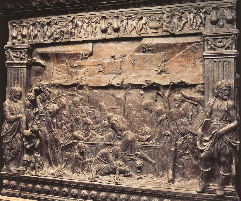
Space is taking on a new meaning. The banqueting hall is almost twice as high as the tallest figures. It is a prelude.to the ‘Trinity’, which was the climax of Masaccio’s work, and a further step in Donatello’s own development. Space is suggested not only by the very proportions of the hail, but also by its extension to either side of the field of view. The children start away on one side; on the other only the back and one leg of a young man are visible as he rushes from the ball, the arch above him being severed in midair. Within the scene space is expressed by the explosion of figures round the severed head, by the tense hiatus at the centre, and by the deep inlet closed by the figure of Salome.
This new interest in space and movement is accompanied by a new decision in the expression of the surface. The frontality of the succeeding architectural planes weaves a network that maintains the surface tension whilst these very forms create the impression of the airy halls beyond the foreground scene. Only on the floor is a single orthogonal allowed to run unbroken, and that is countered by the heavy horizontal of the tablecloth. Indeed the repeated horizontals and the echoed curves of the arches are so powerful in their effect that the figures which amplify the story and define those secondary spaces, enlarged as they are for narrative reasons, serve less to increase than to decrease the effect of depth. The deliberate nature of this insistence on the plane is emphasized by a device which Giotto had already used at Padua, and which becomes almost a hallmark of the dual intention underlying Donatello’s conception of the function of perspective. The high viewpoint not only gives the floor a substantial slope, adjusting it to the planar pattern of the whole, but also coincides with the main dividing cornice. As a result this cornice, which in fact turns through an angle of ninety degrees just to the right of Herod’s head, and so defines the side wall of the room, takes on a form which is practically a straight line. In this way a main spatial feature is turned into a major surface accent.
The relief surface is further emphasized and unified by the overall incised patterning. What is more, the incision, although never heavy, varies little from the nearer to the more distant surfaces, so that a further interlock is formed in even this small detail.
As a seemingly conscious balance to this deliberate stressing of the flat surface, Donatello everywhere insists on the solidity and volume of the architectural features.
Rather than describe this as an architectural space that has been compromised for narrative purposes or to stress a flat surface --- this might better be described as a rumpled narrative surface that occasionally suggests elements of architectural space - and so eliminate any suggestion of "technical uncertainty"
This is not a space into which the viewer is invited to step in and move around.
So rather than query why Donatello is so interested in space, I'd ask why he is so interested in architecture. Among sculptors, he's rather unique in that regard.
In this piece, the wide open arches, like a pair of eyebrows, stare in disbelief at the horror before them, just as the human figures do. And the gnarly, pocked, surfaces of the walls seem as infected and corrupt as the king who lives within them.
The experimental elements in the two foregoing works are clear enough, and there are also features which might well be considered archaisms. The sloping floor has been a target, since the days of Alberti and Vasari, for those historians whose admiration for renaissance forms leads them to an evolutionary conception of aesthetic values. Representational innovation may move hand in hand with heightened aesthetic quality, but the two are not synonymous. It is significant that Donatello was not prepared to desert such ‘archaisms’ until he had found a solution, or solutions, which enabled him to incorporate a new degree of realism without disrupting the decorative surface. In both the early reliefs he is at obvious pains to minimize this very danger.
I certainly share White's scepticism about an "evolutionary conception of aesthetic values." But I also question whether Donatello "desired to incorporate a new degree of realism" beyond what he was already doing. And BTW - I still don't notice that the floor is sloping since I don't assume that this is the representation of a scene in real space from a single P.O.V..
The means by which Donatello reaches a first complete solution of this problem are, however, rather different from those so far discussed. Linear perspective is a way of constructing space by essentially architectural means, and the results tend to be clear and limited, visually speaking. Another way is through aerial perspective. This second method has the particular characteristic that there is far less of a tendency to break through the representational plane. Taken to its ultimate conclusion, and completely divorced from linear perspective and strong chiaroscuro, the result of this atmospheric approach is an absolutely monotone flat surface. Such a consummation is very nearly achieved by certain types of Chinese art, and, nearer home, by Turner in some late works. At any stage, however, the atmosphere tends to produce an unlimited, but also indefinite sense of space. It is largely towards this solution of the spatial problem that Donatello turns in his marble relief of ‘The Ascension, and Donation of the Keys’.

The stiacciato cutting and the slightly undulating surface, even in the apparently flat parts of the sky, bring out to the very full the atmospheric possibilities of the near white monotone of the marble. The result is an atmospheric envelopment of forms that is scarcely paralleled in the actual painting of the Renaissance. But the atmospheric vision of the Brancacci Chapel, here transmuted into marble, is not the only debt which the relief owes to the place for which it was possibly intended. The linear perspective has been handled with the same new understanding as the cutting of the figures.
The low viewpoint, which is the main feature of the perspective, enables Donatello to solve a number of problems. First of all it removes any difficulty about the relation of the figures to the ground plane. Amongst the apostles, only those in the foreground on the right have their feet in full view, and these stand absolutely firmly on the solid earth. Then again the ground plane itself is invisible, so that there is no difficulty about its harmonization with the background, or with the relief plane as a whole, whilst the sharply falling curve of the heads in the semi-circle of apostles gives a dramatic sense of depth. Finally, it enables Donatello to give visual expression to the emotional content of the scene. Indeed the impression of looking up is so strong that it almost gives the feeling that the ground falls away down a hillside, and that the apostles themselves are standing on a slope. But this is not so. All the standing figures are foreshortened in a way which is entirely consistent with a central viewpoint slightly beneath the lower edge of the relief. The suddenly diminishing group of three trees running into and behind the distant hills does nothing to contradict this fact, and there is even absolute confirmation of it in the minute buildings in the hill-town on the extreme left.
The figure of Christ himself, hovering in the ambient air, is not, however, foreshortened from below. The avoidance of such a slightly distasteful realism has the dual advantage of distinguishing and emphasizing the main figure as a whole, as well as of allowing its more, and not its less essential parts to be thrown into higher relief. But despite this vital movement of the viewpoint, which paradoxically enhances the unity of the scene, the spectator remains fully conscious that he is a witness of the supernatural—that he is looking up.
This kind of pictorialism in relief sculpture really does seem to originate with Donatello and Ghiberti - at least I can't find anything like it any earlier here
And I can't find much like it any later either.
If you want something that pictorial, why not get a painting ?
Others have noted that the receding line of trees on the left exemplify linear perspective, while another discussion occurshere

I wish that more, well lit detail areas like this one were available on the internet.
Norris Kelly Smith did not discuss any sculpture at all -- but if he had, this piece would have been a perfect example of "taking a stand" as the viewer is made to feel like one of the crowd who is viewing this critical event in the foundation of the church. It's not just a presentation of Christ giving authority to St. Peter -- it's also the assembly of men who are witnessing it, in back of whom stands the viewer.

The use of perspective to give direct emotional expression to the narrative becomes even clearer in the roundel of ‘The Assumption of St. John’ in the Sagrestia Vecchia of S. Lorenzo. Here the pavement plunges down completely out of sight. The three pillars of the forward parapet converge, and the buildings overhead lean in towards each other in strong vertical foreshortening. On the right, the horizontals of the arcaded houses and their line of windows plunge precipitously down. One is reminded of fantastic photographs of skyscrapers. These upwards accelerating lines, running together, sweeping the eye with them, give movement also to the doll-like figure of St. John, and the zigzag architrave cutting erratically across the scene is like a springboard for the body leaping into space.......... Each detail makes it clear that Donatello comes uniquely close to exploiting perspective for the direct impact of dramatic foreshortening only because the vertical direction of the movement in this one relief allows him to avoid a consequent disruption of the representational surface.
I wonder what a "disruption of the representational surface" would look like. White never offers an example of this sad condition which was so important to his aesthetics.

Meanwhile, this piece would have been a fine example for the architectural regulation of human activity as noted by N.K. Smith. The human figures here are like bees in a hive, with the heavenly host buzzing around above them.

And again, the viewer is invited to be one of the witnessing crowd.
Wonderful distorted foreshortening on that standing figure, by the way.

In ‘The Resurrection of Drusiana’ the perspective is more normal, but perhaps no less exciting. The focal point is this time in the centre of the cornice underneath the triple arch which closes in the main hail. Once again the principal three-dimensional accent makes its appearance as a practically straight line. But now this main space-enclosing cornice is also made an actual visual equivalent of the balustrades which cut across the scene in two dimensions, and which are, not merely in appearance, but also in reality, entirely parallel to the surface. Even more surprisingly Donatello has made no distinction in colour between the great arch supporting the end of the barrel-vault and the vault itself. The result, especially from a distance, is to give the vault and the line of the cornice which supports it a far greater value as flat pattern than they would otherwise possess. It is noticeable that here the figures effectively mask the two rear corners of the room and all the joints between floor and wall except for one short unaccented stretch on the extreme right which is, however, sufficient, with the other visual indications, to make a convincing three-dimensional interpretation possible. Enough, but no more.
There is little need to dwell on the wealth of movement and intercommunicating gesture that weaves a network through the airy hall, upon the skill with which the repeated horizontals again steady the roundel, while the central dark band frames the main action, or on the brilliant invention by which the steps leading up out of the foreground allow the cubic content of that space to be suggested rather than obtruded. Equally clear is the way in which the focal point of the perspective, without actually coinciding either with the central figure, or with the geometric centre of the roundel, harmonizes with both, leading the eye freely but certainly towards the heart of the action centring on the distinctively coloured figure of Drusiana.

Why does Donatello move the setting of this grotesque story from a tomb to a church?
That airy space created by the receding walls of arches certainly does complement the frieze of figures that are performing in front of it.
The space feels to me like the stage of a theater, where the actual performance space is rather shallow but the backdrops are creating an illusion of depth behind it.
The resulting effect feels comic to me - but why would Donatello want to take the original story of corpse-rape very seriously ?

Donatello is now using linear perspective throughout its full formal range. He has created a great space, fully inhabited by the figures. Here is the renaissance heir of that great Gothic hall into which Giusto de’ Menabuoi poured the seething crowds of his fresco of St. Philip Exorcising a Devil’ . The comparison stresses the subtlety with which the sculptor has been able to control the observer’s attention within the increased unity of a composition in which the decorative values have not been sacrificed, but enhanced; for space runs hand’in’hand with the assertion of the surface.

The roundels in the Sagrestia Vecchia cannot, however, be considered merely as individual, self-sufficient units. They are more than that. They are part of a great narrative and decorative unity which rises through the building from the bronze and marble in the lowest to the stucco in the highest register.


Here too perspective plays its part, for in three of the four scenes from the life of St. John the verticals in fact converge.


The convergence is not scientific, in that it does not centre on a single point. It is certainly artistic, however, since it leads the eye towards the area of the centre of the dome, uniting the roundels with the dark, converging ribs above them, just as the slight concavity of surface weds them to the pendentives into which they are set, and their content ties them to the room below.
I admit, they all feel rather comical to me - with all that hustle and bustle on the stage
In a footnote, White notes the rarity of vertical convergence in the Italian painting of that time (or any time)-- but isn't that an obvious arrangement when paintings are made to be placed so high up on the wall?
As we might recall, White showed us examples at Assisi by the Isaac master (discussed here
It is with another series of reliefs, this time united in the complex scheme of a great altar, that the representational high-point in Donatello’s long career is reached.

The Paduan Altar
The documentary evidence for the order of execution of the four scehes from the life of St. Anthony on the Paduan altar tells us only that ‘The Miracle of the Miser’ was begun after the other three had already been cast in the rough, and payments for one or other of the set are recorded between May 1447 and January 1449. There does seem, however, as will appear in the course of discussion, to be internal evidence for completing the sequence.

In ‘The Miracle of the Speaking Babe’ the perspective emphasis on the centre harmonizes with the subject matter and with the concentration of the figures. In general structure there are reminiscences of the marble ‘Ascension, and Donation of the Keys’ . The similar, low viewpoint likewise concentrates attention on the all/important forward plane, whilst the downward pressure of the perspective lines, principally visible in the ceiling, and the lack of emphasis on foreshortening of the figures prevents the generation of the emotionally powerful vertical movements which are so striking in the marble low relief and in the terra-cotta ‘Assumption of St. John’ .
The low perspective focus is, nevertheless, still effective in creating a firm, but largely invisible platform for the figures. An uncompromising spatial box is avoided, while the ceiling provides a quite sufficient feeling of enclosure. The constructional mechanics take place in the background, as it were, without encumbering the action. Similarly the deepest undercutting, with its resulting spatial shadows, is relegated to the wings, the only complete indication of the depth involved being given by the rapidly diminishing figures on the extreme left.
This careful weighing of the exact stress to be laid on the creation of space extends to the detail. The youth standing against the left screen wall softens this otherwise rigid spatial accent with his body, allowing the eye to flow past it on a bridge of figures. His upflung arm distracts attention from the main spatial accent of the corner of the room. This is no mere chance, for on the opposite side, where figures again bridge the forward-jutting wall, some drapery is negligently hung across the wall-joint, its wrinkled folds effectively blurring the transition without in any way affecting the spatial clarity as a whole. At the outer wings, where the angles between the orthogonals and the transverse horizontals is less sharp, no softening is considered necessary.
The general architectural pattern continues the careful counterpoise of depth and surface. Doors, windows, and blind arches stress the solidity of every wall, yet the intensive patterning of every surface weaves a decorative web that has the opposite purpose and effect. The even, overall gilding of ‘The Dance of Salome’, reminiscent of Ghiberti, is discarded, although in decorative intent the departure from the old system is less radical than that in any of the other reliefs. Nevertheless the difference is vast. Here the gilding is strongly applied in flat, rectangular, broken areas, and thick, clearly defined strips. Its hard, disruptive pattern makes little distinction between plane and receding surfaces, and swamps the delicate incisions of the brickwork in flat light. Beyond a distance of four or five feet the smaller pattern - largely disappears, and the bold, jazzpattern of the gilding takes command of the architecture, breaking up the whole of the space-creating area with its surface glitter. It is significant that gold is only used in this particular way in the one relief which is relatively deeply cut.


In ‘The Presentation of the Host to the Mule’ gilding is used for a completely different purpose. In the previous scene there is, if only by contrast, a sense of atmosphere enveloping the dark, ungilded frieze of figures, even where, as in the centre, there is relatively little undercutting. But now gold is used directly to obtain an atmospheric luminism which has no parallel in renaissance bronze-work, while its part in the narrative composition and surface design is hardly less important.
That IS a neat effect -- the glowing ribs of the vault and the glowing grate behind St. Anthony
The perspective once more focuses upon the centre of the lower border, and the viewing distance is extremely short. The total effect is to give the great barrel vaults, magnificent in their spatial quality, a considerable extension on the surface. The greater length of the bold ribbing, which is consequently allowed to run unbroken, means that the space created by the ceiling area no longer seems to be rather limited in comparison with the roomspace indicated by the figure recession. Finally, a series of trellises in the background indicate a bold development of the idea used with such success in ‘The Dance of Salome’. A space, perhaps as deep as the relief is wide, is once again suggested, and the surface still remains intact.
The main action takes place in a relative hiatus at the centre. Consequently there are no countermovements amongst the more heavily concentrated figures in the wings, which all direct attention to the focus emphasized by the perspective. This concentration is further supported by the distribution of the gilding.
The three vaults are not evenly accented. On the left there is no gilding on the ribs, and only the lightest touches on the decorated soffits of the arches.
But does the viewer actually feel a space as deep as it is wide - as one might feel, for example, in the paintings in San Rocco ?
As White will note in the text that follows:
At each succeeding stage, the figures provide a careful definition of the otherwise invisible spatal content, although the explanation is sometimes rather to the investigating mind than to the instantly perceptive eye. This appeal to the intellect is, however, a feature which recurs increasingly often from this time onwards.
Isn't that the same appeal that can be found in Byzantine painting, where you know the arm of the saint is in front of his chest, even if they both appear to be in the same flat plane ?

‘The Healing of the Wrathful Son’ is constructed on a basic plan which develops that of ‘The Resurrection of Drusiana’ , although in cutting and detail there are many elements which intensify ideas embodied in the Salome relief . The focal point is central again, but no longer in the lower border, being situated just below the parapet on which the figures stand at the back of the arena. By once more coordinating this with an extremely short viewing distance and utilizing the full width of the broad, low format, Donatello gives the lines running into depth the greatest possible surface extension, and also makes the angles between the orthogonals and transversals as wide and gentle as possible, so that the latter are sufficiently, but not too sharply differentiated from each other. In the extreme case the line below the second row of bricks in the back-wall under the figure parapet can be continued from wing to wing of the relief with only minor interruptions. In doing this it turns through five right angles without appreciably departing from the straight, and many of the other horizontal lines all but repeat the performance.
The intentional nature of this near ambiguity between lines in depth and lines on the surface is made clear by other features of the design. The gilded handrail of the steps leading up to the building on the left is almost parallel to the gold accented diagonal of the lower border of the portico cantilevered out above them, and also to the similar handrail of the tiers of seats beyond. From any distance these equally highly relieved diagonals stand out strongly and take on an equivalent value in the design, leading the eye down towards the central figures. But three of these diagonals are in a plane parallel to the relief surface, and one is at right angles to them, running into depth. There is a similar equation of the handrails on the opposite side of the scene with the accented diagonal into depth where the upper storey of the building juts forward, an equation emphasized by gilding and relatively high relief, as well as by pattern. In this way diagonals in depth and on the surface unite to form a cradle for the central drama, a surface pattern to which the counterpoint is provided by the wide, inverted V of the building in the background.
The calculated equivalence of receding and planar surfaces is accentuated by the even intensity of the incised pattern of the brickwork, which is stronger now than in the earlier ‘Dance of Salome’ . But as in that relief, the care for the surface is not unbalanced, or the space, which is so magnificent a feature of the scene, would shrivel into flat nothingness. Moreover, arches and inlets are again cut into every frontal surface, and the volume and solidity of the architecture are carefully emphasized.
If this panel were done after the others, it does seem that Donatello was himself dissatisfied with the shallowness of his stage, so this time he used stairways on both sides to push it back, inserted a distant walkway with diminished figures, and then, by way of overkill, drew the open frame of a house in the far distance, inviting the eye to go back as far as it could possibly see.
None of which has reasonably anything to do with the story of the repentant son.
If there were one piece that exemplified the Renaissance love of space for its own sake, this would have to be it. (although I'm sure Smith would argue that it exemplifies a love of architecture)
White goes on to note how effectively the gilding enhances that space - and I sure can't argue with that.
There is also, however, one quite new element in the spatial and decorative structure of the scene.
The building on the right is not in fact an exact counterpart of that on the left. It is obliquely set, none of its surfaces lying parallel to the plane. It introduces what might be called a hidden asymmetry, since it is not something which immediately strikes the eye. It is one of the elements of illusionism that symmetrical designs, which can be instantaneously perceived as a whole without need of second thoughts, have, other things being equal, a more powerful effect on the eye, since they do not invite questioning by the rational mind. Asymmetry is, on the whole, more prone to do this. But a hidden asymmetry, a half’felt difference on the fringes of consciousness, is still more likely to destroy the spontaneous and complete acceptance of illusion. The mind questions, and the spell is broken.
This effect is augmented by the fact that the only visible part of the whole ground plane is associated with the oblique setting of the building. As a result all the lines of its squaring are diagonals which carry on the cradling effect and centre stress already mentioned in other features. The apparent tilting of the ground is so increased that there is, on inspection only, it is true, a real conflict between this sloping surface and the figures in the foreground. These do not actually stand on it at all, but on the lower border of the relief which the prostrate youth grips with his left hand.
And on even further inspection, one might observe that there are two, separate structures on the right. The porch in the foreground is obliquely set, i.e. its forward plane recedes to the right.
But the building behind it is frontal - i.e. it's forward plane is parallel to the picture plane.
Kind of.
Those rows of blocks that comprise the wall don't make any sense - except as a compositional element.
Regarding White's notion of "hidden asymmetry", I think this touches upon an important aesthetic issue.
How important are those things which do "not immediately strike the eye"?
Especially when they can only be comprehended when not comprehending the thing as a whole?
How important is that "real conflict between this sloping surface and the figures in the foreground" ? Is it a problem that the artist should have avoided? Does it somehow change the dramatic meaning or experience with the entire panel?

‘The Miracle of the Miser’s Heart’ continues this exploration of the problem of incorporating unified space into the still paramount flat pictorial design. Here the composition is centered on a relatively narrow alley running abruptly into limited space. The sharper thrusts that result from such a compositional scheme are offset by the open, skeletal structure of the three main buildings in the foreground, which consequently do not solely funnel attention into the central alley. Similarly all the orthogonals are interrupted by arches, changes of level, or vertical breaks.
The central viewpoint at head-level and the placing of the bier strengthen the surface emphasis of the figures, whose spatial disposition, and relief variation with its natural highlighting, harmonize with, and repeat the architectural disposition almost completely. Not only are the ground and its junction with the walls almost totally masked, but special attention is paid to the spatially speaking most important of the buildings, that on the left, which juts furthest into the foreground and is on the longer side of the central alley. By blocking the foremost fluted and gilded pillar with a dark figure in strong relief, and leaving the next pillar completely bare until much lower down, the front pillar is pushed back to a considerable extent, and the rear pillar allowed to come forward, without in any way affecting the spatial clarity of the building as a whole.
The plastic quality of the closing back-wall, and the rich complexity of the space created by the architecture in front of it, are immediately apparent. There is no longer any need for spatial cavities. Space, and plastic form, run riot in the very structure of the scene. But this spatial play becomes so complex that in detail it can be appreciated only by the intellect rather than the eye, a tendency visible in embryo in the right background of the Salome relief and here greatly developed.
White never discusses the psychological effect of the spacious areas in the background, but here it seems to enhance the spookiness of this scene.
Anthony has preached that the dead miser's heart is in his money chest rather than his ribcage, and lo and behold, a port-mortem examination reveals that to be the truth.
The two gold circles in the wall behind the corpse resemble a pair of eyes staring in disbelief.
The documents prove conclusively that this relief was executed after the other three, but from the gradual increase in the complexity of the gilding in the four reliefs, and from the progressive use of silver in the last two, together with the fact that ‘The Miracle of the Miser’s Heart’ bears on it the signatures of three gold and silver smiths, one might alone be inclined to conclude that the present order was the order of conception, although in time there can be little separation.
The analysis of the perspective principles employed, inseparable as they are from the conception of the gilding, seems to point in the same direction, and this is also true of the relief, in which the modelling of the figures blends increasingly with that of the architectural forms. The modelling of ‘The Miracle of the Speaking Babe’ recalls the two and a half inch depth of ‘The Dance of Salome’. The merging is increased in ‘The Presentation of the Host’, and in ‘The Miracle of the ‘Wrathful Son’ there seems, for the first time, to be a complete unity of texture between the figures and the architectural relief. But in this scene the figures in the central group are, as a result, so flatly, and so delicately differentiated from each other that, seen from a distance of more than a very few feet, they blur into an indistinct mass.
Only with ‘The Miracle of the Miser’s Heart’ is there a variation in the relief depth which at one end of the scale approaches that of ‘The Miracle of the Speaking Babe’, and at the other is as low as, and yet more clear than that in ‘The Miracle of the Wrathful Son’ , and which all the time maintains the figures in complete harmony with the architectural setting.
This evolution in the handling of relief presents so close a parallel with that apparent in Ghiberti’s art that it seems worthwhile to pursue the comparison for a moment before discussing the late works of Donatello.
Here's all four in the order which White has proposed.
Since they were all meant to hang together on the same altar, I would be surprised if the designs for all four were not sketched out before any one of them was completed.
But still -- there does seem to be a dramatic change after the first two, as the stage is pushed deeper and the figures are separated from an "indistinct mass".
It's rather clear that the sculptor had a playful mind that was continually searching for different kinds of effects, and judging from this proposed sequence, he wanted to make his pieces more pictorial, preferring space to mass.
GHIBERTI
Certain aspects of the development of Ghiberti’s style are implicit in the interest which he took in optics during the latter part of his life, and which inspired the writing of his unfinished Third Commentary. The main trend from the late Gothic first doors to the renaissance vision of the second is clear enough. The former, with all their echoes ofantique sculpture, are composed of small, figure-dominated fields and fourteenth-century agglomerations of landscape particles that stand out against the flat surface of the door. The movement from this conception to the pictorial experiments of his second doors requires no emphasis.


Within this general trend, the two reliefs of the Siena font, which were finished by 1427, represent an important moment of transition. In ‘The Baptism of Christ’ , the sense of atmosphere, which is so noteworthy a feature of the Paradise doors, seems to be well developed. The landscape dissolves quickly into empty space, as in the centre of the panel of ‘The Story of Adam and Eve’ which begins the sequence on the doors. All the figures, including those in the foreground, are also in unusually low relief.


In ‘The Imprisonment of St. John’, designed although not executed by Ghiberti, the soft atmospheric space gives way to rectilinear architectural perspective. The building runs more deeply into space than any of those in Ghiberti’s early doors, and the attempt to relate the whole figure scene to an architectural setting is more thoroughgoing than before. The structural firmness of the building is increased, and whilst the throne still stands obliquely, the orthogonals of the squared ceiling meet accurately in a single point, although the transversals are irregularly spaced This architectural perspective is accompanied by figures in extremely high relief. At times they are almost in the round, and nowhere do they blend to any extent into the background space. The figure compositions in the two reliefs in fact exactly demonstrate the contrasting qualities of atmospheric and of linear perspective.
At this stage the two conceptions are kept rigidly apart. The atmospheric landscape has no high relief, and low relief is almost wholly absent from the architectural scene. This dichotomy, and its dissolution by great artists, is a recurrent phenomenon. Its progress has been followed in Donatello’s scu1pture from the alternating style of the earlier works to the final mastery of both high and low relief within the single composition of ‘The Miracle of the Miser’s Heart’. A similar process can be followed in Titian’s oils and in Rembrandt’s paintings and drawings.
Does White mean that the architectural features in "The Imprisonment of St. John" are in high relief? It sure doesn't look that way.
And though the trees are in low relief in "The Baptism of Christ", the figures in front of them are not.
So this passage completely puzzles me.

In Ghiberti’s case, the Ark of St. Zenobius reveals his personal solution of the problem.
The composition on the main face of the ark has to be dated after 1432, when Ghiberti won the contract. As even then no subjects had been selected, it seems most likely that the work was done between 1439 and 1442, when the whole ark was finished. Its decoration therefore indicates the direction in which Ghiberti’s ideas were moving at a most important time.

The figures in the main scene run down in even graduation from high to low relief. In this they give expression to the sense of space which their assembly in two long processional groups, forming a human road into the distance, is intended to evoke. Architectural perspective is pushed far into the background. It makes no attempt at overall enclosure, and merges comfortably, in low relief, into the distant landscape.

Even the sharply foreshortened buildings which carry on the steep recession of the foreground figures do not break appreciably into the atmospheric surface of the relief. In its new role the architectural content of the scene is no longer confined to a single building.
A whole town is visible, as well as several individual structures. The pattern of the gradual development of a pictorial relief style capable of uniting the two poles of atmospheric and linear perspective represented in the separate scenes of the Siena font is now complete, and the three architectural compositions of the Paradise Doors fit naturally into it.

A full-frontal view of this relief does not do it justice, while the above view shows how the protruding figures compose themselves around the box, which remains a sculptural object rather merely the support for picture windows.


In ‘The Story of Esau and Jacob’ a single building fills the background with calm grace. It is Ghiberti’s delicate answer to the drama of the gleaming halls of Donatello’s ‘Dance of Salome’ . Here the perspective pavement, now meticulously accurate in its construction, provides a scientific figure platform, and the eye is free to float uninterrupted through the graceful halls towards that golden point in space to which all lines recede. There is no violence in the movement, since it is only in the area of the vanishing point itself that the figures do not intervene. Even here, greyhounds, a fallen bow, and moving figures close on either side, slow down the flight into the distance. In the house itself orthogonals are few and short. As in Donatello’s ‘Dance of Salome’ architectural space is formed by the succession of plane surfaces and the repetition of the arches.
In this clear continuum the figures are diminished in a series of staccato movements. Each episode tends to congeal into a small closed group. The technical mastery, which allows the foreground figures to be almost in the round, has the further effect of isolating them to some extent. The figure in the middle distance, running across the central space, barely succeeds in bridging the wide gap that separates the foreground high relief from the low cutting of the background figures, nearing stiacciato in the reclining woman on the left. The tendencies which show most strongly in the lonely Esau striding out into the desert, or the distant isolation of the episode taking place upon the roof, are present everywhere in this relief, despite the unifying force of the perspective.
Whilst Ghiberti retains the single building, now transformed beyond all recognition, which accompanied so many episodes upon the earlier doors, and which is still seen at Siena , he has completely given up any attempt to enclose the composition as a whole. The onlooker sees into it and even through it, but remains outside it.
The problem faced and solved by Donatello for the second time in the roundel of ‘The Resurrection of Drusiana’ is avoided by Ghiberti in his late pictorial style. The major problem in the harmonization of space and plane never arises. Ghiberti, who shows himself throughout the Paradise Doors to be intensely conscious of the surface values, achieves his ends by compositional means without needing to exploit the ambivalent potentialities of artificial perspective. Orthogonals and transversals are distinguished with the greatest clarity. There are no near ambiguities.
This is another scene that exemplifies the role of architecture discussed by Smith.
That palatial pavilion, so incongruous in a story about shepherds, serves to regulate the activity of the story, and the group on the left seems to have no purpose other than to invite the viewer to enter the building.
Isaac is delivering his errant judgment right in front of the central pillar, while Esau is fleeing for the hills out the side door.
The "problem faced and solved by Donatello" is absent because there is no picture plane to be abused and then reclaimed. Though there is the plane of the Baptistery door which is achieved when all of the panels are hung upon it.
And this "problem" is mostly the creation of modern art theory.
The over-all problem is telling a story while enhancing a space, which is more about establishing a spatial rhythm than maintaining a plane.
It is important to remember that the solutions of the problems of perspective space evolved by Giotto and by Donatello seldom recur outside their own work during the renaissance period. When they do, it rarely seems to be as part of a co-ordinated compositional scheme. Examples of the straight line which encloses space, such as that to be seen in Ghiberti’s relief of ‘The Story of Joseph and his Brethren’ , soon to be mentioned, do occur, but seem to be largely incidental.
Incidental because the full-round figures in the foreground keep the receding lines of the buildings from establishing a picture box.
A similar example is, perhaps, the line of capitals in Masolino’s fresco of ‘The Feast of Herod’ , where the space enclosing straight line is easily missed in the company of so many spatially emphatic architectural elements. In such cases it is impossible to establish the intention in drawing the line in question. Unless they are carefully and consciously avoided, they are bound to occur incidentally now and then in complex architectural designs. It is only when such things are compositionally stressed, and given a place of honour, where their influence is strong, that they become potentially significant indications of the artist’s aims.
In other, and fewer, words, some artists create a picture box, and some artists don't.

Many of the qualities of ‘The Story of Esau and Jacob" are also apparent in the succeeding panel of ‘The Story of Joseph and his Brethren’. The buildings are again presented from the outside, and have receded further from the foreground. There is a sharper emphasis on architectural recession. The orthogonals plunge more steeply, and only in the platform underneath the throne is there a near equivalence of surface and receding planes. In compensation there is no unbroken tunnel to the vanishing point. The squaring of the pavement is also less obvious in the more crowded scene in which the isolation of single figures is avoided and the diminution is less jerky. Nevertheless there is still something of a break between the virtuoso high relief in the foreground and the busy crowd of people encircled by the building well towards the rear.
Here is a You-tube visit to this piece that reminds us that it is not flat and there is no picture plane.
Instead, the viewer is invited to poke around and delve into each of the separate tableaux, each of which has its own distinct sense of space even if they all fit together so nicely.

‘The Meeting of Solomon and the Queen of Sheba’ marks a further step towards the resolution of these problems. A high viewpoint spreads the figures over the whole surface. Flights of steps maintain the cormpositional logic, avoiding any consequent necessity for an almost vertical ground-plane. Despite the courtyard wall, the figures now flow evenly into the background and are nowhere isolated. The continuous graduation in their size is accompanied by a similar smooth transition in relief. The perspective pavement has now vanished, and the foreground space is defined exclusively by horizontal accents in full harmony with the plane, and by the disposition of the figures. The buildings stand still further back, hardly enclosing any figures, let alone the onlooker himself. There is the same clear separation of frontal and receding surfaces, the same extension in the plane, and now, not one, but many buildings. Here, in conjunction with the Landscapes of ‘The Story of Joshua’ and ‘The Story of David and Goliath’, is the last intermediate stage of the painstaking compositional development that separates Ghiberti’s early doors from the pictorial composition of the Ark of St. Zenobius.
A "further step towards the resolution of these problems" (the break between foreground and background)--- or just a very different kind of narrative -- one that is nothing more complex than a royal procession enhanced with local color.
The receding architecture on both sides make this something of a picture box whose contents are spilling out.

And here's the local color.

It's so much more enjoyable than the central figures of Solomon and Sheba.
This process of development, which fits the compositions of the Paradise Doors into the wider pattern of Ghiberti’s life, shows that despite the many episodes within a single scene made necessary by the programme, his relief style undergoes changes which are fundamentally the same as those apparent amongst Donatello’s Padiuan reliefs. Perspective is essentially a unifying force, both spatially and compositionally, as handled by these two contemporaries. Its increasing use is accompanied by a steady effort to achieve a similar unity in their relief style without sacrificing that full range of modelling the two poles of which had, in their earlier works, to be confined to separate compositions. This similarity of aim is accompanied by a wide disparity of means. Donatello runs full tilt into the problems of creating architectural space in harmony with the plane. Ghiberti, influenced though his whole conception is by the new science, pushes it, once mastered, more and more into the background, overlaying it with softer forms. He never seizes upon the dramatic possibilities of his story in the same way as Donatello. Consequently he never attempts to bring the formal qualities of perspective to bear upon the emotional content of his subject, as Donatello does at every stage of his career. Ghiberti’s use of linear perspective is consonant with his decorative gilding, and with the flowing draperies of the figures that enact his stories.
With evidence, presented in the footnotes, that in 1438 the "Esau and Jacob" was finished while the "Solomon and Sheba" was partially modeled, White has discovered the same "process of development" that he did with the Donatello pieces at St. Anthony's: "Perspective is essentially a unifying force"
Does he really have an aesthetic problem with the "dis-unity" of those "earlier" pieces ?
What if a viewer, like myself, does not feel the same way?
Does not the camera invariably present us with images that follow the rules of linear perspective -- but if a strong sense of unity is common to all photographs , isn't it rather banal ?
The feelings that White and I have regarding pictorial unity are apparently quite different. I'm afraid that a winner is never going to be declared in the "Wimbledon of assertion and counter assertion", which White mentioned in the introduction.
But this problem will always arise whenever White steps outside, as he must, the "analysis of the treatment of rectangular solid objects".
I would say that, in his reliefs, Donatello likes to enclose his figures in a picture box, while Ghiberti has them in front, spilling out or moving in.
Which may be connected to their differences regarding figurative gesture. Ghiberti's figures appear to be attending a dance -- while Donatello's are caught up in a riot. Which also seems to be the difference between life in a court, and life on the street.
In Donatello’s work the atmospheric mastery achieved at Padua is not the prelude to a soft late manner. On the contrary, the dramatic harshness of the figure style of his last years is accompanied not only by a reduction of pictorial space, but also by the statement of his conception of the function of perspective in the barest and most forceful, at times almost abstract, terms, thereby giving a maximum intensity to the contrast with Ghiberti’s methods.
THE LATE WORKS OF DONATELLO


The transition from those works of Donatello which have so far been considered is effected by the modello in the Victoria and Albert Museum, of which the Scourging and the Crucifixion scenes remain . Whilst there is much that still connects it with the Paduan reliefs, the figures have begun to take on the emotional intensity characteristic of the final years in Florence.
The unity of the representational and the decorative spheres is perhaps most strikingly indicated by the way in which the swags held by the putti in the frieze below the main body of the relief form the decorative counterpart of the barrel vaults in the scenes above. The putti themselves link decoratively with those which stand on the scrolls marking the keystones of the arches, and which effectively flatten the deep architrave running across the top. This flattening effect is increased by the shortness of the viewing distance, and by the placing of the viewpoint so that it once more straightens out the main spacedefining cornice.
Amongst the expressive figures in the crucifixion scene the five-fold repetition of the gesture of the upflung arms does not create monotony, and in the other scene a new tendency appears which is symptomatic of the changing emphasis in Donatello’s art. The figure of Christ at the column moves against the flow of the perspective, and his pose is repeated, but in reverse, by the elongated figure leaning on the foreground rail. The horseman in the lunette rides with the centring orthogonals, and the putto on the key stone above runs out against them to the left. The element of contrast is on the point of being used in order to achieve, not balance, but dramatic tension.
These two images off the internet are so frustrating!
The one is too small -- and the other is so poorly lit.
Clearly, the figurative expression is getting even wilder than before.
But is there really a different kind of architectural space?

Conflict, instead of balance, appears fully developed for the first time in the Bargello bronze relief of ‘The Crucifixion’. The enormously elongated figures, especially in the background, the strong perspective of the trees, denied by the gold high#lighting of their trunks, and the strange, incomplete, gold etched structure underneath them, all build up the tension. The scene piles vertically over the surface. The excited figures blaze with strong gold, the broken pattern of which greatly increases the confusion. Its overall glitter is the first thing that is seen, and the last to leave its impress on the mind. Silver is here used in profusion too. Thin lines of it decorate the accoutrements; broad bands of it accent the side-poles of the ladder; and plates of it everywhere highlight the rough ground, and flow in pools amongst the clouds through which the angels break in spatially inexplicable turmoil. Space is used, not for itself, but to heighten tension, and the term decorative hardly fits the jarring, flat pattern of the gold and silver.
White cannot discuss Donatello's transition into a more turbulent style without losing his focus on the treatment of rectangular volumes.
And how can one measure the extent of either "conflict" or "balance" ?
It's something that can only be felt.
White seems unaware of when he has stopped being the historian of pictorial space, and descended into the role of art museum docent, offering no critical thought about anything.
Throughout Donatello’s late work, in the round as well as in relief, the naturalistic elements seen at Padua are increasingly replaced by emotional expressionism. In the last works of all, the two pulpits in S. Lorenzo, perspective space is reduced to its barest terms, a mere indication often, yet with an essential part to play in building up the emotional impact.


In the scenes of ‘The Pentecost’, and ‘Christ in Limbo’, with ‘The Resurrection’, and ‘The Ascension’, the firm purpose of the vestigial indications of space is at its clearest. In ‘The Pentecost’ the orthogonals of the little ardiculae centre attention on the descending Paraclete, and the viewpoint is equally high in the remaining three scenes. It has already been observed that, in contrast to this, a low viewpoint throws into relief the figures in the extreme foreground planes. Here there is a rising theme from left to right, the hieratically enlarged figure of Christ appearing from behind the crowded souls and saints. The rising lines of the perspective in these scenes, placed as they are above the spectator’s head, draw attention to the backward planes, and tilt them forward into prominence, even as the figure of the ascending Christ itself surges forwards and upwards in ever higher relief.
The differences between the scenes in San Lorenzo and those in St. Anthony's might be connected to their location. The altar at St. Anthony's sits on a platform off the floor, while at San Lorenzo it has been raised by columns into the space above the viewer's head, where the scenes have the opportunity to be more aggressive.
Without that gate to hold him back, Christ would be falling onto the viewer's head.
White has been documenting the trend of artists who say "welcome into my space".
But here Donatello is joining the earlier artists who said "watch out, I'm coming into yours"

.... like the figures on this capital from the 12th Century.
The opposite effect is obtained in ‘The Entombment’ on the north pulpit. The sad scene is emphasized by the heavy, horizontal cleavage in the rock’ face, weighing down upon the figures, and the falling lines of the low view point draw the figure of the dead Christ down behind the wall of the sarcophagus.
The edge of the coffin is the only diagonal line that goes back into space. All of the others are in planes parallel to the surface -- which really makes that rock above get pushed forward. Yes, it's falling, and so are the putti above it who have nothing to stand on.

Most interesting of all, from the point of view of space creation on the surface in its latest phase, is ‘The Martyrdom of St. Lawrence’ . A great ceiling, receding with unbroken side orthogonals into extreme depth, presses down upon the scene, stressing the prostration of the saint, already marked by the horizontal of the pole which forces him onto the flaming grid. The strange invention of the roof and upper part of the relief is not mere fantasy. The alternating pillars and columns, which appear above it, stand on those supporting its inner edge at the back of the deep hall. Yet they come into sight immediately above its forward edge, and are intimately associated with the decorative frieze that runs above the narrative scenes, stressing the decorative surface of the pulpit as a whole.

Masking these upper columns reveals immediately the way in which, without them, the box-like space would punch a deep hole into the surface of the pulpit. The aged master has reduced the interplay of space and plane to its starkest, most simple terms.
What's wrong with "punching a deep hole into the surface" ? Can't an artist create a rhythm of holes and lumps ?
Besides which, masking those columns, as I have done above, does not seem to affect the space beneath it to such a great extent.

The strange brilliance of Donatello’s invention also extends to the design of ‘The Maries at the Tomb’. Alone of all the reliefs planned by him, its focal point lies right outside the area of the action, and is in the ball-frieze overhead. The subject of the scene is really the Risen Christ, and the perspective indicates the true direction of attention. The blank roof laid bare by it only emphasizes the emptiness of the scene below. The chaotic distribution of the figures dramatizes the moment of desolation and confusion.
Regretfully, no adequate image of this piece could be found on the internet.
Which may be because it doesn't really look very good.
Several of the San Lorenzo scenes were executed by inferior assistants, and as I remember from looking at them 40 years ago, some of them are horrible.
Which reminds us that the only reason any of these spatial features are interesting is that they have been incorporated into pieces we want to look at.
The deep relief, with the complete undercutting of the pillars, gives a depth of shadow only attainable by such means, the broken quality and destruction of the surface reinforcing the compositional chaos. There is even a shattered arch, this time more firmly stressed than its counterpart in the relief of ‘Christ Before Caiaphas and Pilate’, and suddenly cut short in its leap into space over the spectator’s head.


Even in this relief, Donatello has a message for the intellect which the deep cutting, obeying the emotional demands of the scene, prevents him from giving more directly to the eye. The trunks of the decorative trees, which appear above the scene, and, like the columns in ‘The Martyrdom of St. Lawrence’, associate with the decorative surfaces above, can be seen on close inspection to run down behind the tomb. Logical explanation for the mind again replaces the instant indication to the eye that artistic space and the flat surface are one and the same—a unity not to be dissolved but to be preserved and strengthened by every traditional, remembered skill, and by every new device made possible by the growing artistic science of perspective.
Though White has very little to say about these pieces, he does offer a concise statement of his two primary concerns:
1) that "artistic space and flat surface are one" - taken from mid-20th C. art theory
2) "every new device made possible by the growing artistic science of perspective" - so that the study of art may be considered one of the sciences and belong in a university.
Historically there is nothing surprising about the development which has just been outlined, and the consistency with which Donatello, a sculptor, tackled the new pictorial problems is at once an indication of the impact of the new ideas, and of the genius of the artist. Wishing to take full advantage of the powers inherent in the new perspective, and faced with the necessity of controlling its disruptive tendencies, he turns with a new urgency, and a new persistence, to exactly those solutions which were first formulated by Giotto over a century before. The problem arose as soon as the suggestion of convincing space and solid objects enabled the artist to break through the flat surface. The invention of artificial perspective, with its vastly increased power to do precisely this, made the problem infinitely more acute. In Donatello’s work the complexity and variety of the methods used, the innumerable combinations working towards the same goal of harmony between space and plane and elaborated through the course of a long lifetime, seem to show that, in his case as well, the conflict between the two was realized. It was not merely an unseen hurdle surmounted by infallible good taste. To him perspective was no spatial game with a value of its own, It was, for him, only the means to more important, and essentially artistic ends.
White stops short of asserting that pictorial space was the end rather than the means - though he has very little to say about what those "essentially artistic ends" might be, other than to return, again and again, to that 20th C. concern for the "harmony of space and plane"
And I really wonder whether the variety of deep spaces Donatello created in the St. Anthony panels really did serve any purpose other than as a "spatial game with a value of its own".
On the San Lorenzo arks, he apparently abandoned that game in favor of a far more intense emotional experience.
The new artificial perspective was a tool finely fashioned to perform the three tasks for which the greatest masters used it from the moment of its inception: the creation of pictorial space; the organization of the composition; and the maintenance of a perfect harmony between this new reality and the surface upon which it has its being. It was on these fundamental aspects of the new invention that Donatello concentrated all the power of his genius.
These "three tasks" do not include any reference to the images of architecture and civic space which artificial perspective so often presents.

And here's one more Donatello relief thrown in only so that I can enjoy it whenever I revisit this post.
