It is improbable that more nonsense has been written about aesthetics than about anything else: the literature of the subject is not large enough for that (Clive Bell)

Index

*********************
*********************
The Index is found here
*********************
*********************

Sunday, August 28, 2011

John White : Meaning of the Picture

(this is chapter 7
of John White's "Birth and Rebirth of Pictorial Space.
Quoted text is in YELLOW.
Text quoted from other authors is in GREEN)


Late Fourteenth-century Painting and the
Meaning of the Picture


Qne of the most important developments in recent surveys dealing with minor artists, and particularly with those working in the late fourteenth century, has been the replacement of a largely negative attitude by one that is thoroughly positive. Unfortunately for the present study, the varied interests and achievements of these painters lie predominantly in fields other than those of spatial realism and perspective innovation. At times they have, indeed, been credited with inventions which do not exist.


White, exemplifying an academic in the modern science centered university, thinks of painters as research engineers whose designs can be considered innovative regarding a variety of separate, technical issues.

So spatial realism in paintings can be considered just as independently as navigational systems in airplanes.


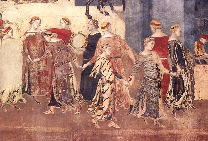
The most intriguing of these mythical monsters, inverted perspective, largely deriving from such scenes as that of ‘St. Mary Magdalen’s Journey to Marseilles’ in the Lower Church at Assisi, is based on the idea of systematic diminution towards, instead of away from the spectator. The difficulty is that the variations in figure scale are neither dependent on any spatial relationship within the composition nor upon the relationship of the scene as a whole to the observer. The deciding factor is invariably the importance which, for one reason or another, is attached to each particular figure. The impossibility of finding any systematic diminution away from the principal figure in the composition is of some importance. It illustrates the general truth that in Italian art all deviations from a naturalistic diminution away from the spectator, other than for purely decorative reasons, are due to the intervention of a hierarchic scale based on the importance of the person or object represented, and not upon any principle of optical inversion.


In his footnotes, White further details how the size of the figures in the above scene is proportional to importance rather than distance, but without a further explanation of the narrative, how can relative importance be a factor?

It's a dream-like scene that is even more bizarre since it is floating in a vault up near the ceiling.


The painter of this unusual fresco, the Master of Magdalen Chapel, is, nevertheless, one of the three closest followers of Giotto, the other two being the Master of the Early Life of Christ, working in the north transept of the Lower Church, and, last but not least, Taddeo Gaddi. It is a significant confirmation of the position the oblique setting held in Giotto’s art, and in his vision of nature, that it is used consistently by all three artists. With a couple of minor exceptions, the foreshortened frontal setting does not appear at all.


The many variations on the oblique construction are, however, indiscriminately used for compositional purposes and do not reveal a pattern of development in any new direction, except, perhaps, in the case of the extreme oblique design of Taddeo Gaddi’s ‘Presentation of the Virgin’


In this fresco a tall-columned temple, standing on a high, complex base containing several flights of steps, juts forwards from a spatial inlet formed by similarly constructed flanking buildings. But although the only structure architecturally isolated from the main mass is the small building on the left, the impression given is rather of a series of coordinated solids than of a single heavy block.

The reappearance of this design in the work of Pol de Limbourg underlines the fact that both the northern miniaturists and the countless minor Italian painters turned to sophisticated, yet not too monumentally inclined artists such as Taddeo Gaddi; to men who combined structural conservatism with ever increasing naturalism of detail.
The extreme oblique setting, as the most obviously powerful and direct way of achieving architectural realism, remained, throughout the century, one of the stock patterns for artists unable to understand, or simply disinterested in, its later transformations and refinements.


Ouch.

Even handicapping it for its damaged areas, this still is an awkward painting whose only value appears to be how it shows, by contrast, the success of the better paintings in Giotto's style.

Where is the "ever increasing naturalism of detail"?


The concentration on a single pattern, that of the oblique setting, which was seen in the work of Giotto and his most important followers, was never a feature of the output of minor, provincial, or derivative artists. It is likewise foreign to the majority of painters working in the second half of the fourteenth century. The return to a mixture of patterns, similar to that found at Assisi and in Rome during the earliest stages of the late thirteenth century revolution, is, at the later date, a reflection of a less intense observation of nature, as well as of the confluence of the Sienese and Florentine artistic streams during the thirteen,forties.


Or perhaps it's a reflection of a preference for a different kind of feeling for the world.


By the end of the century, an artist such as Lorenzo Monaco, although largely uninterested in the problems of pure naturalism or of spatial realism, is among the most important in these very respects because of his technical power and high aesthetic sensitivity. It is this sensitivity that leads Lorenzo Monaco to a differentiation in his use of patterns which, though more abrupt, is reminiscent of the Chinese practice. All the distant towns and buildings, necessarily small in relation to the picture surface, are seen in the sharpest of extreme oblique settings and usually have a doll’s-house delicacy and certainty of structure. On the other hand, those buildings which fill the frame, particularly in fresco painting, are presented in foreshortened frontal setting.


I'd tend to agree that Lorenzo is "uninterested in the problems of pure naturalism or of spatial realism", but why is that more true of him than the artists White has already mentioned?

The architectural rendering in the above scene seems as realistic as all the others.

Perhaps he is considered backward because his world feels more Christian than neo-Platonic.


The slackening, and even reversal of the acceleration towards realism, which are characteristic of the painting of the last half of the fourteenth century, are reflected not only in the individual scenes, but also in the architectural framework which surrounds them. The framing of a panel or a fresco is amongst the most important factors in establishing the relationship between real and painted space. It may serve to magnify their separation, or to blend them yet more closely into one another. It is therefore worthwhile to consider for a moment what has happened to this framework within which so much had been achieved during a century and a half of turbulent activity.


In some situations the distinction between real and painted space is a matter of life and death. Is there really a tiger in the room, or just a painting on the wall?

But aesthetically there is no need to distinguish them.

The eye, searching a space for an imaginative/aesthetic experience does not need to notice where the real architecture ends and the painted illusion begins.

It's just that in modern times it's very rare for paintings to be designed for specific spaces, so usually one needs to look at a painting to the exclusion of everything that surrounds it.


The first steps towards the conquest of the barriers between reality and art are already taken by Cimabue in the heavy cornice, with cowered underside and supporting consoles used to emphasize the spatial unity of choir and transepts at Assisi. The plasticity of this painted architecture is in noticeable contrast to the tapestry like framing of the individual frescoes. Like the similar features used to support the massive ribbing of several of the vaults, it is intimately connected with the real architecture of the church. In the latter case there is the obvious supporting function. In the other an attempt is made to nullify the break caused by the encircling passage, and to push back the lower wall, so that the whole surface may appear to run on upwards, broken only by a bold, projecting ledge.


Isn't it a lot quicker, and therefore also much less expensive, to paint the illusion of architectural detail than to actually carve those details into stone?

Wouldn't that be the strongest incentive to "break the barriers between reality and art" in situations where the prestige of the more labor intensive materials was not required ?


Both in Cimabue’s work and in the subsequent framing of the St. Francis cycle in the nave, it is quite difficult to tell where painted mouldings give way to the real stonework of the diaper-patterned cornice which lies just below the passage.


Perhaps such faux-architecture is more appropriate for a building designed for a widely dispersed community based on fervent belief rather than locality (like the municipal cathedrals built in the previous centuries).


Even more striking is the clear equation, in the southern transept, of monumental, painted archangels, who stand behind an actual arcade and angelic half length figures above them, framed by an arcade which is this time only painted.


In a Gothic cathedral, this would all be carved in stone.

How well the space has been designed is, unfortunately, impossible to tell with the tiny image that was all I could find on the internet.


The element of architectural illusionism is intensified in the nave, despite the bay-by-bay. perspective. The monumentality and plasticity of the architecture grows. The added depth of the colonnade makes the pushing back of the pictorial surface of the lower wall more thoroughgoing than before. Spatial illusionism is cut short, however, before it reaches the pictorial scene of action. The immediate framing of each composition is a pair of flat, patterned colour bands. The latter separate the narrative from the architectural illusion. They at once assert the flat reality of the wall, proclaiming the depicted scene to be indeed a picture and no more. These separation bands make every scene appear as a flat tapestry stretched out between the solid-seeming architectural forms. As yet pictorial space itself has no illusionistic quality.


"No illusionistic quality"?

Each of these bays suggests a shallow stage set with props and costumed human figures, so the viewer feels some kind of spacial illusion.


The purposeful nature of the coloured separation bands seems to be shown aleady at Assisi by the selective way in which they are applied. All the narrative scenes, both in the transepts and in the St. Francis Legend, are surrounded by them. In the niches of the angels in the transepts , and of the saints upon the soffit of the entrance arch, however, nothing intervenes between the painted figure and the painted architectural frame. It seems as if a higher degree of illusionism was considered possible for the single pictures of the saints or angels in their niches than for complex scenes containing architectural and landscape features, and carrying associations both of time and place.


An alternative explanation would be that frames (i.e. the painted bands) are used to mark the edges of a window onto an imaginary world.

Just like the Virgin and Child shown above (from an 11th C. Spanish church), the angels in the niches are present in the church itself, but not because they fool the eye into believing that they are actually there.

The highly stylized figures are more like pictographs than illusions.


In the single figures, whether considered as real presences or as lifelike statuary, there is no element of contradiction in their appearance all together in a single building.


Some churches don't have any imaginary picture windows, and worshipers seeing these picture windows for the first time might have been surprised, happily or otherwise.


In the work of Giotto and his immediate followers the situation is more complicated, and its interpretation more exciting. The conclusions reached carry a new conviction, since there is more evidence that bears on the elucidation of the artist’s purpose and ideas.


At Padua the architectural framework of each wall is surrounded by a plain red band. This functions as a neutral strip, drawing attention to the fact that this is painted architecture on a flat wall, and not solid marble.


Yes it does - if that's what you're looking for.

Otherwise, it just defines forms in an overall rhythmic scheme.


A similar, neutral, surrounding strip occurs already in the entrance arch of S. Francesco, where the tiers of niches ‘float’ between the ribs of the real architectural structure. The differential use of separation bands in the Paduan architectural framework elaborates exactly those distinctions visible in the different parts of the Assisi decorative scheme. The frescoes of ‘The Life of Christ’ in the middle and bottom registers are all surrounded by the twofold decorative bands.


These do not appear, on the other hand, in the niches of the grisaille figures of Virtues and Vices, nor in the realistic painted chapels flanking the entrance to the choir . They are similarly dispensed with in ‘The Last Judgement’, which fills the entrance wall, and in the scenes of ‘The Early Life of the Virgin’ forming the uppermost row of frescoes on the side walls .


Yes, the virtues and vices are framed by framed by faux architectural features, but those features (imitation marble etc) appear to lie just as flat as that red band, while the figures of virtues and vices appear to be that kind of sculptural relief which has an illusionistic quality of its own - i.e. it appears to project further into space than it really does.

Does anyone, besides White, really care whether a flat, horizontal band on the wall has been painted to represent the face of a stone block, or nothing more than just a painted stripe?


Nor are they present in ‘The Annunciation’ which occupies the entire upper part of the triumphal arch. All these scenes are therefore framed essentially in the manner which became the rule in the succeeding century. The distinction in degree of realism has been extended into the area of the history compositions themselves. Now, scenes which stand alone or occupy the entire area of a wall, and scenes placed at the top of a surface shared by several compositions are given a degree of realism formerly confined to single figures in their individual niches. The flatness of the pictured scene is no longer emphasized in the same way, and, whenever the position of the fresco allows the conflict with its neighbours to be minimized, the absence of the separation bands permits the architecture to become a window looking out into a new reality. It is no longer a picture frame, bounding an impenetrable decorative surface.


Byzantine mosaics are also usually framed by their architectural setting.


In an earlier chapter it was seen that in the individual frescoes Giotto was changing and developing his pictorial method as he worked. The present analysis of the function of the frame in the Arena Chapel shows that his conception of the relation between picture and spectator, together with his whole idea of the significance of the pictorial surface, was also in a state of flux. The flatness and non-reality of the decorative scheme as a whole is asserted by the neutral bands which isolate its major units.


The decorative bands are no less an architectural feature when they are made with paint and brush rather than stone and chisel.


The onlooker sees before him painted walls. Yet this indication of the actual nature of the decoration is not in any way obtrusive. Only the most observant notice it at all, and as the spectator focuses his attention on the individual scene the illusion of a marble framing is allowed to work upon him. He is, in fact, free to see the entire decoration of the chapel now as space, and now as plane. And when he chooses to see space, he is allowed, according to the logic of the situation, to see sometimes a painted scene on a flat surface emphasized by coloured separation bands that run within the marble frame, and sometimes a new world that opens out beyond the wall—a world partly dependent on his own, but not as yet a mere extension of it.


I wonder whether this tension between flat surface and depth is as important to art academics in the post-modern era?


In Sta. Croce, under the influence, possibly, of the more assertive forms of the real architecture, Giotto makes a firm choice between the possibilities implicit in the Paduan scheme. Here are no floating panels, no flat, neutral bands. The painted architecture now supports the plastic elements of the actual structure of the church. The realism of the painted marble surrounds the onlooker completely. There is no labouring of the structural logic. Neither is there the assertion that what looks like marble is but paint. The onlooker is now completely free to think of the appearance as the actual thing.


Has any sane person ever thought that the painting of an apple was the actual apple itself?


Within this ‘marble’ framework there is here the same distinction as at Padua between the pictures with their separation bands, which occupy the lower surfaces , and the realities which are seen through the architectural framing of the large lunettes that top the walls. Similarly, no separation bands insist on the non-plastic, pictorial nature of the saints within their niches. The same distinction is systematically applied throughout the frescoes by Taddeo Gaddi in the Baroncelli Chapel, and by the Master of the Magdalen Chapel at Assisi, as well as in the transepts of the Lower Church. In Gaddi’s case the illusionist intention of the architectural framework is confirmed by the small, realistically lighted inlets in the marble socle, which, with their simple, still-life objects, are the forerunners of the fifteenth-century intarsia cupboards.


The paintings with window frames are no more or less real than those without.

But they do summon the viewer to ignore the rest of the church's interior, and look into a special world of the imagination - much like the framed art in a museum gallery.

Without those frames, the viewer's mind is kept inside the church which is itself an imaginative world of which the painted images are particular details.


This developing conception of the picture is accompanied, as has been seen, by the increasing use of oblique settings within the individual composition. There is, at the same time, a firmer placing of the onlooker on whose position the appearance of the contents of the scenes, as well as of their framing, is now definitely dependent. At this point the blending of the real and the pictorial worlds is already far advanced.


The final stage before the advent of perspective theory can be seen in Maso’s frescoes in Sta. Croce in which the separation bands have completely disappeared.


Completely disappeared?

Aren't there bands of ornamentation that completely frame the above painting?


Would they do so any less if they were stripes of solid color, as shown above?


A similarly complete conception of the picture frame as a window into space is to be seen in Jan van Eyck’s Van der Paele altarpiece. The contemporary frame is foreshortened so as to form a plastic window ledge with its orthogonals continued inwards by the foreshortened pavement of the actual picture space.” Although the panel dates from 1436, the construction of pictorial space is still a matter for empirical approximation, not the application of a unified system.’ In the north, as well as in Italy, the new idea of pictorial reality is expressed in practice well before the evolution of a mathematical theory. The fundamental change is carried forward hand in hand with the developments within the composition which were previously discussed. The same great artists were responsible both for the detailed growth and for the general change in values.


Why has White jumped a century ahead to look at a Van Eyck frame which serves the same function as the 14th century frame shown above? (Duccio)


It is no contradiction that the new ideas remained restricted to a relatively narrow circle. The existence of Giotto’s figure style is not disproved because its meaning was not understood for a full hundred years. There can be no doubt that the majority of craftsmen and minor artists still painted on wall and panel, and still thought of their artefacts in the same way as their medieval forbears. There is a similar contrast between the ideas of the artistic leaders and those of their minor and provincial followers in first century Pompeii and in fifteenth century Italy. Cennino Cennini throws little or no light on the meaning of the fourteenth-century picture surface. His silence has no positive value, for he shows a similar backwardness in his advice about perspective.
‘And always use this method for buildings: that the cornices which you make at the top of the building fall down towards the shadow below; the cornices in the middle of the building, half-way up the surface are even and level; the moulding of the base of the building runs upwards from below, in the opposite way to the upper cornices which hang down."
Such instructions do scant justice to the perspective subtleties of Giotto and Maso and the Lorenzettis.


If only Cennnini had advised artists to make the horizontal edges of buildings recede ever so slightly even in full frontal view.

Assuming that the history of art, like the history of science, is the story of an ever-progressing, ever-more-accurate, body of knowledge, then yes, Cennino Cennini's
How-to-paint book is backward, as it described how things had been, rather than might better be, done.

Though one might notice, in the only painting now attributed to him, he places elements of the carved frame on top of a painted figure, a rather forceful way of pushing the pictorial space beneath the surface of the panel, and one that has not appeared in any of the paintings White has yet shown us.


Turning from the question of pictorial framing back to that of compositional content, it is on three artists working in North Italy during the last quarter of the fourteenth century, namely Altichiero, Avanzo, and Giusto de’ Menabuoi, that attention must be focused in order to discover the most interesting developments in spatial design. It seems to be unlikely that these three artists, the one a Veronese, the second Paduan, and the last a Florentine who settled in the North, have any of them a direct historical connection with events in Florence in the early fifteenth century. The analysis of their achievement does, however, help towards an understanding of the explosion in spatial realism which was touched off by the invention of artificial perspective.


Altichiero’s great fresco of ‘The Crucifixion’ in the chapel of S. Felice in the Santo at Padua was probably painted by 1379. This scene marks the highest achievement of this group of artists in the realm of landscape. The spreading of the unified design across three column separated bays recalls the similar treatment of the tripartite Gothic panel in Pietro Lorenzetti’s ‘Birth of the Virgin’. Although the conventional, constructed rock forms show that it is not a landscape in the new Sienese manner, the variety of grouping and movement, and the skillful use of horsemen to increase the crowd’s extension into depth and also to carry the design well up the surface of the wall, combine to give a real feeling of outdoor space. The impression is increased by the deep, and unusually realistic architectural coulisses which run far into the distance upon either wing. Finally, the oblique construction of the architecture accommodates the scene to the roving eye of the spectator as it moves across the three bays of the wall, whilst a culvert in the foreground confirms the impression that the painted world continues forwards and downwards beyond the lower border, as well as out to either side. The non-naturalistic landscape detail and the contrasting realism of the buildings reveal the essentially architectural basis of Altichiero’s sense of space.


By way of comparison, here's Giotto's crucifixion from the Arena Chapel.

Altichiero da Zevio gives us a much larger stage, in three-screen cinerama as it were, and as White notes, it projects forward as well as backward. While Giotto uses a close-up to magnify the emotions of the actors.

White doesn't mention it, but I think Altichiero's great achievement is incorporating the complex architectural frame into his design.


"Presentation at the Temple"


"St. George Drinking the Poison" is just to the left of the left window.


Oratory of St. George, Padua


A similar foundation is even more apparent in the work of Jacopo Avanzi and of Giusto de’ Menabuoi.
The fresco of ‘The Presentation in The Temple’ , in which Avanzo elaborates the architectural design of his signed ‘Funeral of St. Lucy’, also in the Chapel of St. George beside the Santo, reveals the essential qualities of his approach to spatial realism. The characteristic elaboration of imitative architectural detail is here accompanied by a determined inwards thrust, particularly on the left. The sense of nearness, and of the onlooker’s inclusion in the event is, on the other hand, less emphasized than in the scenes such as that of ‘St. George Drinking the Poison’, which takes place in a small, and only partly visible courtyard opening out from an elaborate Gothic cloister. In spite of this relatively self-contained quality, the scene of ‘The Presentation’ still appears to be seen from close at hand. In the degree of realism, and the extent of the spatial movement, there is no parallel for such a composition in Tuscan art before the coming of theoretical perspective.


What a strange looking chapel!

The walls are stuffed with images of architecture, and the upper story has been so truncated, it makes the characters beneath appear to be giants.

And although the architectural drawing creates a deep interior space, the figures feel flat and comical against it.

The entire effect is as if the pages of a comic book have been made big and plastered onto a wall, quite a let down compared with Giotto's work that's only a few blocks away.

There is such an emphasis on buildings, I wonder why Norris Kelly Smith didn't discuss this cycle.

Perhaps because however great the interest in the depiction of architecture, it's the overall aesthetic effect that makes a painting worth writing about.


The only comparable designs are the work of the last member of the northern trio, Giusto de Menabuoi, who was working during the seventies on the decoration of the cathedral baptistery.

The artist’s forceful approach to architectural space is witnessed by the fresco of ‘The Feast at Cana’ in which the depth of the interior is reiterated time and again by the orthogonals on the left. Its precise extent is measured out by the monotonous sevenfold accent of the seated figures ranged in depth. The limits of the cluttered central floor space are shown through the careful disposition of the gaps that open up between the figures of the servitors.


That "careful disposition of gaps" also participates in a rhythm of volumes in space, from the P.O.V. on the far right, across the wine jars, through the servitors, into the line of disciples, and against the wall openings behind them.

What are those two fellows directly in front of the viewer doing?

They seem to be sampling and discussing the wine, while paying no attention to the Son of Man and his mother seated at the table behind them.


In some scenes, such as ‘The Massacre of the Innocents’, the whole interior is filled by a seething crowd. But even then, a row of heads, as if of soldiers on parade, runs down the side wall to ensure that the spatial content is not lost on the beholder.


Smith discussed this painting in his chapter on The Two Allegiances

He wrote: "Although by means of perspectival orthogonals Giusto has created a deeper room than any that Giotto defined, he has no perspective in regard to his subject - that is to say, he has taken no stand, assumed no standpoint toward the issues involved in the massacre"

Looking at that image again, I think there is a stance, although it's a very cynical one that suggests that such behavior is business as usual. The soldiers who are prominently featured seem to be fine, upstanding nobles rather than crazed, dehumanized butchers.

The deep, but crammed, stage in both of these paintings creates a space that's hard to escape from. The figures seem to be getting pushed off the wall.


It makes more sense as part of the entire wall that glorifies the Virgin and Child.


In other frescoes, grandiose, vaulted architectural schemes, cut short by the intervention of the frame, are used to create impressive space. In ‘The Feast at Cana’ itself, only the left- hand wall and a small part of the back wall can be seen before the room is cut from view. The considerable depth of the pictorial space is established by the emphasis on recession, and the sideways extension of the banqueting hall is left to the imagination.


Menabuoi’s obvious weaknesses as a landscape painter, and his tendency to abrupt transitions into the realm of popular imagery, are thrown into increased relief by the growing control of internal and external architectural space revealed in the Belludi Chapel in the Santo, which he decorated in 1383.


Where did Menabuoi paint a landscape?
Where is one of those "abrupt transitions into popular imagery"?
And where is the evidence that his control of architectural space was growing?

What White does not mention is the distinctive character of the St. Anthony Basilica.

It's been over 30 years since I stood in it, but I still remember the intensity of the child-like sense of veneration, for which the Menabuoi frescoes seem appropriate.


The vast crowd filling the piazza in ‘The Martyrdom of St. James’ is convincing in the extreme. There is no piling up of heads over the surface, and the imagination is free to accept the continuation of the mass of figures far into the distance. The portrait quality of the architecture is enhanced by its convincing scale. The sense of recession, conveyed by the orthogonals receding arch on arch into the distance, particularly in the magnificent edifice on the left, is more typical of the 1430’s than the 1380’s. The perspective remains empirical, and there are still uncertainties in detail. But in what has been attempted the artist reveals precisely that spirit which was to flourish to the full under the impact of a systematic method of creating space.


How would this scene look any better if all the orthogonals converged to a single vanishing point ?

Concerning those "uncertainties in detail", White explains that: "The mouldings of the pillars supporting the arches in the building on the right run upwards far too steeply, while the crowns of the arches and the line of windows above are almost horizontal, so that there is little co-ordination with the falling recession of the building on the left"

But try as I might --- I just can't see what he's talking about.

What I think is remarkable about the architecture is that he shows the verticals leaning towards the center, which has the viewer looking up from his position down the piazza.


The same spirit shows itself in the great Gothic interior, crowded with figures, which contains the scene of St. Philip Exorcising a Devil’. The huge central hail extends above, and out to either side beyond, the boundaries of the frame with which its wide Gothic arches are in such close harmony. The alignment of the figures carries the spatial play of the, architecture into the crowd which it encloses. The sense of a great, echoing space, teeming with life, is achieved as never before.
The fact that such explosions of originality in the creation of pictorial space could occur in the Italy of the 1370’s and 1380’s is highly significant. In a period generally characterized by economic and political tension, and by artistic uncertainty and even stagnation, there was a siow combustion of ideas, which finally burst into flame, fanned by the favourable conspiracy of events in Florence in the early fifteenth century.


Regretfully, no image of "St. Philip" exorcising the Devil" could be found on the internet today, so I've had to post the rather miserable image from the book.

What I find interesting about Menabuoi is that he shows how paintings can display a deep, convincing architectural space without the geometrics of linear perspective.

Regarding the subject of this chapter, beginning with Giotto, there does seem to be emerging paintings as windows on the world, with the frame functioning like the proscenium of a stage. Over the following centuries, many painters will make that imaginary world will feel more like a real world and less like a puppet theater, or at least they'll make the puppets feel more real.

Some followers of Giotto make more elaborate architectural props on that stage, and Menabuoi makes the stage feel deeper.

White suggests that it's important whether a fresco is framed by painted ornamentation or by the actual architecture of the building itself, but the examples that he offers don't convince me that it makes any differenc

Friday, August 19, 2011

John White : Lorenzetti

(this is chapter 6 of John White's "Birth and Rebirth of Pictorial Space. Quoted text is in YELLOW.
Text quoted from other authors is in GREEN)


The perceptions of the natural world, and the idea of visual reality, which underlie Ambrogio Lorenzetti’s ‘City of Good Government’, painted in the Palazzo Pubblico in Siena in 1339 and the years immediately following,’ are precisely those which are the wellsprings of Maso’s achievement in the scene of ‘St. Sylvester and the Dragon’. Here, these insights are clothed in a new richness and complexity. The Florentine abstraction of essentials and constructional approach to composition underline the garrulous, descriptive sweep, the all embracing quality of the Siennese approach to nature.


St. Sylvester is the center of attention in his painting, for which the surrounding buildings set the stage. But here, it's the buildings themselves that are the evidence of "good government", so the artist has eliminated any ambivalence about where they stand in relation to each other.


The dancing serpentine of gaily costumed maidens marks the centre of the scene. At this point a wide inlet opens into the packed houses, giving a sense of spaciousness found in no earlier townscape. To either side ’of this wide centre emphasized by space and movement, the architectural horizontals of the houses all run down to left and right in soft recession.


Every building is obliquely set. Each recedes from this one centre, the dividing line of which is marked by the street that runs upward through the houses beyond the left,hand boundary of the foreground inlet.


This unity of construction spreads beyond the city into its dependent countryside. There, castles, houses, bridges are all seen from the direction of the town. All the architectural features of the countryside diminish in proportion to their distance from the city, and not merely in proportion to their distance from the foreground. A group of farm buildings is placed in the middle ground almost at the centre of the country scene. Further to the right on the hills that form the left-hand border of the lake, but at an almost equal distance from the foreground, castles and walled villages or towns appear on a far smaller scale. The centre of the city is the point from which all architectural diminution runs.


I can't recall any other landscape that moves back into space horizontally, from left to right, but perhaps it can be found in book illumination.

It certainly makes a point about about the importance of urban life, but the resulting sense of space in the room itself is a bit uncomfortable.


In the city of Good Government itself no mathematical construction is involved. Yet the whole town curves backwards from the centre, as if receding softly from the observer’s shifting gaze. The casually jumbled houses, welded into unity by his eye as it roves slowly outwards from the centre, are further tied together by accented horizontal features. The most noticeable of these is the long line which starts from the roof above the head of the man on horseback who rides to the right out of the central space and is about to disappear behind the foreground building. This line is carried through continuously from house to house, right to the city gate, and is only the most striking feature of many. Within the greater unity each building has its fully individual character, conforming closely through its softened oblique construction to the visual experience of the onlooker in his own three’ dimensional world.


The sizes of things seem so strange to me, for example the horseman in back of the building is larger than the merchants in front of it.

White will discuss this "lateral diminuation" below, but does not suggest that it's even steeper than in the straight ahead view.

And height of the second floor of the buildings does not diminish in proportion to distance.


The down-sloping roofs express the normal viewpoint. The piling of the houses tier on tier does not denote a bird’s-eye view. This is a steep, hill’ hugging town, as is Siena itself. The plunging road beyond the city gate confirms the fact. And if the artist has not taken care, either in town or country, to run the receding lines together on a single, strict horizon, other means are used to seal the unity implied by the perspective in its broad conception, although not in any mathematical precision. Like all Giottesque empirical perspective, the construction presupposes radiation from the centre. It is the pictorial counterpart of the spectator’s situation, always looking outwards from himself, the centre of his world. It is the reverse of the frozen stare of fifteenth-century perspective in which the composition is sucked in towards a single point by centring orthogonals. This outwards radiation, already noted as inherent in the structure of each building, is also expressed by figures, and by movement, and by light.


I don't get this feeling of radiation from the center, though maybe it feels that way when standing before the wall itself.


In both town and country of Good Government the figures, like the houses, are diminished from the single centre where the young girls dance. This diminution is again not merely in depth, supposedly at right angles to the pictorial surface, but over it to left and right as well. The riders, and the figures shopping at the stalls that line the inner boundary of the central space, are all smaller than the dancers in the foreground. But so are the knights and ladies riding outwards to the left and situated in the same plane as the dancing figures. This lateral diminution extends also to the right throughout the figures in the town, whilst at every stage those in the background are likewise diminished in relation to the corresponding figures in the foreground. The process is continued on the road beyond the gates. As it runs down and across the landscape foreground the figures steadily grow smaller. The same is true wherever the eye wanders down the roads, or out over the fields, away from the city into the deep countryside. Full rein is given to the new sense of space apparent in the structure of the town. A panoramic vision of the countryside unfolds for the first time, diminishing into the distance with the continuity of natural space.


Perhaps no one has offered a panoramic view before because the city and its surrounding countryside have never been a subject before.

Lorenzetti's design follows an interest in subject matter, rather than in how a scene would appear if one were actually standing in front of it.


The five peasants working amongst the vines within the shadow of the city walls are the only contradictions in this remarkably consistent pattern. They are definitely smaller than the figures on the road beyond them. The fact that in this single instance the compositional demand for concentration at the point of greatest interest has come into conflict with, and been allowed to override, strict naturalism, does not destroy the unity of the composition as a whole. At all other points the continuity of diminution, both laterally, and directly into depth, is steadily maintained. The break in logic is liable to seem far more important to the analyst than to the artist, and particularly to the analyst who is only prepared to recognize the single diminution into depth from front to rear. In lateral diminution there is very little inconsistency.


"strict naturalism" ?

I don't think so.

But making the peasants small follows the same logic as making the horsemen big and making everything get smaller in proportion to its distance from the center of town.


Just as the center of the city is the area of most importance, the merchant or gentleman on a horse is more important, and therefore larger, than the lowly peasant.


Recognition of the unified interpretation of reality visible in the descending architectural and figure scale does not entail the supposition that an absolute naturalism of any kind has been attempted. Even in the town the figures are a little large for their surroundings, and the disparity increases as the eye moves over the more distant reaches of the countryside. The figure diminution is maintained in step with the diminution of the landscape. It is not tied to it by laws of photographic naturalism. If it were, the figures would be ants, mere dots, alive only beneath the magnifying glass of analytic scrutiny.


Except when there is a difference in social status.


The dimunition both of figures and of architecture has been seen as radiating from the centre of the city. From this it was deduced that the composition is constructed, like an individual building in an oblique setting, to be read outwards from the centre, and not inwards to it. The truth of this hypothesis is confirmed by the directions which the artist stresses through the movement of the figures. Riders travel outwards from the centre to the left, and emphasize the flow against the natural movement of the eye. In the central space the further inlets are stressed by townsfolk, and by horsemen moving out of sight. The three foremost dancers, moving to the right, start the eye outwards. The movement, which is easier in this direction, is assisted by the architectural recession. Consequently less encouragement is needed from the figures. These move impartially to left and right until, as the eye is held and taken upwards by the steeply climbing castellated wall, laden donkeys carry it on with them into the narrow street that climbs yet further into depth. Outside the gate the movement of the foreground riders encourages the eye to venture onwards. On the hill itself a contrary movement prevents an unwanted, comic toboggan slide from being generated by the slope. As soon as the flat is reached, the outward movement is continued until the figures struggling to pull their mules across the bridge reverse the trend once more, this time to slow the eye, and stop it running out beyond the frame. Similarly, the smaller roads that run out from the city past the isolated farms, and curl towards the distant hills, have figures moving outwards with them, pointing the essential structure of the composition with their quiet motion. In movement, as in scale, the figures therefore play a fundamental part in the creation of a unified design, for all their seeming casualness of grouping. The apparently conflicting and disruptive qualities, which have been observed in them by some, are due, not to their own inherent properties, but to a misunderstanding of the compositional unity which they are so carefully calculated to support.


This "misunderstanding of compositional unity" is attributed to Giulia Sinibaldi, in her 1933 book, "I Lorenzetti", but White does not quote her. (you'll have to read pages 102-106 which, unfortunately, are in Italian)

But even without knowing what she wrote, I question whether her, or anybody's, sense of "compositional unity" can be dismissed because of a misunderstanding.

I also question whether such a unity is affected by the perceived direction that the characters appear to be moving, and the problem with discussing this particular painting is that its center has been so badly defaced.


The final seal is set upon this total radiation from the heart of the city of Good Government by the way in which the light itself flows from the glowing centre. The pictorial lighting takes no notice of the single natural light source in the window lying to the extreme right in the adjoining wall beyond the furthest boundary of the landscape. It shines instead to left and right out of the city’s centre. As in the case of the perspective, it is the road leading inwards from the wide space behind the dancers that forms the demarcation line. The right-hand surfaces of all the buildings to its left are lighted. The red tower which rises up above the main polygonal building in the foreground constitutes the sole exception. This, however, is the fault of clumsy restoration.” To the right of the dividing line, light floods outwards over every house, and on over the countryside, flowing like a tide against the real light from the window of the room. The lighting from the window side in the whole triangle extending from the bottom right-hand corner diagonally upwards to the ceiling beam is the result of damage and of restoration, as are other minor contradictions. The degree of interference suffered by the entire area is visible even in a photograph.


That never occurred to me!

Yes, the center of town is the center of light, at least as far as we urbanites are concerned.

Yet another reason why "strict naturalism" is hardly being practiced here.


It is an exciting experience finally to stand in front of this great fresco, and to see the way in which the perspective of figures and architecture, the lighting, and the movement, are all used by Ambrogio Lorenzetti both to give reality to the pictorial world and to create a composition with sufficient unity to contain an unprecedented wealth of natural detail.


...and to proclaim the importance of civic life? How can White persistently ignore that issue, which is probably the intended theme of this entire city hall project.?


Here are some charming details that would, by themselves, be enjoyable paintings.

Indeed, given the damage to key areas, piecemeal is the best way to enjoy this room, despite the 'final goal' mentioned below.


The enjoyment of this fresco for itself is not the final goal, however, for the decoration of the room is not confined to this one wall. The full sweep of Ambrogio’s invention only emerges when the remaining compositions are appreciated in relation to the artist’s purpose.

The unity which binds the town and country of Good Government together has been emphasized enough. It is also clear that the whole wall may be considered in another way. Whilst the main centre of attention is placed in the left half of the city, the countryside may be thought of as a secondary centre. When the wall is looked at in this light, it is seen that the division of the composition corresponds exactly to that on both the other walls.


The side of the room opposite the fresco of the consequences of good government is occupied first by the ‘Allegory of Bad Government’ itself, and secondly by its effects on town and country.


The composition is distributed in such a way that the horned figure of Bad Government is placed exactly opposite the compositional centre of the city of Good Government. Since the throne on which the figures of the vices of Bad Government are seated is, at the same time, the perspective focus of the entire fresco, the spectator’s principal standpoint is the same for either side wall.

Within this unifying framework Ambrogio Lorenzetti does not confine the dramatic contrast to the subject matter of the medieval allegory which it is his task to illustrate. It is extended also to the fundamental formal structure of his compositions.

The focusing of the entire wall on the centralized construction of the throne of Bad’ Government calls attention to the fact that on this wall no place is found for the oblique setting. Ambrogio is now drawing for his own particular purposes upon the Sienese, instead of on the Florentine tradition of perspective. All the buildings in the crumbling city are foreshortened frontal in construction. The receding lines all run the eye towards the enthroned allegorical figures on the right. There is no centre for the town itself; no point of rest or concentration as the eye searches the ruins; no radiating harmony corresponding to the centralized oblique constructions exploited by Ambrogio on the opposite wall. The eye of the observer looking at this scene of desolation is always trying to escape—a futile occupation in a composition cleverly contrived to foil so simple a solution.


Hah!

White has discovered the significance of that oblique construction that has been the major theme of his art history: it leads the viewer into a space he would like to go (the well governed city); whereas a foreshortened frontal construction stops him short at the picture plane.


On the right of the town the buildings jut far down into the foreground. The full effects of this arrangement are now lost through damage, but enough is left for a quite accurate assessment of intention. In the first place it provides a demarcation line between the representation of the ‘Allegory of Bad Government’ itself and the illustration of its consequences. Formally, it increases the difficulty of transferring attention leftwards from the central allegory to the city. A steady leftwards movement is always more difficult than the reading to the right which is habitual in the West. Here this inherent difficulty is increased by the presence of the forward jutting wall of houses and by the uncertain movement of the figures placed in front of them. In the well governed city everything was done to help the movement on the left. Steeper recession of the architecture and determined figure motion were combined to help the leftwards flow from the pictorial centre. Here every thing is done to make it harder.


Maybe it feels different in the room itself, but in the reproduction, the lines of houses seem to echo the right arm of the tyrant - so, for me, the energy moves to the left.


The same retaining wall renders the leaving of the town an equally painful process once it has been entered. It shuts in a spatial box that stands in front of the main line of houses, its other side closed by the wall which separates the town and country. The figures, instead of harmonizing with this spatial pattern, are in conflict with it, running down the sides of the enclosure and across its open front. Running is not, however, the appropriate word. There is no circulation round this vacuum. There is no explanation and enrichment of the compositional movement through a flow of figures similar to that upon the opposite wall. Here little knots of struggling figures stand in shriveled isolation, pointing no direction, building up no formal harmony. Nor is this greater unity provided by the disposition of the architecture in the background. Streets are indicated leading inwards, but no movement up them is encouraged, or indeed allowed at all. The wide road that passes upwards from the city gate is cut from view by the outer wall which runs into an area of damage that obscures the composition at this point. It does not obscure the fact that no circulation from the main space to the street was ever possible.


I'm just wondering how this scene would feel if the central group of figures were joyfully dancing instead of murdering.

Would the space still feel just as dismal?


Finally, the light itself is treated in a way that differs from the method used in town and country on the opposite wall. Instead of radiating from the centre in harmony with a composition built entirely in this way, it falls upon the devastated country and decaying town as if from the real source of light, the window on the left. The compositional centre and the source of light are set at opposite poles. As a result, light falls onto the flat frontal surfaces of all the houses, whilst the receding sides are left in shadow. In terms of composition this produces an effect of constant jarring as the eye moves over a succession of strongly lighted, variously coloured, flat, vertical strips. The difficulty of lateral movement through the composition, which was noted earlier, and which the light accentuates, is further increased by the broken quality of the horizontal accents. In the city of Good Government there was a tendency for the architectural cornices and mouldings and the lines of the windows to be run together at important points. In this way buildings were linked together, and horizontal movement was made easy. In the ill-governed town there is none of this. Nothing fits. Nothing continues from one building to the next. Nothing is made easy.


Here are detail areas of buildings taken from both paintings.

Yes, it does seem that buildings, like the people, are living happily side by side in the city of good government, while each building feels isolated and fearful in the town run by a tyrant.


The light-fall, which accentuates the mounting compositional unease, also leaves in shadow all the receding righthand surfaces of the houses. Bad Government blazes darkness and not light out over the dying town and the dead countryside. At every step throughout the illustration of the consequences of mis-rule, or of good government, Ambrogio Lorezentti uses compositional means to give visual reality to intellectual concepts, and to accentuate by formal harmony and discord the emotions which their contemplation should arouse in the spectator.


This is the "concretization" of ideas familiar to the followers of Ayn Rand.

Perhaps it applies more to this painting than any of the others we've yet seen because it's the first one that is overtly political.


Whatever final judgment may be given as to Ambrogio’s success or failure, it can only be reached on the basis of a thorough understanding of his purpose, and of the methods used for its achievement. It is clear, at least, that he attempted far more than a careless mixture of the incompatibles of medieval allegory and modern naturalism. On one wall allegory is supreme. On one it shares the field with the new world of illustrative naturalism. On the third it slips away into the background.


"success or failure" as what?

As a painter ?

White has left this question open, but he has only discussed Ambrogio as a promoter of certain ideas - and even then, only as those ideas can be grasped by us, 700 years later.


Everywhere in town and country, form and content are an indissoluble unity. The Sienese artist fully understands the inherent qualities of the foreshortened frontal setting handed down by Duccio and Simone, paradoxical as the use to which he puts them may appear. On the other hand, the centralized oblique constructions of the city of Good Government mark a new development of that clear vision of the world which is typically Florentine. Here, for the first time, the two streams intermingle fully. The multiplicity of nature is approached with a new confidence justified by Ambrogio’s growing power to exercise control by compositional means. Here Florence and Siena meet, and medieval allegory gives, and is given meaning by the first full vision of the landscape which still lies unchanged beyond the windows of the room.


These are the kind of grand, sweeping statements that define the role of art historian in our time and place.

"Everywhere in town and country, form and content are an indissoluble unity" is more a catechism of faith than a reasonable conclusion.


The feeling for space, and for the organization of natural detail, so abundantly revealed in the frescoes of the Palazzo Pubblico, is equally present in the two panels of interiors painted, the one by Ambrogio Lorenzetti, and the other by his brother Pietro, during the year 1342.


Note the date of 1342.

That converging grid on the floor was painted 62 years before the birth of Alberti.

The receding lines do not converge at a single vanishing point, but they do converge into a single vertical line. So there is only one spot where the viewer can be standing on the floor, but his eyes are at various heights.


In Ambrogio’s large scale panel of ‘The Presentation’ the increased complexity of the architectural detail is matched by a new depth of recession. The usual Sienese or Florentine interior of the first half of the fourteenth century is one or, at most, two bays deep. The width of the room space also normally exceeds its depth. In Ambrogio’s high, narrow format this relationship is decisively reversed. The movement into depth continues for at least six bays, and the impression of space, particularly in the foreground, is intensified by the strong diminution of the successive rows of squaring on the floor. This represents a definite technical advance, the effect of which is further strengthened by the disposition of the figures. The rapid diminution of the squaring is accompanied by a fairly accurate, single, vanishing point, which is, however, valid only for the central area of the floor. The outer orthogonals to the left and right converge upon a point which lies much higher up the picture plane. The construction as a whole is therefore that of the vanishing axis, combined with a single vanishing point for one part only of the most important horizontal plane. Technically the construction is therefore a more systematic version of the one which Duccio had developed. The conception of the interior as a whole, on the other hand, is not advanced by the retention of the older pattern, which shows both the outside and the forward surfaces, as well as the inside of the building.


Why must these features be considered an "advance" ?

The effect is to make a imaginary space which viewer is invited to enter.

Perhaps the divine is rendered more accessible or earthly, but that is not necessarily an improvement.


Here's Duccio's version.


In both conception and technique Pietro Lorenzetti’s ‘Birth of the Virgin’ is, perhaps, the most remarkable interior created by the brothers. In this painting the whole surface of a Gothic triptych has been welded together by an indoor scene. The latter covers it entirely except for minor areas in the apexes of the arches. The room, occupying two of the three bays, is unified to a considerable extent. The orthogonals of the floor, the covering of the bed, its foot and head rests, and the upper mouldings of the walls, all run together in a series of vanishing points that lie within a more restricted area than usual. The left-hand bay, however, is not included in this system. Even in those features, such as the coverlet of the bed, which are completely within its influence, the single vanishing point construction never appears to be entirely valid for a whole plane. Nevertheless, the new degree of co-ordination, and the completeness of the enclosure, flowing over and absorbing even the frame, are evidence of the growing tendency to move from the idea of ‘things’ surrounded by space towards that of space enclosing and uniting things.


Norris Kelly Smith discussed this painting here as follows:

"Yet all the while the Church continued to assert that chastity was the highest virtue, the celibate monk, nun, or priest the truest of Christians. The first artist who fully understood the ethical conflict in all this was Pietro Lorenzetti. In The Birth of the Virgin , his fixed triptych of 1342, he confronted the fact that it was necessary that the ecclesiastical frame of reference and the domestic or familial frame of reference be reconciled with one another and with the lives and ethical commitments of the Sienese Christians who were his fellow citizens."

......We cannot simply “enjoy” the painting as an attractive formal composition on a flat surface, for if we comprehend anything at all of the picture’s message, we know that we are being urged to think seriously about the life of the family as it is led within the context of home, church, and city."


White does not flatly assert that the architectural illusion was intended to do nothing more than to exercise and develop a more naturalistic pictorial space - but no other intention is suggested.

Smith's speculations would be more credible if there were evidence that even one citizen of 14th Century Sienna connected this painting to a concern for ethical commitments.

While I am most struck by how the wings complement the center which is pushed strongly forward by the bright light behind the Virgin's mother. It's such an enjoyable romp through color and space.


During the rest of the fourteenth century this change of emphasis, whether in landscapes or interiors, was never carried substantially beyond the points reached by Ambrogio and Pietro Lorenzetti. The tentative nature of the shift in mental attitude need not be stressed, since it is emphasized enough by the whole history of late fourteenth-century painting.


In Ambrogio’s case the impact of the art of Giotto and his followers during his stay in Florence in the 1330’s seems to have been sufficient not only to influence his style, but to force him to that fresh scrutiny of the visible world which flowered in ‘The Allegory of Good and Bad Government’. This appears, in general, to have resulted in sensitive working approximations to experience, rather than in the creation of strict geometric systems.


There is evidence, however, in the panel of ‘The Annunciation’, which is dated 1344, that in his later years Ambrogio was working on problems of perspective in the more restricted meaning of the term.

In this panel all the orthogonals, except the fractional line behind the angel’s back, run roughly to a single vanishing point in the central column. Although the succeeding rows of patterning on the floor are rapidly diminished, it is still not possible to join the squares diagonally by straight lines. If such diagonals could be drawn, it would mean that the law of diminution characteristic of fifteenth century artificial perspective was already being used. It is interesting, and also baffling, to see that underneath the final pattern of the floor a totally different system of squaring was originally drawn out. What is more, at least five diagonals, three running to the left and two towards the right, were drawn in at the same time. Unfortunately for historical neatness, they do not converge consistently to single points at all, let alone to points that lie on one horizon. All the same, they are extremely finely executed, and Ambrogio clearly drew them for some purpose. The warping of the panel and the difficulty of making accurate observations of such delicate underdrawings add to the general uncertainty. It is only possible to say at present that they seem to show that underneath the present painting there lies an experiment which Ambrogio was unable to bring to a satisfactory conclusion, and which he discontinued, at least for the time being. Possibly he was merely trying to see what actually did happen to the diagonals of his foreshortened squares. This in itself is interesting, since there is evidence by this date of the occasional use in coffered ceilings and squared pavements of the distance point construction which was the northern counterpart and seemingly the southern forerunner of Italian artificial perspective.


Would this painting have been improved by making the lines on the floor converge to vanishing points on the same horizon?

The floor feels unreal -- but isn't it appropriate for that most important supernatural moment in sacred history?


Here's Simone Martini's Annunciation, done a decade earlier in 1333.

Lorenzetti must have seen it, and he might have felt the challenge to make his completely different - with different personalities for the figures and a different interaction with the frame. His remarkably thin, dissolving pilaster in the center is quite an invention.


Here's some detail views from the Google Art Project


Note the pattern of marbling on the floor. The lines recede on a diagonal, and converge from either side of the Madonna, but they are far from parallel or even straight. They seem appropriate for the lighter, more vaporous sense of volume and space that Martini has in comparison with Giotto, Maso, and Ambrogio.

If Martini had woken up one morning and found himself in Edo, he could have immediately gone to work painting Japanese screens.


It is, perhaps, not altogether wrong to end the story of so much achievement on a tentative note. The Lorenzetti brothers, Ambrogio, in particular, mark the wave-crest of early fourteenth-century naturalism. This is followed by the trough of hesitation, and of recapitulation, of uncertain movement, sudden advances and sharp changes of direction, that precedes the great surge of the early fifteenth century. It is this moment of small certainties, and of large indecision, which prepares the way.


Here's the same theme done about 140 years later.

The ornate Gothic frame has been replaced by a simple picture window.

But you also might notice that only the far right corner of the floor has a grid, it is barely perceptible, and the receding lines are not parallel to the palace so they have their own vanishing points.


Mostly, the ground plane is floral -- just as in the tapestries from that era.


( More close-ups can be seen
here)


The Leonardo certainly better servers as a window on the world that even includes a distant landscape, complete with a city, harbor, ships, and mountains shrouded in mist.

But the intense psychological drama isn't there.

Leonardo's Madonna is a princess receiving a royal messenger. Unlike the two examples from the previous century, her knees are parted, appropriate for the function she will serve.


This scene is not really about her.

She's not making any choices or having any reactions or revelations.

She's just getting impregnated.


And while scouting out more recent versions, I came across this one by Rupert Charles Wulsten Bunny (1864 – 1947.) Half of the floor has a grid, but what's more fascinating is the painting of the Expulsion of Adam and Eve in the background. The Madonna looks like an exhausted flapper, doesn't she?


As these variants on the same theme might suggest, the specifics of linear perspective are mostly marginal to the important differences between them, and definitely less important than how the figures are handled.

So, above I've posted up some examples of figures by each of the artists White has discussed so far.

(Giotto, Maso, Duccio, Martini, Lorenzetti)