(this is Chapter Five of Meyer Schapiro's "Words, Script,and Text".
Quoted text is in YELLOW.
Text quoted from other authors is in GREEN)

Medieval art is in two senses an art of the book. Its subject matter, in a great range of techniques, is founded on sacred texts that shaped religious life, The spiritual content of these writings entered into the allusive expressiveness of the work of art. In the second place, the sacred manuscript, with its paramount importance in cult and religious thought, became an object and field of art in itself, with qualities of its own and the source of an acknowledged merit for one who commissioned or transcribed or decorated the written text. In no other epoch has the book been for generations, even for centuries, as it was throughout the Middle Ages, a prime field of invention of styles of art and the expression of individual sensibility and perceptions. In this double sense one may speak of medieval art as a book art.Quoted text is in YELLOW.
Text quoted from other authors is in GREEN)

The nature of the book entails for the painter who illustrates it special problem that is the subject of this study ---- A drawing or painting on a written file poses for the artist a problem: how to integrate the script on the surface of the page with the freer order of an image of state or action in a suggested spatial depth.
Various devices in that art bring out the material reality of the spoken and written word. Among them is the carving of stone inscriptions and the hammering of metal repousse as salient forms of relief. The intital-- even the written word or printed leaf could be represented a a monumental object in its own right suspended in three-dimessional space. In a magnificent example ...that page appears on an enormous simulated sheet of parchment virtually twelve or more feet long, hanging in front of a building"
Here's a page from that example, 'Aristotle's Works' printed on vellum by Andrea Torresanus and Bartolomeo de Blavis in Venice, 1483.
It can be found here , and here are some details of the page showing Aristotle debating Averroes:


These little devices beg for more discussion - as they seem to demand that the text be visualized.


The need to make script part of an object in three-dimensional space, and to give it as tangible a presence and support of the same order of materiality as the adjacent human figures, buildings, and landscape, is evident in the attachment of signatures and other writing to objects in depth.
Consider, as an example, the signature in a view of the sea painted by Gustave Courbet. His name stands up on the beach in the foreground, overlapping the sand and water behind it. What is that row of little black marks in the lower left in the seascape? What kind of objects do they represent? In recognizing them as the artist’s signature, you know they do not signify in the same way as the painted marks around them, which call to mind so vividly the ocean and beach. The written name “Gustave Courbet” invites a mode of perception and interpretation different from that of the pictured scene. You locate the letters on the surface of the canvas rather than in the projected three-dimensional space of nature Is it a defect in the painting, inconsistent with the spatial order bf the depicted scene? It would have disturbed the purist taste of Shaftesbury, his ideal of the “eusynoptic” in painting and his distinction of the different types of “characters” or visual signs. Yet in shifting our attention from the picture as an image of a deep space to the painting as a pattern of varied tonal flecks on the flat surface plane of the canvas, we see the artist’s name as a horizontal series of dark touches related to the dark of the distant boat on the horizon at the right; those touches on a light ground are an anchored set that, in our view of the painting as a whole, we couple on a diagonal axis with the boat on a darker ground; the difference in relative value contributes to and reinforces our perception of the distance between the foreground and horizon. Nevertheless, we sense a discrepancy of script and image, a difference between reading and viewing, no matter how the two types of signs are integrated and harmonized. We are induced to accept the signature in the ocean or on the beach as a convention, though it violates the consistency of the picture as a rendering of an actual site in nature.
Schapiro's book offers a reproduction of this painting from the Metropolitan Museum. Perhaps Schapiro was referring to this one which is also from the Met and actually does have the signature in the lower left instead of the lower right corner. Either way, he must have been looking at a black and white reproduction , because those "little black marks" are red in both paintings. Whatever ..... both he and his editor have been more than a little careless.
Regarding how those little red marks feel in the lower right corner of the painting, they seem to enhance it, at least in the reproduction, as they are set against that warm, yellowish brown foreground that contrasts with the cool, gray distance. It perks it up, just as Constable (or was it Turner?) was once said to have done, when he painted in a red buoy after the painting was already hung in a gallery.
And, I don't expect any painting to be a "rendering of an actual site in nature". I do expect 'consistency', but of a different kind. Schapiro is not speaking for me when he says that "we sense a discrepancy of script and image"


In resolving the anomaly of a signature in the depth of a landscape, the American painter Winslow Homer resorted to the device of inserting his name inside a deep, diagonal furrow in the snow pictured in the midspace of his Fox-Hunt. He allowed the snow to mask the lower part of the letters of his name, as if to conceal, yet discreetly assert, the artist’s presence inside the scene. Here, as in Courbet’s picture, the name was designed to accord with an element of representation. In that signature, which is set so precisely within the depth of the pictured space and is overlapped by the furrow, the long tail of the R resembles the bushy tail of the fox above.
What a wonderful painting! Too bad it didn't travel to the Homer retrospective at the Art Institute a few years ago. More about about it can be found here
This is one signature that seems to be doing much more than "resolving the anomaly of a signature in the depth of a landscape". It so playfully echoes the shape of the fox - lightening up the dark mood of the piece - I can't imagine it not being there.

Th same problem was resolved in a similar way by Edouard Manet in painting The Fifer. He signed his name diagonally so that the difference between ground plane and background is barely evident. Apparently, he wished to locate the signature in perspective space on the floor itself and to detach it from the lower, horizontal line. Through this inclined axis, it also reinforces the shoe, its cast shadow, and the dark stripe on the trouser.

In another work, the Portrait of Zola, Manet adopted the device known since the Renaissance, and perhaps earlier, of placing the artist's name on the surface of a distinct object inside the scene.Among the books on Zola's table is the one that he wrote in Manet’s defense; on its cover is the painter’s name, partly masked by the feather of a quill pen. As an element of the printed title, the name here has a local habitation and can take its unambiguous place in the ordered sequence of layered planes, depths, and varied surfaces represented in the picture space; its perspective determines the axis and angle of the book. This is a common solution to the problem of integrating the word, usually a single word, with the representation in which it has been placed.
I have to admit, it took me a while to discover the signature in the 'Portrait of Zola'. Since it also serves as part of the subject matter appropriate for this particular portrait of a writer, does it really have to be recognized as the artist signing his name?
Regardless -- it still seems to fit into the pictorial space just as well as the name scrawled diagonally, and rather musically, across the floor beneath the 'Fifer'.

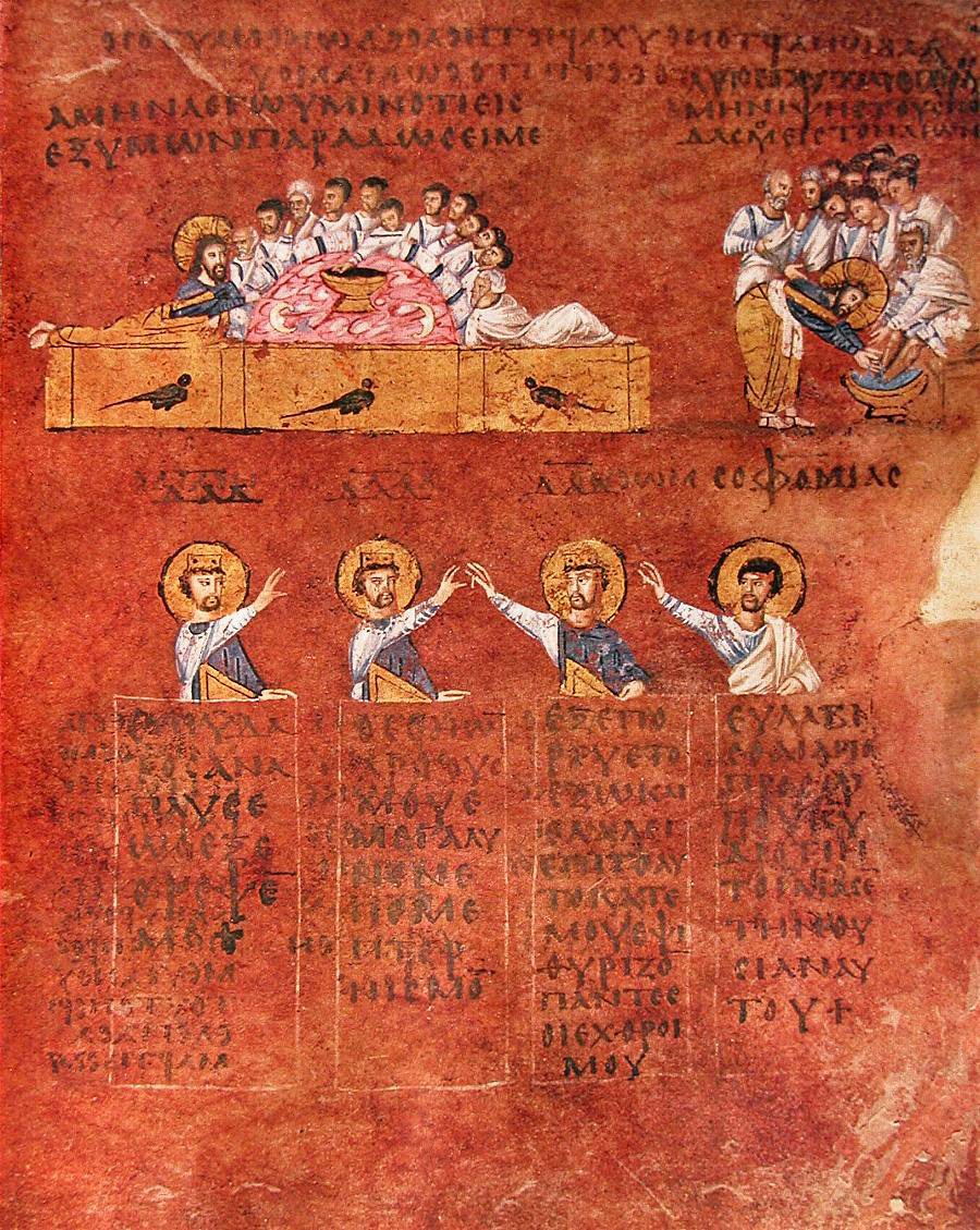
In the Early Christian period the artist often had the task of portraying the four evangelists in gospel books and on the walls of churches. To distinguish them, he coupled each with a different symbol: John’s was an eagle and Matthew’s a man. But he could also identify each through an inscription on the book; the author’s name or the first words of his Gospel were exposed on its open leaves, In the mosaic image of Saint Mark in San Vitale at Ravenna, you read in his book the words SECUNDUM MARCUM— the Gospel according to Saint Mark. The letters are so big that they fill the two pages that are displayed en face to the viewer. But in Matthew’s book the writing is illegible, though only slightly smaller than in Mark’s. The leaves are turned, however, to the author-scribe, who is shown with pen in hand. The large wordlike marks are vertical, horizontal, and diagonal lines in regular alignment, perhaps intended to suggest the appearance of a capital script in a book seen at a distance. They may be explained also as an effort to simulate Hebrew writing— Matthew’s Gospel was believed to have been composed originally in that language. On a nearby wall the prophet Jeremiah holds an extended scroll with illegible marks. But in the image of John .... the words look upside down..

Here are some details - that also remind us just how different photo images of the same piece can be. I also suspect that these detail photos were made after the mosaics were radically restored.


Virgil between two muses, Tunis
Schapiro is identifying three ways that text appears in early Christian art: as legible to the viewer, as legible to the character in the story, or in a strange tongue. In the above example of a 3rd century floor mosaic, in order to read the script, the viewer would have to walk around the piece to a position where Virgil would be upside down.
To make the text legible to the character in the story is called 'naturalism', while making it legible to the viewer is called an "archaic object oriented attitude"
But I don't think the difference is very important, since the viewing experience is ongoing, especially for pieces installed on floors or walls. Once the viewer has taken whatever steps are required to read a text, the results will thereafter be an indelible part of the viewing experience.

St Luke, Stauronikita Monastery
Schapiro notes that the above painting presents some text that is illegible (on the extended scroll) and other text that can be read (as it is written by St. Luke) ... presumably exemplifying his task of compiling various source material into a single comprehensible narrative.
(BTW - doesn't Virgil and his muses, as depicted above, appear to be suffering from a writer's block, especially in comparison to the hyper-active St. Luke on his red cushion?)

Stockholm Codex Aureus, 8th-9th Century (Canterbury)
Here's another example of the letters inverted so that the represented figure (St. Matthew) can read them.
But why is Schapiro continuing to show us these repeated examples?

Reims, Ms. 9, Fol. 23, Biblioteque Nationale, Matthew
How are figure and script unified as a visual pattern? It is not easy to say; different adjustments of the eye come into play when we sight figure and read a text in the same field. One will, of course, see that the little black lines of those letters resemble other small units in the representation of the figure and its surrounding objects; the scale of writing is like that of the ornament and drapery folds and even of the facial features drawn on the same leaf. Are we perhaps rationalizing the coherence of picture and script? The common scale may result from an effort of unification, what of the actual grid, the network of elements?. The letters form a regular matrix that belongs to script, a pattern that we do not find in the other parts, though the frame is rectangular and the rod and furniture sustain that form. At any rate, it is problem for the observer, not for the artist who takes it in stride
At last -- the discussion is getting interesting - though it seems that Schapiro is addressing the above question in a general way -- rather than attending to this specific piece (I can't find a color reproduction - so it seems a bit pointless to discuss its overall visual pattern) Schapiro also tells us whatever problem of 'unification' the observer might have, the artist "takes it in stride" -- while, of course, Schapiro knows nothing about the artist beyond what the artist done in this painting.
Surprisingly, Schapiro does not mention the unevenless and the variant sizes of the lines of text. These are features which have no effect on how the words are read, but are very important to the flow of energy within the design. Imagine how painful the piece would feel if the text were as regularly spaced as a word processing program would produce as it sets up "a regular matrix that belongs to script".

Schapiro then uses a manuscript from the Morgan Library to show how medieval artists related the depiction of hands to the text that the hands were holding. I couldn't find his example online, but above is another example from the same library. The hands of the angels partially obscure the text, but presumably do not render it illegible. (except to me -- I can't recognize the final letters in what I'm assuming to be "LAUDAMUS").

In Schapiro's example, the angel's hand comes between "A" and "VE", allowing for the text to either read as "AVE" or "A VE", both of which would have had meaning in that period.

This red-figure cup painted by the Athenian artist Douris shows how this 'primitive form' of representing text (as readable to the viewer but not the characters in the depicted scene) is neither uniquely Medieval or Christian.
The development is from a stage wherein each object is presented as if beheld from a point of view that preserves its fullness and distinctness, to one in which the position of an artist -spectator, unique and fixed, determines the apparent relationships of all objects to each other and to his point of sight, and entails in his picturing of that field the foreshortening and overlappings that transform the constant shapes of objects adapted to the ordered pattern of the whole

Here's a view of the entire cup - and I'm wondering if the word 'primitive' is really applicable here. A catapult is a 'primative' cannon because it performs the same task as the later device, only not so well. But the paintings on this cup might be said to be performing a task quite different from the illusions painted on walls or panels in other times and places. I don't think that Attic cup is inviting the viewer into its pictorial world, so much as it is functioning as an object in the domestic world of the viewer.

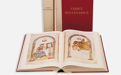
In this depiction of St. Matthew from the Carolingian Codex Millenarius:
the perspective view determines a zigzag outline of the book. Simplified in form, the open leaves are symmetrical , but the lines of writing do not follow the convergence and foreshortening of the edges of the page. The word, as I have said , is indestuctible and invariant, as.. it preserves its form and size despite the perspective transformation of the boundary of the surface that carries the script.
This painting has got some bizarre perspective !
The surface at the top of the reading table has been been made vertical so that it faces the viewer head-on ----- while the edges of the book on that table have been drawn so they recede from the the position of St. Matthew, but not us. While the text in that book is kept within strictly parallel lines. Utterly bizarre! But it's a delightful painting, full of energy and wonder.

Schapiro finds a "foreshortened zigzag pattern" in the representation of a book in the above stucco relief in the Orthodox Baptistery, Ravenna. He says it's in a "naive reductive style" taken from earlier, more naturalistic Classical works.
Perhaps he does not think it was done in a fully developed new style - because it seems a bit awkward -- especially that badly swollen thumb that looks as if it were jammed while playing softball without a mit.

Regarding this scene of 'David playing the harp', a Carolingian miniature,folio-108r from the Stuttgart Psalter, c. 830, Schapiro writes:
The book itself is drawn in an angular view that suggests acquaintance with perspective forms; the sides are shown, as well as the front elevation; but the open book, perched on the front edge of the altar, stands up in a improbable way. Yet it is a carefully considered drawing; we see how well the lines of the book have been fitted to the altar cloth and to the reversed convergence of the top edge of the altar
Schapiro has digressed from the discussion of depicted text to that of depicted books, and seems to be concerned with issues of realism and perspective, without even mentioning the subject and why the artist might have depicted David's performance in this way. The depicted book of psalms seems to be magically floating, while the wide-eyed performer appears to be in a trance.

Returning to the discussion of text in this depiction of St. Augustine in the Royal library in Brussels:
Even where these are drawn more naturalistically... where the left page of the open book is parallel to the picture plane and the much smaller right page is sharply foreshortened, the inscription is written across the two pages as if on one leaf.. It is a clear illustration of that phenomenon of conservation of the script matrix in the picture plane even when attached to an object foreshortened in the third dimension"
Though I wonder whether discussion of perspective is relevant in this depiction of a book, which seems to be more like a pictogram for that object


As Schapiro then shows us, this Carolingian manuscript from about 820 exemplifies the use of lines of script to model the limbs of a figure in something like three dimensions.

And this page from the Goslar Evangeliary of Jerome offering his book to the Pope is an example of text being inverted so that one of the characters being represented can read it. But haven't we seen this done in an earlier example ?

Italian, C. 1320
The above King David from Morgan Library Ms. 643 is offered as an example of script being used to give some volume to the twisting object (the scroll) on which it is written. But still, as Schapiro notes, the script is on a single surface that is not identical with a three-dimensional surface for the roll.
So, I guess he has found an intermediary step, sort of like those fish that climb out of water and walk on their fins. Though the compositional effects of those diagonal script lines, contrasting with the gaze of the eye and the gesture of the hand, seems more important to me than whatever role they play in the evolution of painted text.

Botticelli, Madonna of the Magnificat
In the above painting from the Renaissance, Schapiro notes how the hand obscures parts of the text, and that "the reader can hardly make out the words; instead, he has a more vivid sense of the moment, the ongoing activity of writing, and of the book as an object of weight and volume; the open, inscribed page is a flexible surface in depth distinct from the others around it, yet coordinated with them in the perspective system.
I'm not sure that anything like a "perspective system" has been employed here - since the sizes and dispositions of things do not seem to depend upon a specific P.O.V. in space -- so it's less like looking through a window into an imagined world, and more like images asserting themselves into the world of the viewer.
And the script does not really conform to the undulating surface of the page as it might do in trompe l'oeil paintings, though I agree that it does "contribute to the vivid sense of the moment" -- which, in this case, is that amazing moment when the finger tips of the young nobleman touch the hand of the Madonna.

The script beneath them becomes distorted, and it seems to dance with excitement.
But these are not issues or effects that apparently concern Schapiro, who is more concerned with how script has been incorporated into "the perspective viewpoint governing the picture as a whole"

Shifting attention from the script to its support, Schapiro shows us the above example, where scriptless scrolls are represented in various positions -- all of which contribute to the identification of the central figure as a man of the Word.

Likewise with this example from the 6th C. Rossano Gospel. The scene of the Good Samaritan at the top is related to four Old Testament figures beneath it, each of whom holds a scroll that presents their testimony.
(BTW - the Rossano Gospel is rather interesting, both historically and visually. Here and here are some of my favorites. Also, a great Last Supper, or better yet, here )

This page from the Barberini Exultet exemplifies yet another application of text - where it is upside down relative to the image. When the priest holds this scroll and reads it from the pulpit, the image on the hanging scroll will be right-side up to the congregation facing him.

The represented rolls in this illuminated page from the Goslar Rathaus Matthew gospel serve as "a sign and bearer of dramatic relations in a narrative image". Schapiro notes that the characters being represented in this dialog, Jesus and the Devil, are not in a position to read each other's scroll. (but then, they're not known for paying much heed to each other anyway. "It is the sign for speech recognized as such rather than the internal viewer's reading of the written word that matters"
And I might note, that in one episode, Jesus seems to be using his scroll to clobber the devil on his head.

From another page in the same manuscript, we have this detail of Mary and Elizabeth where "together they carry a single roll that is divided length-wise by a line through the middle; Mary's speech move downward on the left side and Elizabeth's upward on the right.
Except that -- when we look closely at the detail published in this book, only one line of text can be seen. Possibly the wrong reproduction was used?

Engelbert Codex, 1143-1178
(presumably this sheet was used at the beginning of an edition of St.Gregory's Commentary on Job )
The voiced communication is materialized here as a tangible connecting instrument in space. Observe that the roll is bent and pleated; through that fold is produced a recession in depth - the scribe is farther from us. Sitting on a pedestal, his head rises above the level of the saint's, as if seen from a higher viewpoint. Above in a scene of Job and his friends, their conversation is implied in the bare rolls.
I'm doubting that any viewpoint is implied here at all - other than that of the viewers (us) facing the book. But it is fascinating how the blank scroll signifies speech -- between poor, naked Job and his well dressed friends, and between Gregory and the monk/scribe.

King Edgar, from the Tiberius Psalter, later 11th C., Cotton collection, British Library
(note: this piece has nothing to do with Tiberius, except that Sir Cotton kept his books in shelves beneath busts of Roman emperors)
This is a similar example - where a single, shared scroll signifies that the three characters above are talking -- while the monk beneath them seems to be composing their speech on a scroll of his own - which which he appears to be dancing !
A delightful drawing.

In the above Supper at Emmaus, from an English manuscript c. 1200, Schapiro suggests that the crossed, blank rolls in the upper register signify the speech of the two disciples as they agree in their recognition of Christ who has just visited them.


Among these other medieval versions, the one that Schapiro has chosen does seem to be the most exciting and fantastic. It's as if the blank scrolls indicate that the two disciples are left speechless while Christ is shot like an arrow up to heaven. For whatever reason, depictions in later centuries keep Christ earthbound.

In the wonderful Stuttgart psalter (St. Germain, France, 820-830, Schapiro found this folio which depicts a plowman crying out "ara, ara " i.e. "plow, plow" to his ox. in text written just outside the borders of the picture.
(the entire psalter can be found online here )
Though he relates that some scholars believe these words were added by a later hand.
And since no other examples of such text can be found in the entire psalter, I would tend to believe that these words were scrawled in by a bored, mischievous, and rather dim witted monk during the subsequent centuries.

Here are are some other pages from the same book.

Some very compelling illustration.

By the way -- here's a shout out for those libraries that has put these images of historic books online, and treating them like the world legacy that they are, without monetizing them or restricting them to institutional use.

This illumination for Psalm 44 (now called psalm 45) in the 12th C. Albani Psalter attempts to illustrate the phrase" "My tongue is the pen of a scribe who writes swiftly" - as an introduction to a royal wedding song (usually interpreted as messianic)
Schapiro note that the tongue, the instrument of speech,is identified here with the pen. When you speak, you write, as it were, in the air. The authorizing metaphor creates a problem for the artist; how to distinguish the speech act, the invisible writing produced by the tongue, from the writing that the artist appends or inserts as a label for picture or as a passage from the Gospel transmitting an already recorded speech.
Apparently the artist has rather crudely solved this problem by pointing to his outstretched tongue with one hand, while holding a pen with the other.

And here the artist has depicted various kinds of text on the page. In one kind, it is horizontal and used to identify a character. In another, it curves up around the face to represent speech coming from the lips of a character. And in a third, it curves in a direction to represent thought about a fragrant odor entering the nose.
As Schapiro characterizes it "the script has been been oriented with reference to the source, goal, and meaning of a speech act"

Text may even emerge from the mouths of animals, as this bear responds to his trainer's attempt to teach him the alphabet, in this manuscript from Cambridge, Trinity College.
Charming, no ?

Similarly, in this example from a Greek vase, c. 500 BC, "speech was depicted as a visible element of a pictured episode, no less concrete for the viewer than the speakers and the objects of their talk"

Here's how the scene appears without the text -- and the exhortations of " How beautiful?" and "Spring is here" don't seem to be missed at all, at least by me.
(I wish I could have found a photo of the original vase, instead of just this transcription.)
Without the text, the emphasis is more on the relationship of these three characters. In response to the bird, one young man has turned away from his companion and now is facing the naked boy. So I'm not really sure that this scene was originally intended to be primarily about the arrival of birds in Spring.
(this piece was mentioned here by Oliver S. Tonks in a 1913 lecture to public school teachers at the Metropolitan Museum of Art)


Here two facing pages from the Klosterneuburg version of "De Sacramentis" by Hugh of St. Victor --- showing a disputation over an unknown topic, with assertions being issued from the lips of the disputants. The man on the left asserts "It is", the woman to the right "It is not"
A familiar story! - enhanced, as Schapiro notes, by cross symmetry of postures and genders.

No less amusing is this 11th C. scene from San Clemente in Rome, depicting the patrician Sisinnius swearing at his servants to hurry up and carry off the stone pillar that he thinks is the body of St. Clement. "Fili de le pute, traite!" issues from his lips, as the workers give shouts of their own.

It's not too surprising that one of the earliest recorded uses of the Italian language is a man swearing in a Roman church.

This Annunciation from San Miniato, Pisa, features the words of the virgin reading from right to left, i.e. her direction as she faces the angel to her left. (it's not an especially good sculpture, so the artist, Giraldo, is not well known).
Schapiro speculates that the reversal of text might follow the fact that "ave", the first word of the angel's speech, is the inverse of "Eve", the first woman, whose sin will soon be undone by the Virgin giving birth to the savior.

And then we have the Annunciation from the Ghent altarpiece, where Van Eyck has the words of the Virgin running right to left and upside down (since they are addressed to God above )

Here's the other Van Eyck Annunciation where the same thing happens.
I realize that the topic here is text within the picture frame -- but these details, like all details from this artist, are so beautiful it's difficult to think about anything else.
But I might note that the Ghent Mary appears a bit more helpless, immature, and less elegant than the Mary in the National Gallery, and the text at Ghent is larger and more ornate, while the line of text in the National Gallery feels more sweet, lilting, and musical.
Finally, Schapiro concludes this survey as follows:
What I have presented so far is characteristically medieval. It marks an art in which the bond with language determines some pictorial features; painting, then is like language in its sequential narrative order, its literalness, and its submission to symbolism. Founded on texts, the image admits the written word as a concrete component free to rotate in the two dimensions of the picture plane.
I feel like I've been listening to the slick car salesman who shows me one thing, and then wants me to sign up for something else.
How has he even begun to show that "painting is like language in its sequential narrative order" ?
Is that the conclusion we must make just because a piece of sequentially-read text has been placed within the picture frame? Has that text, as large or small as it may be, fundamentally transformed the entire picture into something sequential, literal, and symbolic ?
And though sometimes we may feel that the image has allowed the written word to freely rotate in the picture plane (as when the script runs upside down, backwards, or at various curves or angles) -- at other times, the written word seems to strictly follow the conventions it would follow if it were unaccompanied by other images. And why must we assume that since all of the above artworks are called 'Medieval', they therefore must share some specific characteristics regarding the texts within them?
I'm just not buying it --- though his claims may be more understandable after he discusses art from more recent times.
********************************************************************* ********************************************************************* *********************************************************************

Leaving behind the Middle Ages, we now take a look at a post-Renaissance artist who:
could break through the constraints of the eusynoptic ideal within the framework of a most refined and searching painterly style.
It's too bad 'eusynoptic' has not caught on enough to make it into an internet dictionary. 'Happily-seen-together' is a nice phrase to apply in the discussion of paintings - though it might refer to a medieval manuscript as well as a Renaissance painting.
In the above depiction of himself with his physician, Schapiro notes that the artist has written a dedication to that physician, Dr. Arrieta, upon a background of the same tawny tone as the skin of his hands and face "in subtle accord with the red and green tones of the portrait".
But on the other hand:
The inscription does not belong to the space of the realistically pictured scene or to the frame. To read it we must shift our attention to what is visually of another order than the absorbing image above. Because of the poignant occasion, Goya was willing to inject a distracting and artistically incongruous element addressed to the viewer in order to explain and record forever that deeply disturbing climatic experience.
I'll have to look at the actual painting the next time I'm in Minneapolis, but just based on the reproductions, I'd have to agree with Schapiro. The inscription does not belong with either the painting or its frame - it's an anomaly.

BTW - here it's been adapted into another, text-filled setting -- and it seems to make a better fit.

Then there's this 1797 portrait of the recently widowed Duchess of Alba, pointing to the words "Solo Goya" that have been scrawled in the dust at her feet, upside down so that the image of her might read it - though we would assume that the artist would like the lady herself to read it when the painting was shown to her.
Schapiro says "the two words are an avowal addressed to the woman as both subject and ultimate viewer of the painting - a doubling and interlacing of the objective and the subjective, fascinating to the imagination.
Or -- at least fascinating to those who are philosophically inclined - though every commissioned portrait has that same interlacing, doesn't it ?


There have been several centuries of speculation concerning the nature of the relationship between the duchess and the painter -- but I'd have to say the lady should have been highly offended if he showed this to her and they were not lovers.
Words of text have, of course, occurred in many paintings after 1400. What's mostly unusual about these two is that they are so personal -- apparently directed at an audience of only one person -- and even then --- only in the context of how that person relates to the artist.
As Schapiro then speculates:
Before these two painting we may ask whether the requirement of a strictly unified, homogenous visual language is inherent or necessary in art. Is it not an ideal arising in a certain style of objectivity, with a particular norm of truth to nature and visual perception in art of the 16th to 18th century ? Yet even that inscription in the portrait of the duchess of Alba may be viewed as a realistic trompe l'oeil effect, a consistent rendering of a material reality, a verbal message imprinted on the soft soil of the ground in a perspective coherent with the rest of the image. It belongs to the simulated reality of its pictured three-dimensional space rather than to the canvas surface, like an ordinary signature. At the same time, it signifies the active presence of the artist in that space as both a speaking self and an operating hand.
I'm not sure how often Schapiro and I, or anyone else, would agree concerning the presence or absence of "a strictly unified, homogenous visual language" - or whether that's an especially positive attribute. But since Schapiro feels that the script in the sand does not defy the visual language of this painting, why would it be an issue raised by this painting ?

Similarly, here's an example of a depicted character writing letters in the sand, from the Codex Egberti, Christ and the woman taken in adultery. According to the Gospel of John, irate citizens brought an adulterous woman to him for judgment -- and Christ's response was to write something in the sand. Subsequent commentary has suggested that he wrote "Terra terram accusat"... or "earth accuses earth" ... and the woman was left alone by her accusers.
Schapiro proceeds to offer his own interpretation of this episode -- of Christ laying down the law of forgiveness --- though I don't see how this advances his discussion of text in paintings.
In the scene as depicted above, it looks like the accusers cannot see the letters on the ground, though they have already decided to slip away. It's as if they can feel his judgment upon them (as being no better than her)

In Manet's portrait of his friend, the art critic Theodore Duret, the artist's signature is also scrawled in the sand so that it's right-side-up to the character in the painting rather than the viewer.
Schapiro relates that one commentator has suggested that the inverted signature suggests that this art critic has not always been favorable to the artist. While he suggests that the Latin meaning of 'manet' is equivalent to that of 'durer', thus supposedly linking these two artists. But I assume he's just being playful.


More recently, text also often appears in Cubist paintings and drawings. Schapiro describes it as follows:
The still-life objects that became the main themes of Cubist representation -- are marked by discontinuous and intersecting lines, straight and curved, like the a1phabetic forms in the musical notation. These, too, are generally fragments, often only part of a word is presented, but enough to incite the viewer to complete the whole, as in "Jour". They are artificial signs, instruments of communication, as the still-life objects are instruments of music and conviviality. At the same time, while seeking an austerely constructed order and engaging the viewer in contemplation of multiplied and ever shifting relations strokes and marks, lines and tones, often ambiguous or paradoxical when viewed as objects of representation----- In the Cubist painting the material reality of the written and printed words is allied to the no less marked concreteness of the strokes and touches that make up the painting, its lines, and its surface planes. It is not the represented objects but the material signs of the painters ordered operations on the field of the canvas that claim our attention and make for the interest of the whole. Script, printed matter, marks, strokes, lines, flecks, are visible alike, and if they have a common matrix in the glasses, bottles, pipes, books, playing cards, musical instruments, and newspapers that are discernible in the work - all these may be taken as metaphors of the artistic intention and outlook. They are things from the quotidian reality, objects of manipulation without a fixed place or position, though static; they owe their existence and position to momentary and randomly placed, yet habitual, choices and manipulation by the individual, and they serve his senses.
He notes that the text is not presented to an interior reader, and that often the viewer must twist his head to read the words; but does not address the question of how the words relate to the piece other than as marks within the composition. So he does not note, for example, that the 1912 newspaper clipping in the above drawing discusses impending war, and how that contributes to the overall effect of the piece.
Indeed, he does not discuss that overall effect or mood of the piece at all, which, like the objects being represented, seem trumped, for him, by "the material signs of the painters ordered operations on the field of the canvas". As if there were no purpose to that ordering other than to signify itself.

While the Cubists justify movement,the deviation from the strict vertical and horizontal by the resulting coherence with the irregular segment of newsprint (or other object) to which the letters are attached, the words retaining their constraint by the orthogonals of a matrix as the whole is rotated, other artists of the time take pleasure in isolating and scrambling the elements of a word, a phrase,or a sentence from each other, and varying the axis of each (and often its size)
Once again, Schapiro does not discuss how the use of text develops the overall effect of the piece, but suggests that the word forms have been manipulated only for the artist's pleasure in doing so.
And yet this artist, Marinetti (b. 1876) was more of a journalist and poet, and seems to been dedicated to his Futurish/Fascist ideology rather than the pleasures of graphic designing.

Perhaps El Lizzitsky (b. 1890) would have been a better example, since he was more dedicated to a visual art practice -- but even then, he was also committed to making ideological propaganda.
Schapiro also does not discuss the impact of the directional property of text -- how in these European languages, it reads left-to-right, creating a dynamic to which the rest of the page must (and does) respond.
Though finally, he does allow that the Marinetti pieces are not just signs of an artist taking pleasure in graphic manipulation:
The Futurists' practice is allusive in both the form and meaning of the scattered words, which are often designed to shake up the reader. Together these words celebrate with explosive energy the freedom, spontaneous movement, and noisy clamor of the contemporary metropolis, a feature of an advancing modernity.

While, in contrast, "something of the sacredness of the word in medieval art returns" in the above painting. It's hard to tell in this reproduction, but in the background to the left are the iconic names from European art history: Cezanne, Tintoretto, Courbet, Fouquet, Giotto, Breughel, Rembrandt --- rendered in different alphabets and consequently in different directions.
Chagall departs from the Cubist practice of Picasso and Braque, for whom the reading matter in a painting belongs to the same intimate sphere of the vernacular, everyday, artificial, and quotidian as the still life objects among which they are embedded and to which they are related by their recurrent elementary forms.
This image is a bit puzzling, isn't it ?
Wouldn't you except to see such a old, traditional looking guy accompanied by names from the Torah or Talmud ?

As he is in this painting, done in the same year. The text behind him is the Hebrew text from Genesis, relating to Abraham setting off on his journeys.. Though, in this painting, the text seems less like an emergent revelation, and more like just one more detail about the guy's uncomfortable life - like the steep pitched roofs behind him.
This painting is discussed at length here ), and though many other paintings by Chagall and others are mentioned, the Jew with the artist names is not.

Here's another painting on the same theme, with Hebrew text included, done a year earlier. This guy looks rather ill, doesn't he ?
The artist's personal identity is the subject of these three paintings, isn't it?
The Jew (in him) only feels healthy and vibrant when the iconic names of European art history are his sacred text.
Which is probably how Schapiro felt about his Jewish identity as well.

Joseph Kosuth, "Untitled Mistake (Discussed) #2, 1990


Joseph Kosuth, "Art as idea as idea"
In more recent decades, script has spread over the entire surface as a message of what is called conceptual art. Penned ideas about art have replaced the preceding painted colors and drawn or constructed forms. The polarity of the written sign and the image construction has been resolved by the restriction to a writtten discourse as an object of art in itself.
A rather abrupt way to end his essays. Schapiro makes no further comment on this recent development in the modern artworld.
Though I would query whether there is any reason to include this item in a discussion of art, other than for the record of its sale at auction.

Our culture produces an enormous quantity of words and pictures, why is the page clipped from a dictionary any more worthy of attention than the above side of a freight train, recorded just yesterday as I was standing at a station.
And here's a quote taken from the final page of Robert Beverly Hale's "Drawing Lessons from the Great Masters" : "And finally remember that you are forsaking the world of words and entering the world of visions. The best of luck to you all!"
