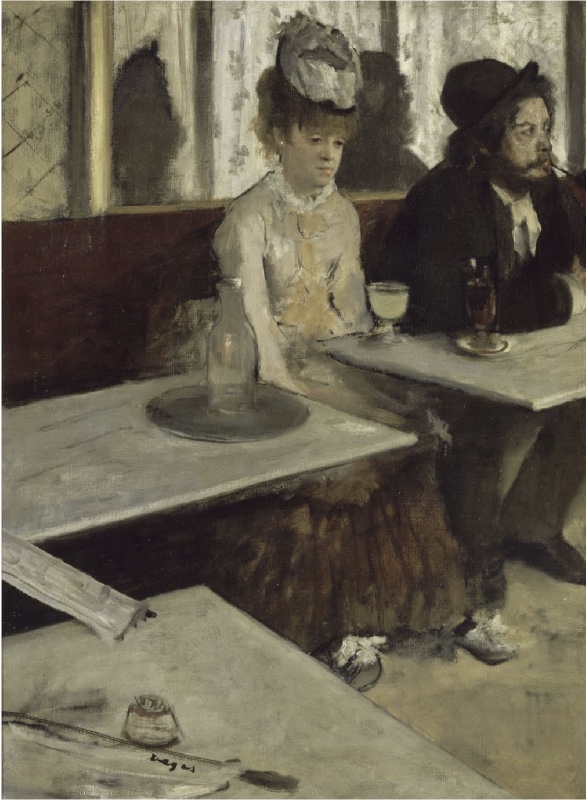
Degas, Dans un Cafe, 1875-6
This enigmatic and now famous painting, was originally bought in 1876 by the British collector, Henry Hull. It ascended to infamy when it appeared in the Grafton Gallery’s inaugural London exhibitions in 1893 - becoming the center of what might be called a culture war. The old guard of the Academy was offended by its subject matter and/or appalled by its rough, sketchy brush work. The avant-garde of Modernism appreciated the edgy realism and pictorial power.
Manet’s Bar at the Folies Bergere, done five years later, also depicted a modern public, urban facility into which was front-and-centered an attractive young woman who may or may not be a prostitute. It was also somewhat scandalous, controversial, and open to conflicting interpretations,
as discussed here .
Most of the quotes presented below were found in
this essay by Kimberley Morse Jones
Frank Holl, portrait of Henry Hull
I can't remember ever seeing the actual piece in the Musee D'Orsay, but I've certainly become familiar with the reproductions over the last fifty years - and have never forgotten its firm admonition: "Don't drink absinthe, it will rot your brain!"
But was the painting originally intended to deliver that message?
It was first called "In a Cafe"
and the two people depicted were local artsy folk
who hung out in the same cafe where Degas often did.
By the way - here’s how the painting looks without the green glass.
For me, the design does not appear to be missing it,
and now it might well depict travelers at a station cafeteria
waiting for the next train.
except that:
The design does seem to be centered on the contemplation of that unaccompanied woman.
Her isolation is emphasized by her close proximity to a man
who pays absolutely no attention to her.
(my friend Tor cynically suggested that they were an old married couple) .
The vertical center line of her body coincides with the vertical center line of the painting itself.
This image is about her - and she's kind of lost / dazed / bewildered
especially in contrast to the dynamic fellow to her right.
Perhaps she just lost her job or broke up with her boyfriend.
So it might be called a psychological study
enhanced by the feeling that you, the viewer,
are seated at an adjoining table in that public space.
This contrasts with the more theatrical setting
favored by the French Academy.
Here there is no sense of actors on a stage facing an audience.
It’s more like the intimate feeling created in Ukiyo-e.
Utamaro
This genre, then quite fashionable in Paris,
also depicts attractive, available young women
and works more with contour line than with the illusion of volume
Utamaro
And it uses strong, straight, diagonal edges
to dramatically dig into pictorial space
The Japanese tradition elevates timeless elegance
while still creating immediacy -
like shadows on a sunny day,
this is a passing moment.
L’Absinthe is a bit more confrontational than an Impressionist landscape.
Wouldn’t you rather imagine yourself among poppy specked fields
rather than in a cheap cafe across the table from two strange strangers ?
It’s also more confrontational than both of the Japanese prints shown above.
They invite you into the personal space of young, attractive women
which is where every male visitor to Tokyo’s pleasure district would like to be.
Degas has conflated that Asian male fantasy
with gritty French Realism.
Don Colley
But the Degas piece is still more peaceful than this cafe scene
drawn mostly on-site by a 21st Century Chicago master.
No pretty girls here - just the kind of people you’re likely to find seated in any diner.
Edward Hopper, Nighthawks (detail), 1942
Here’s yet another cafe scene.
The girl is pretty - but cold, closed, and inaccessible.
The whole space feels that way.
Degas, Women on the Cafe Terrace, 1877
Here’s a piece Degas made one year after L’Absinthe.
Everyone seems to agree these are sex workers waiting to get picked up.
They’re not especially attractive or introspective.
If you wish to strike up a conversation- they would probably have little interesting to say - and be prepared to pay for it anyway.
Much closer to social realism than L’Absinthe
And much closer to sociology than to aesthetics.
L’Absinthe is more appealing to me because it’s more enigmatic
and I’d prefer to hang out in a bohemian cafe than in a red light district.
It seems to incite the mystery of just being alive.
And as George Moore will later explain,
it is more formally dynamic
than the storytelling paintings of the Academy.
Even if Degas intended it to warn us about absinthe,
that’s not why this painting is worth viewing
over and over and over again.
Now, L’Absinthe is a literary performance. It is not a painting at all. It is a novelette - a treatise against drink. Everything valuable about it could have been done, and has been done, by Zola. It would be ridiculous not to recognize M. Degas is a very clever man , but curiously his cleverness is literary far more than pictorial. -- William Blake Richmond
William Blake Richmond, Self portrait with Felt Hat
It's tempting to digress into this artist/critic’s career. His father named him after the great visionary poet/artist who inspired his group of companion artists who called themselves "the Ancients".
It's ironic that Richmond would scold Degas for being more literary than pictorial since that is what I would say about him and his namesake. His ideas have more life than his forms.
But L'Absinthe, by Degas, is the inexhaustible picture, the one that draws you back and back again. It sets the standard by which too many of the would-be "decorative inventions" in the exhibition are cruelly judged... M. Degas understands his people absolutely; there is no false note of an imposed and blundering sentiment, but exactly as a man with a just eye and comprehending mind and power of speech could set up that scene for us in the fit words, whose mysterious relations of idea should affect us as beauty, so does this master of character, of form, of colour, watch till the cafe table-tops and the mirror and the water-bottle and the drinks and the features yield up to him their mysterious affecting note. The subject, if you like, was repulsive as you would have seen it, before Degas made it his. If it appears so still, you may make up vour mind that the confusion and affliction from which you suffer are incurable.....Dugald MacColl
If MacColl exemplifies the "new critics" of London in the 1890’s, sign me up! L’Absinthe is indeed both sharp character study and painterly painting. And "inexhaustible " is the same word I would choose for what distinguishes art from illustration.
For what is the New Art Criticism? It is simply the attempt to apply to current art the same standards which we apply to ancient art, to disengage from the enormous stream of picture-producers the one or two contemporary masters who are worthy to be named beside the ancients, the one or two promising talents that may some day deserve the same praise ; to refuse steadfastly to confound the very good with the pretty bad, and to take mediocrity at its own estimate.... Dugald MacColl, 1893
Today’s artworld is quite distant from the notion that the ancients set standards by which the contemporary can and should be judged. In the late 20th Century that notion was replaced by the institutional definition of art : art is whatever is shown in an art museum.
Donald MacLaren, Portrait of Dugal Maccoll, 1905
Here a man and a woman are seated at a table in a cafe.
The man is lounging over the table, smoking a pipe, with a glass of absinthe before him,
while the woman that chance has placed next to him is staring straight before her with dull eyes in vacant thought.
The foreshadowed view of the tables, and the prominent shadows of the two, projected upon the clear depths of the
window behind, contribute to complete the effect of the whole. This composition is one of the most rigorous that
the artist has accomplished, and, as a study of contemporary manners, these two people form a perfect epitome of
a class of shady individuals who spend their lives in the cafes of Paris, trifling away their days... .......Theordore Duret
I haven’t read Duret’s book about the Impressionists - and now perhaps I won’t. He’s sloppy - the green glass is in front of the woman not the man; many Degas compositions feel no less rigorous; and the characters portrayed here need not be "shady".
Manet, Portrait of Duret, 1868 (detail)
This masterpiece of painting as of a characterization. The brutal types are seized and relished with profound
impartiality. In this strange picture there is nothing of the commonness in life. The severity of treatment,
the exclusion of all save the essential elements, the ordered composition,
the simplicity of the color, lift it far out of the region of squalor and misery, which was its motive... Charles Whibley
I like his use of the word "severity" - but not "squalor" or "brutal types" (though he might also say that I am also a brutal type who lives in squalor. The Nouvelles Athenes, the site for this painting was a hangout for artsy Bohemians, not the bourgeoise. He was somewhat higher on the social register)
Powys Evans, portrait of Charles Whibley, 1929
Regretfully, Morse-Jones did not share any long quotes from the morally conservative press that would soon be inspired by Max Nordau’s "Degeneration" (1892). How ironic that the notion of "entartete kunst" would be introduced into modern Germany by the Zionist son of a rabbi.
Edouard Manet, George Moore in the Artist’s Garden, 1879
We do, however, have an extensive essay by George Moore (1852-1933). It's near the end of "Modern Painting" (1893), a book of his which can be read online. Coming from the Anglo-Irish landed gentry, Moore went to Paris in his twenties to study painting. He began with the academic ateliers, and eventually turned to Manet and Degas for inspiration. Eventually, he abandoned a career as a painter and pursued one as a novelist. He wrote art criticism for English journals in the 1890's.
At first he wrote that L’Absinthe was a moral admonition:
"Look at the head of the old Bohemian the engraver Deboutin -a man whom I
have known all my life, and yet he never really existed for me until I
saw this picture. There is the hat I have always known, on the back of
his head as I have always seen it, and the wooden pipe is held tight in
his teeth as I have always seen him hold it. How large, how profound,
how simple the drawing! How easily and how naturally he lives in the
pose, the body bent forward, the elbows on the table! Fine as the
Orchardson undoubtedly is, it seems fatigued and explanatory by the side
of this wonderful rendering of life; thin and restless like Dumas fils'
dialogue when we compare it with Ibsen's.
Willam Quiller Orchardson, The First Cloud, 1887
This may not have been the Orchardson piece to which Moore refers, but presumably it is similar, and makes for a strong contrast with L'Absinthe.
It resembles a screen shot from an episode of "The Crown" -- i.e. high drama in high society under high ceilings- and it is so well done -- so convincing - so humorous in an understated way. Such a delicious anxiety permeates every quivering brush stroke in every object, from the figures to the cut flowers. It's a wonderful confrontation between the masculine with the feminine - and you already know who will win.
L'Absinthe presents a man and a woman as well -- but they don't appear to even know each other. They each live in their own worlds - and unlike the Orchardson, they're not up on a stage - they're sitting down in a cafe, across some tables from the viewer.
The Orchardson is mostly about drama - the Degas is mostly about painting. So we might say the one is a great illustrator - the other a great painter. I've got to agree with Moore, the Orchardson does "seem fatigued and explanatory by the side
of this wonderful rendering of life". It is inexhaustible.
The woman that sits beside
the artist was at the Elysée Montmartre until two in the morning, then
she went to the ratmort and had a soupe aux choux; she lives in the Rue
Fontaine, or perhaps the Rue Breda; she did not get up till half-past
eleven; then she tied a few soiled petticoats round her, slipped on that
peignoir, thrust her feet into those loose morning shoes, and came down
to the cafe to have an absinthe before breakfast. Heavens! what a slut!
A life of idleness and low vice is upon her face; we read there her
whole life.
The tale is not a pleasant one, but it is a lesson. Hogarth's view was
larger, wider, but not so incisive, so deep, or so intense. Then how
loose and general Hogarth's composition would seem compared to this
marvellous epitome, this essence of things! That open space in front of
the table, into which the skirt and the lean legs of the man come so
well- how well the point of view was selected! The beautiful, dissonant
rhythm of that composition is like a page of Wagner-
the figures crushed into the right of the canvas, the left filled up
with a fragment of marble table running in sharp perspective into the
fore-ground. The newspaper lies as it would lie across the space between
the tables. The colour, almost a monochrome, is very beautiful, a deep,
rich harmony. More marvellous work the world never saw, and will never
see again: a maze of assimilated influences, strangely assimilated, and
eluding definition-remembrances of Watteau and the Dutch painters, a
good deal of Ingres' spirit, and, in the vigor of the arabesque, we may
perhaps trace the influence of Poussin. But these influences float
evanescent on the canvas, and the reading is difficult and
contradictory.'
Then he backpedaled:
I have written many a negligent phrase, many a stupid phrase, but the
italicised phrase is the first hypocritical phrase I ever wrote. I
plead guilty to the grave offense of having suggested that a work of art
is more than a work of art. The picture is only a work of art, and
therefore void of all ethical signification. In writing the abominable
phrase "but it is a lesson" I admitted as a truth the ridiculous
contention that a work of art may influence a man's moral conduct; I
admitted as a truth the grotesque contention that to read Mademoiselle de
Maupin may cause a man to desert his wife, whereas to read Paradise Lost
may induce him to return to her. In the abominable phrase which I plead
guilty to having written, I admitted the monstrous contention that our
virtues and our vices originate not in our inherited natures, but are
found in the books we read and the pictures we look upon. That art
should be pure is quite another matter, and the necessity of purity in
art can be maintained for other than ethical reasons.
Moore’s initial claim about L’Absinthe being "a lesson" is believable if we don't need Degas to have ever intended it as such.
Moore's later denial that never "a work of art is more than a work of art" has many counter-examples — beginning with stuff made for churches, shrines, temples, palaces, and a variety of other public buildings. Even some weather-vanes has been called "art" despite their quotidian function.
Art I am speaking
now of literature, owes a great deal to ethics, but ethics owes nothing
to art. Without morality the art of the novelist and the dramatist would
cease. So we are more deeply interested in the preservation of public
morality than any other class the clergy, of course, excepted. To accuse
us of indifference in this matter is absurd. We must do our best to
keep up a high standard of public morality; our living depends upon it
and it would be difficult to suggest a more powerful reason for our
advocacy. Nevertheless, by a curious irony of fate we must preserve at
least, in our books- a distinctly impartial attitude on the very subject
which most nearly concerns our pockets.
An interesting twist on the connection between art and morality. It is an understandable reaction to the politicized art of the French Academy as founded on behalf of Louis XIV and still ruling the Paris where Moore studied. It is also encouraging to read those words in today’s artworld that is so attached to social justice. But the orderliness of art can indeed be seen, in a more general way, as promulgating harmony in human society. That’s a Confucian idea that may be too open ended for the European tradition of didacticism.
To remove these serious disabilities should be our serious aim. It might
be possible to enter into some arrangement with the bishops to allow us
access to the pulpits. Mr. So-and so's episcopal style I refer not only
to this gentleman's writings, but also to his style of figure, which,
on account of the opportunities it offers for a display of calf, could
not fail to win their lordships' admiration marks him as the proper head
and spokesman of the deputation; and his well-known sympathies for the
pecuniary interests of authors would enable him to explain that not
even their lordships' pockets were so gravely concerned in the
maintenance of public morality as our own. I have allowed my pen to wander somewhat from the subject in hand; for
before permitting myself to apologise for having hypocritically declared
a great picture to be what it was not, and could not be "a lesson"-it
was clearly incumbent on me to show that the moral question was the
backbone of the art which I practise myself, and that of all classes
none are so necessarily moral as novelists. I think I have done this
beyond possibility of disproof, or even of argument, and may therefore
be allowed to lament my hypocrisy with as many tears and groans as I
deem sufficient for the due expiation of my sin. Confession eases the
heart. Listen.
I assume his confidence here is intended to be playfully humorous. It’s one thing to say that a great picture offers no "lesson" for him —- and quite another thing to say that it "could not" offer some kind of lesson to others.
My description of Degas' picture seemed to me a little
unconventional, and to soothe the reader who is shocked by everything
that lies outside his habitual thought, and to dodge the reader who is
always on the watch to introduce a discussion on that sterile subject,
"morality in art", to make things pleasant for everybody, to tickle the
Philistine in his tenderest spot, I told a little lie: I suggested that
some one had preached. I ought to have known human nature better- what
one dog does another dog will do, and straight away preaching began-Zola
and the drink question from Mr. Richmond, sociology from Mr. Crane.
But the picture is merely a work of art, and has nothing to do with
drink or sociology; and its title is not L' Absinthe, nor even Un Homme
et une Femme assis dans un Cafe, as Mr. Walter Sickert suggests, but
simply Au Cafe.
The piece was originally presented to the public as "Au Cafe", but Degas himself is not quoted one way or the other.
Mr.
Walter Crane writes: "Here is a study of human degradation, male and
female." Perhaps Mr. Walter Crane will feel inclined to apologise for
his language when he learns that the man who sits tranquilly smoking his
pipe is a portrait of the engraver Deboutin, a man of great talent and
at least Mr. Walter Crane's equal as a writer and as a designer. True
that M. Deboutin does
Modern Painting
not dress as well as Mr. Walter Crane, but there are many young men in
Pall Mall who would consider Mr. Crane's velvet coat, red necktie, and
soft felt hat quite intolerable, yet they would hardly be justified in
speaking of a portrait of Mr. Walter Crane as a study of human
degradation. Let me assure Mr.
Walter Crane that when he speaks of M. Deboutin's life as being
degraded, he is speaking on a subject of which he knows nothing. M.
Deboutin has lived a very noble life, in no way inferior to Mr. Crane's;
his life has been entirely devoted to art and literature; his etchings
have been for many years the admiration of artistic Paris, and he has
had a play in verse performed at the Théâtre Français.
The picture represents M. Deboutin in the cafe of the Nouvelle Athènes
He has come down from his studio for breakfast, and he will return to
his dry-points when he has finished his pipe. I have known M. Deboutin a
great number of years, and a more sober man does not exist; and Mr.
Crane's accusations of drunkenness might as well be made against Mr.
Bernard Shaw.
When, hypocritically, I said the picture was a lesson, I referred to the
woman, who happens to be sitting next to M. Deboutin. Mr. Crane, Mr.
Richmond, and others have jumped to the conclusion that M. Deboutin has
come to the cafe with the woman, and that they are "boozing" together.
Nothing can be farther from the truth. Deboutin always came to the café
alone, as did Manet, Degas, Duranty. Deboutin is thinking of his
dry-points; the woman is incapable of thought. If questioned about her
life she would probably answer, "je suis à la coule". But there is no
implication of drunkenness in the phrase. In England this class of woman
is constantly drunk, in France hardly ever; and the woman Degas has
painted is typical of her class, and she wears the habitual expression
of her class. And the interest of the subject, from Degas' point of
view, lies in this strange contrast the man thinking of his dry-points,
the woman thinking, as the phrase goes, of nothing at all. Au Cafe-_that
is the title of the picture. How simple, how significant! And how the
picture gains in meaning when the web of false melodrama that a couple
of industrious spiders have woven about it is brushed aside!
Just because the men modeling for David’s "Oath of the Horatii" were not Roman warriors, that doesn’t not mean that they should not be considered as such in that painting.
Again, Moore is just entertaining casual readers with playful chatter.
I now turn to the more interesting, and what I think will prove the more
instructive, part of my task- the analysis of the art criticism of Mr.
Richmond and Mr. Crane.
Mr. Richmond says "it is not painting at all". We must understand
therefore that the picture is void of all accomplishment composition,
drawing, and handling. We will take Mr. Richmond's objections in their
order. The subject-matter out of which the artist extracted his
composition was a man and woman seated in a cafe furnished with marble
tables. The first difficulty the artist had to overcome was the symmetry
of the lines of the tables. Not only are they exceedingly ugly from all
ordinary points of view, but they cut the figures in two. The simplest
way out of the difficulty would be to place one figure on one side of a
table, the other on the other side, and this composition might be
balanced by a waiter seen in the distance. That would be an ordinary
arrangement of the subject. But the ingenuity with which Degas selects
his point of view is without parallel in the whole history of art. And
this picture is an excellent example. One line of tables runs up the
picture from left to right, another line of tables, indicated by three
parts of one table, strikes right across the foreground. The triangle
thus formed is filled by the woman's dress, which is darker than the
floor and lighter than the leather bench on which both figures are
seated.
Moore attributes the success of this composition to its geometric arrangement - but does not characterize that accomplishment. Apparently we just have to accept that there is something special about triangles.
I would prefer to talk about how the foreground affects what we feel about the people seated behind it but according to Moore, subject matter is not relevant.
Looking still more closely into the composition, we find that it
is made of several perspectives, the dark perspective of the bench, the
light perspective of the partition behind, on which the light falls,
and the rapid perspective of the marble table in the fore-ground. The
man is high up on the right-hand corner, the woman is in the middle of
the picture, and Degas has been careful to place her in front of the
opening between the tables, for by so doing he was able to carry his
half-tint right through the picture. The empty space on the left, so
characteristic of Degas's compositions, admirably balances the
composition, and it is only relieved by the stone matchbox, and the
newspaper thrown across the opening between the tables. Everywhere a
perspective, and these are combined with such strange art that the
result is synthetic. A beautiful dissonant rhythm, always symphonic
coulant longours de source; an exasperated vehemence and a continual
desire of novelty penetrated and informed by a severely classical spirit
that is my reading of this composition.
I’m surprised that the odd perspectives of Japanese woodcuts are not mentioned. Perhaps that is what he is calling the "continued desire for novelty".
"The qualities admired by this new school are certainly the mirrors of
that side of the nineteenth-century development most opposed to fine
painting,
Modern Painting
or, say, fine craftsmanship. Hurry, rush, fashion, are the enemies of
toil, patience, and seclusion, without which no great works are
produced. Hence the admiration for an art fully answering to a demand.
No doubt impressionism is an expression in painting of the deplorable
side of modern life." ( Moore quoting WB Richmond )
After "forty years of the study of the best art of various schools that
the galleries of Europe display", Mr. Richmond mistakes Degas for an
impressionist (I use the word in its accepted sense); he follows the
lead of the ordinary art critic who includes Degas among the
impressionists because Degas paints dancing lessons, and because he has
once or twice exhibited with Monet and his followers. The best way
possibly the only way to obtain any notion of the depth of the abyss on
which we stand will be by a plain statement of the facts.
When Ingres fell down in the fit from which he never recovered, it was
Degas who carried him out of his studio. Degas had then been working
with Ingres only a few months, but that brief while convinced Ingres of
his pupil's genius, and it is known that he believed that it would be
Degas who would carry on the classical tradition of which he was a great
exponent. Degas has done this, not as Flandrin tried to, by reproducing
the externality of the master's work, but as only a man of genius
could, by the application of the method to new material.
Hippolyte Flandrin, Shepherd, 1834
Flandrin, portrait of a Lady, 1860
It appears that Flandrin worked with "new material" as well - or at least his homoeroticism cannot be found in Ingres. The warmth and compassion in that above portrait is distant from Ingres as well.
Degas's early
pictures, "The Spartan Youths" and
"Semiramis building the Walls of Babylon". are pure Ingres. To this day
Degas might be very fairly described as un petit Ingres. Do we not find
Ingres' penetrating and intense line in the thin straining limbs of
Degas's ballet-girls, in the heavy shoulders of his laundresses bent
over the ironing table, and in the coarse forms of his housewives who
sponge themselves in tin baths? The vulgar, who see nothing of a work of
art but its external side, will find it difficult to understand that
the art of "La Source" and of Degas's cumbersome housewives is the same.
To the vulgar, Bouguereau and not Degas is the interpreter of the
classical tradition.
Ingres, The Source, 1820-1856
Flandrin , Young Man Sitting Near the Sea, 1835
Is the stubby little pin-up girl by Ingres really a better painting than the pin-up boy by Flandrin ? I'm surprised that Moore chose it as exemplary.
Ingres, Le Grande Odalisque, 1814
The grandeur of this Ingres, however, might make make a better comparison. It feels like an arrow about to be shot from a bow.
Degas, Young Spartans Exercising, 1860
I can't think of anything by Ingres with this much spacious power and action.
"Hurry, rush, fashion, are the enemies of toil, patience, and seclusion,
without which no great works are produced." ( Richmond)
For the sake of his beloved drawing Degas has for many years locked
himself into his studio from early morning till late at night, refusing
to open even to his most intimate friends. Coming across him one morning
in a small cafe, where he went at midday to eat a cutlet, I said, "My
dear friend, I haven't seen you for years; when may I come?" The answer I
received was:
"You're an old friend, and if you'll make an appointment I'll see you.
But I may as well tell you that for the last two years no one has been
in my stu-dio." On the whole it is perhaps as well that I declined to
make an appointment, for another old friend who went, and who stayed a
little longer than he was expected to stay, was thrown down the
staircase. And that staircase is spiral, as steep as any ladder. Until
he succeeded in realising his art Degas's tongue was the terror of
artistic Paris; his solitary days, the strain on the nerves that the
invention and composition of his art, so entirely new and original,
entailed, wrecked his temper, and there were moments when his friends
began to dread the end that his striving might bring about. But with the
realisation of his artistic ideal his real nature returned, and he is
now full of kind words for the feeble, and full of indulgence for the
slightest artistic effort.
The story of these terrible years of striving is written plainly enough
on every canvas signed by Degas; yet Mr. Richmond imagines him skipping
about airily from cafe to cafe, dashing off little impressions.
Some interesting first person anecdotes. Perhaps they’re even true.
They do make the point that a successful quick sketch may rest upon years of study and effort.
In
another letter Mr. Richmond says, 'Perfect craftsmanship, such as was
Van Eyck's, Holbein's, Bellini's, Michael Angelo's, becomes more
valuable as time goes on.' It is interesting to hear that Mr. Richmond
admires Holbein's craftsmanship, but it will be still more interesting
if he will explain how and why the head of the old Bohemian in the
picture entitled "L'Absinthe" is inferior to Holbein. The art of
Holbein, as I understand it and if I do not understand it rightly I
shall be delighted to have my mistake explained to me consists of
measurements and the power of observing and following an outline with
remorseless precision. Now Degas in his early manner was frequently
this.
His portrait of his father listening to Pagan singing whilst he
accompanied himself on the guitar is pure Holbein. Whether it is worse
or better than Holbein is a matter of individual opinion; but to affect
to admire Holbein and to decline to admire the portrait I speak of is
well, incomprehensible. The portrait of Deboutin in the picture entitled
"L'Absinthe" is a later work, and is not quite so nearly in the manner
of Holbein; but it is quite nearly enough to allow me to ask Mr.
Richmond to explain how, and why it is inferior to Holbein. Inferior is
not the word I want, for Mr. Richmond holds Holbein to be one of the
greatest painters the world ever knew, and Degas to be hardly a painter
at all.

Degas, Father listening to Pagans, 1871-2
I would not say, here, that Degas was “following outline with remorseless precision"
This outline in L’Absinthe is wonderfully done.
Hans Holbein the younger, portrait of a member of the Wedigh family, 1533
The outlines of each finger are perfect, but not as dynamic as the Degas outline shown above it.
Hans Holbein the Younger, portrait of cleric or scholar, 1530-35
These outlines, however, are indeed "remorseless precision"
Simultaneously they reveal the three dimensional form, compose the surface of the painting, and express the character of the subject. It’s amazing.
For three weeks the pens of art critics, painters, designers, and
engravers have been writing about this picture about this rough Bohemian
who leans over the cafe table with his wooden pipe fixed fast between
his teeth, with his large soft felt hat on the back of his head, upheld
there by a shock of bushy hair, with his large battered face grown
around with scanty, unkempt beard, illuminated by a fixed and
concentrated eye which tells us that his thoughts are in pursuit of an
idea about one of the finest specimens of the art of this century and
what have they told us? Mr. Richmond mistakes the work for some hurried
sketch- impressionism and practically declares the painting to be
worthless. Mr. Walter Crane says it is only fit for a sociological
museum or for an illustrated tract in a temperance propaganda; he adds
some remarks about "a new Adam and Eve and a paradise of unnatural
selection" which escape my understanding. An engraver said that the
picture was a vulgar subject vulgarly painted. Another set of men said
the picture was wonderful, extraordinary, perfect, complete, excellent.
But on neither side was any attempt made to explain why the picture was
bad or why the picture was excellent. The picture is excellent, but why
is it excellent?
Because the scene is like a real scene passing before your eyes? Because
nothing has been omitted that might have been included, because nothing
has been included that might have been omitted? Because the painting is
clear, smooth, and limpid and pleasant to the eye? Because the colour
is harmonious, and though low in tone, rich and strong? Because each
face is drawn in its distinctive lines, and each tells the tale of
instincts and of race?
Because the clothing is in its accustomed folds and is full of the
individuality of the wearer?
We look on this picture and we ask
ourselves how it is that amongst the tens and hundreds of thousands of
men who have painted men and women in their daily occupations, habits,
and surroundings, no one has said so much in so small a space, no one
has expressed himself with that simplicity which draws all veils aside,
and allows us to look into the heart of nature.
Where is the drawing visible except in the result? How beautifully
concise it is, and yet it is large, supple, and true without excess of
reality. Can you detect anywhere a measurement? Do you perceive a base, a
fixed point from which the artist calculated and compared his drawing?
That hat, full of the ill-usage of the studio, hanging on the shock of
bushy hair, the perspective of those shoulders, and the round of the
back, determining the exact width and thickness of the body, the
movement of the arm leaning on the table, and the arm perfectly in the
sleeve, and the ear and the shape of the neck hidden in the shadow of
the hat and hair, and the battered face, sparely sown with an ill-kempt
beard, illuminated by a fixed look which tells us that his thoughts are
in pursuit of an idea--this old Bohemian smoking his pipe, does he not
seem to have grown out of the canvas as naturally and mysteriously as a
herb or plant? By the side of this drawing do not all the drawings in
the gallery of English, French, Belgian, and Scandinavian seem either
childish, ignorant-timed, or presumptuous? By the side of this picture
do not all the other pictures in the gallery seem like little painted
images?
Compared with this drawing, would not Holbein seem a little
geometrical? Again I ask if you can detect in any outline or accent a
fixed point from whence the drawing was measured, calculated, and
constructed. In the drawing of all the other painters you trace the
method and you take note of the knowledge through which the model has
been seen and which has, as it were, dictated to the eye what it should
see. But in Degas the science of the drawing is hidden from us a
beautiful flexible drawing almost impersonal, bending to and following
the character, as naturally as the banks follow the course of their
river.
I stop, although I have not said everything. To complete my study of
this picture we should have to examine that smooth, clean, supple
painting of such delicate and yet such a compact tissue; we should have
to study that simple expressive modelling; we should have to consider
the resources of that palette, reduced almost to a monochrome and yet so
full of colour. I stop, for I think I have said enough to rouse if not
to fully awaken suspicion in Mr. Richmond and Mr. Crane of the profound
science concealed in a picture about which I am afraid they have written
somewhat thoughtlessly.
Prior to reading Moore’s essay, I had never read an assertion of the critical importance of measurement - i.e. the apparent absence thereof.
He hasn’t shown us any examples where measurement is not hidden - but I think I get his point.
Perfunctory drawing measures/feels lines against each other. The paintings of WB Richmond, for example.
In a more aesthetic drawing, lines seem to be the consequence of the flow of forms through pictorial space - like "the banks following the course of a river".
It’s the revealed presence of that inner flowing river that makes all the difference.
And it feels to me that even the faintest of outlines can produce a similar effect:
Bouguereau, Nymphs and Satyr ( detail), 1873
Matisse, Nude in a Forest, 1909
..or even without any outlines at all.
Give Moore credit for articulating the excellence of Degas,
even if he missed it in other kinds of painting.


.png)

.png)


.png)


