It is improbable that more nonsense has been written about aesthetics than about anything else: the literature of the subject is not large enough for that (Clive Bell)

Index

*********************
*********************
The Index is found here
*********************
*********************

Tuesday, January 31, 2012

John White: Present Problems

(this is chapter 17 of John White's "Birth and Rebirth of Pictorial Space".
Quoted text is in YELLOW.
Text quoted from other authors is in GREEN)


Ivon Hitchens (1893-1979)


The artists of today are still experimenting with the possibilities of artificial perspective, and still rediscovering those aspects of reality which led to the development of synthetic perspective. In some cases they're even using the latter as a whole, in its developed, curvilinear form.

For example, lyon Hitchins, many of whose works seemed to me to reflect a fully developed synthetic type of perspective, told me that as far as he was aware he had never read anything on the subject, but that he had, during a period of prolonged and intense observation, become aware objectively straight lines did in fact appear to him to be subtly curved, and that such observations formed the basis of these compositions.

.


White's final chapter only runs for 3 pages, includes no specific examples, and mentions only one artist (and even then, only in a footnote)

But I do appreciate the introduction to Ivon Hitchins.

How I wish there might be a special exhibit of Hitchins along with the watercolors of his near-contemporary, John Marin.

Once again, White discusses pictorial space as if it were primarily created and controlled by the treatment of straight lines and rectangular solids.


The already long list of artists who have used approximations to synthetic perspective lengthens continually with the passage of time. It reveals that although, for practical, as well as for aesthetic reasons, synthetic perspective has been relatively little used as a complete system, the ideas which led to its invention, and those which it subsequently inspired, have been a powerful factor in the history of European art throughout the last six centuries. Their influence upon the final flowering of antique design was hardly less extensive.

In much the same way, artificial perspective was, from its beginnings, as important when its rules were only partially applied, or else deliberately dislocated, as it was when it appeared as a complete, consistently executed system. The fact that so many sensitive artists of so many nationalities, at such widely separated periods of time, have tended to see artistic reality from a point of view that leads towards, or is dependent on one system or the other, seems to imply that any argument that denies the value of either may be more polemical than sound.


And so the book comes to end, with one final, passionate but polite, plea for the importance of theoretical systems of pictorial space.

But how many times has White suggested to us that artists have been working empirically rather than theoretically?

Friday, January 20, 2012

John White: Spatial Design in Antiquity

(this is chapter 16 of John White's "Birth and Rebirth of Pictorial Space".
Quoted text is in YELLOW.
Text quoted from other authors is in GREEN)


Old Kingdom


New Kingdom


VASE PAINTING IN GREECE AND ITALY
The painters of ancient Greece hold an unique position in the history of spatial realism. It was in their work that the absolute dominion of the flat, pictorial surface was, for the first time, seriously challenged. This knowledge only serves to throw into relief the obstacles with which the lapse of time has fortified the approaches to their art.


The Egyptian New Kingdom painting shown above seems to be dealing more with pictorial space than the Old Kingdom relief shown above it.

Doesn't the left arm of the cute, naked servant seem to be holding a bowl that is poised in the middle of an empty volume between the figures? As if the girl's breast is further back, deeper than the surface of the painting?


And hasn't the left arm of the flautist been foreshortened, with the folds of drapery stepping back from the hand to the shoulder?
(both of these New Kingdom paintings are from the tomb of Nebamun, C. 1500 BC)


But one thing that I've yet to find is a straight line that goes back into space.


Drawings done of the Amphiaraos Krater
(disappeared from Berlin Museum in 1945)


Proto-Corinthian Chigi Jug

A certain sense of space is imparted to the figure decoration of Greek vases at a very early date by the complex overlapping of form on form. The Proto Corinthian Chigi Jug provides perhaps the best-known illustration of how much could be achieved by the simple superimposition of completely planar forms, and a similar prefiguration can be seen in the Corinthian Amphiaraos Krater in Berlin. In the latter there is once again no figure diminution, and no decorative piling upwards over the pictorial surface. The hustling crowd races along the narrow picture band, once more upon a single ground line. On the extreme right a sense of crowded space and movement is gained by overlapping horse on horse twelve deep, by chariots glimpsed beneath their arching bellies, and by means of streaming reins and half-seen charioteers. All this is crystallized by the sudden juxtaposition of the wheels of two pairs of quadriga. Here, as elsewhere in the scene, the depth created visually is small compared with that implied by the number of horses, chariots, and drivers. The two wheels of a chariot in profile coalesce into a single round. The four wheels of each pair of chariots produce the mock-foreshortening of a single galloping quadriga. The vitality of the design imparts a sense of space that overrides the logic of its factual limitations.


The problem with discussing pictorial space in ancient Greece is that all that remains are painted pots, and even then, there are issues with dating and, of course, the fact that the painted surfaces are curved, so that from any single POV, the lines to the right and left will be receding backward into the real space inhabited by the pot.

A "certain sense of space" can be found, but is it any deeper than the New Kingdom paintings from a thousand years earlier?


550-530 BC
(Toledo Museum)


A blending of the two original patterns (front and side views) is achieved in which the front view of a chariot is combined with charioteers and horses in pure profile These are sometimes set more or less directly in front of the actual body of the chariot, which may be almost entirely hidden. Often, as in the example illustrated, the main intermixture of forms is accompanied by an extension of the principle to the smaller elements of the design. In the original front-view quadriga pattern all the horses’ heads were shown in sideview. Now, in the second horse from the right, the body is shown moving one way in pure profile, whilst the neck is twisted in the opposite direction, once again in profile, and the head itself is in a purely frontal setting.
By these means the artist can almost create an impression of diagonal movement in the design as a whole without introducing a single foreshortening. Just as the rapid succession of the photographic frames produces movement on the cinema screen, so here the rapid shuttling of the planar forms almost induces a diagonal compromise within the mind of the spectator. The result is what has often been called ‘pseudo_foreshortening’, and if this type of composition were the only evidence at hand, it would be very difficult to say how much the impression of depth and diagonal movement is merely a contribution of the modern eye, or to what extent it represents a tentative indication of the artist’s own intentions.


In the above examples, White compares pseudo-foreshortening (above) with foreshortened frontal (below)

We can note how much shorter the torso of the horse is in the second painting compared with the first.

And we can also note how the circular wheels have become elliptical in their foreshortened view.


Eos Chariot, 430-420 BC
State Museum, Munich

White does not mention the above example,
but it's parallel pair of chariot wheels
seen from a central POV
are foreshortened just as the opposite walls
of a rectangular room would be.


East frieze of the Delphic treasury at Siphnos


White chose this piece to exemplify fore-shortening in sculpture because in his time it there were remnants of a paint job that depicted elliptical wheels on the chariot.

As you can see above from a recent photograph, that paint has been cleaned off (was it identified as a much later addition ?)


But many examples of foreshortened figures in three-quarter view can be found among the sculpture from the Parthenon:


From the time of Exekias onwards the painters of the vases tackled the foreshortening of three things, namely sails, and shields, and chariots, with a boldness which is quite unequalled elsewhere in their work. The diversity, and the particular nature of the objects singled out, appear to indicate that the reasons for their selection lie within themselves, and not in some unknown, external factors.


The sails that billow over Exekias’ vine-bowered ship and over the more prosaic vessels of Nikosthenes and his contemporaries, hang beneath a curving yard which lies in one plane with the hull, instead of at right-angles to it. It is in the same non-functional relation to the ship itself as is the standard, full-face torso to the profile legs beneath it. The impression of foreshortening is created by the curves which flow from the attachment of the halyards to the stern half of the ship, and its vividness is accentuated by the brilliant device of the wind-scalloped new moon of canvas, seen from the other side, which the artist adds upon the left. The painter’s aim is achieved by means of easily drawn, and decorative curvatures that do nothing to disturb the unbroken surface of the cup.


The contrasting upper and lower parts of the design on this cup create a delightful, dreamy sense of space that White does even begin to discuss.

And it has nothing to do with foreshortening.


The nature of these curves appears to be the main connecting link between the sails and the foreshortened shields which form the second favoured group of objects. Here, the curves required to change the side-view of a shield into a sharp three-quarter view are visible already in the convex forward contours. The very simplicity of the task of conversion may well have proved a major contribution to its popularity.


A red-figure composition executed by Euthymides in the final years of the sixth century seems to indicate that the leading artists were acutely conscious of the nature of the innovations they were making. The design, which shows three naked dancing figures, is remarkable for the quality of the anatomical drawing, and particularly for the astonishing mastery with which the artist handles the extremely difficult foreshortening of the central figure’s sharply twisting back. There can be little doubt as to Euthymides’ meaning when he added the self-satisfied inscription—’Euthymides son of Polios drew this as Euphronios never did.’


I'd say that Euthymides should have been justly proud of the beauty and liveliness of his design -- of which the "extremely difficult foreshortening" of the back was just one, small part.


The Washing Painter, Nuptial Lebes, the Met.


Dionysiac Cult, Louvre


Eretria Painter


White then chronicles the emergence of 3/4 views of tables and chairs in the 5th C. BCE, using the above examples, culminating in the "direct centralized recession" of the Eretria painter.

(BTW - the piece shown above from the Louvre is nearly identical to the piece from the British museum which White shows in his reproductions.)

Perhaps its only coincidental, but that piece by the Eretria painter feels like figures set into a picture box, rather than the pieces shown earlier, where the figures aggressively make their own space.


A useful starting point for any study of the further expansion of ideas of space and three-dimensional solidity that is revealed by South Italian vases, is the well-known volute krater from Apulia, decorated with the story of ‘Orestes and Iphigeneia in Tauris’.

One of the many striking things about this vase is the solidity of the altar upon which Orestes sits. This new boldness in the handling of the foreshortened frontal setting is a characteristic feature of the best Italian vases. Equally characteristic is the fact that an increased ability to give a convincing appearance of three-dimensionality to relatively complex forms is not accompanied by the evolution of a vanishing point or even of a vanishing axis.’ There is a tendency for the orthogonals to converge, but quite haphazardly, and they occasionally stay parallel to each other, or, in several cases, actually diverge to some extent. These divergences are not so strong, however, as to cause a serious disruption of the general pattern. In plain, rectangular boxes, simple stone blocks, marble bases, stelae, and the like, all the few, visible, receding lines quite frequently converge. But this is rather a reflection of the lack of complexity in the object which is represented, than a witness to the attainment of a higher degree of organization than is shown in the altar on the Orestes krater.
The altar, with its white front and its red, receding sides, which serve to emphasize its clarity of volume, draws attention to a further spatial innovation. Whereas in the Attic vases a low viewpoint is the unvarying rule, except occasionally in the curving backs of chairs, here the upwards flowing lines establish a high point of view. This signifies a change of attitude towards the base or groundline, and foreshadows the consolidation of a visible, horizontal ground plane, with its untold consequences for the subsequent history of the visual arts.

The ground plane had already been suggested at a very much earlier date in Assyrian, and in Minoan art, but had not congealed into a stable, horizontal platform, and no strong tradition was established to be handed down to subsequent civilizations. It had been the surface-climbing hill-scene that had achieved the greater popularity in the early history of the Middle East, although with hardly less impermanent results. This hill, or rock convention does not reappear in Attic art until the mid-fifth century, when it can be seen, upon the vases decorated by the Niobid painter, as a probable reflection of the fresco paintings of the two great innovators, Polygnotos and Mikon. It is this convention which is used once more in the Orestes scene. Here it places in sharp focus the essential contrast that exists between its unformed, vertical hill-surfaces with their implied, but hidden figure platforms, and the level ground which is created by the bold recession of the left side of the altar. The element of conflict is quite clear, although this level space is still, as yet, almost unable to extend beyond the altar’s marble boundaries even with the help of the two figures standing on its right.

The high viewpoint and the confident foreshortened frontal setting of the altar are still more revealing when they are considered in conjunction with the temple that appears above the latter on the right-hand side. This seems to be softly, but undoubtedly oblique in disposition, although the recession of the pedimented forward face is so slight that the first impression may quite easily be that of a foreshortened frontal building. In any case, there is a complete change of viewpoint when the temple is considered in relation to the altar. This is yet another illustration of the familiar observation that neither the Greek, nor the Italian vase painters ever felt that it was necessary to coordinate the viewpoints of a number of separate objects. This is true, however, only in the horizontal sense. The casual collection of things seen indiscriminately from left or right, or straight ahead, is not accompanied by an equally carefree attitude to things seen from above or from below. This again is illustrated by the painting of ‘Orestes and Iphigeneia’. Here there is no question of a single eye level, as there are neither vanishing points or vanishing axes to establish such a line. On the other hand there is no vertical conflict comparable to that occurring in the horizontal sense. The altar at the bottom of the picture is seen quite sharply from above, whilst the temple at the very top of the scene, with only its upper half in sight, reveals down-sloping lines as if it were viewed from a slightly lower level.


Is this still the earliest known example of a fore-shortened rectangular solid?

Indeed, there's two of them, and even if the altar and temple may have a different POV, the hilly horizon line makes it possible for them to be seen from the same level.

White is telling the story of "spatial design in antiquity" as if it were a gradual, evolutionary development. But fore-shortened rectangular solids are part of everyday visual experience for people who live in box-like buildings - so it's just a matter of drawing from that experience whenever it might apply to some narrative purpose.

The story on this pot seems to begin with "Once upon a time..", while the earlier stories began with "Here is ...."


Orpheus in Hades, 4th C. BCE

White notes that the above exemplifies a coordinated POV for the furniture and building that contains it.


The fact that this development of space on the curved surface of the vase should be so closely similar in its essentials to the patterns which were later to evolve on the flat planes of panel, wall, or page, shows that the tension of the smooth, continuous surface of the clay was the prime reality for the early artist. Its curvature did not induce an attitude to pictorial space distinct from that aroused by the flat wall or panel, except in so far as it encouraged the primitive tendency to make use of disparate viewpoints for the individual objects that were represented. This leads on to the conclusion that this surprisingly constant pattern was undoubtedly reflected also in Greek monumental painting.


White concludes his discussion of Greek pottery painting with the above words -- but this "surprisingly constant pattern" is more of an assumption than a proven conclusion - just like his final speculation concerning the Greek monumental painting that can no longer be seen.

******************************************

ANTIQUE PERSPECTIVE THEORY AND POMPEIAN PRACTICE


White now goes on a mining expedition to unearth the three documents of ancient literature that may, or may not, relate to a theory of pictorial perspective.

Though actually, two of the writers, Euclid and Lucretius are only concerned with optics.

And Vitruvius only discusses the topic in reference to architectural renderings in a book about architecture.

The passage is so brief, an interpretation invites the kind of microscopic word-by-word study that religious scholars usually reserve for passages from sacred texts.

So... I'm going to skip this section, and its application to Alberti, to move on to White's discussion of Pompeii, beginning with the Second Period, 70-10 BCE, when pictorial illusions began to appear on the walls.


In the earliest phases of the Second style the painted architecture is so simple that problems of perspective scarcely exist. Perspective only makes its entry in the later stages, when new depths are created in the wall, and prospects open up beyond it. At the present time this early flowering of the monumental architecture of the Second style is only fully visible in the remaining decoration of three houses: the Villa of the Mysteries at Pompeii; that of Publius fanmus Sinistor at Boscoreale; and a town house in Pompeii, the House of the Labyrinth. Of these three, it is the last named which by virtue of the composition that is repeated on the side walls of the Corinthian oecus about which the house is balanced, is undoubtedly the most important in the present context.

The solidity, and the structural clarity of this sharply drawn and boldly lit design immediately strike the eye. The firm foundation of this first impression is laid bare with the discovery that in the upper parts of the remaining section of the composition over forty receding lines in many widely separated planes, both vertical and horizontal, vanish to a single point low in the centre of the altar. A further half a dozen miss it only by an inch or so. This constancy of the recession to a single point, with only occasional aberrations, mostly in the small, repetitive detail where the ease of execution readily becomes the chief consideration, is repeated in the fragments on the opposite wall. It therefore represents a definite intention.

Despite the quantity of vanishing lines receding accurately to a point, it is quite clear that the composition is not fully unified. Although certain of the orthogonals in the bases actually recede towards the vanishing point, and others run quite close, the bases as a whole are not controlled by it. This inconsistency does not call attention to itself, as it is not near the strongly lighted centres of interest. The contradictions in the decorative vases and in the central altar itself are far more obvious. The former show a genuine internal inconsistency in drawing, since the mouths alone are seen from a high viewpoint that conflicts with the slightly lower setting of the vanishing point. The altar, on the other hand, presents a rather different problem. Here there is no question of confusion or inaccuracy. There is instead a radical change of viewpoint which is quite unparalleled elsewhere in the fresco. The sudden adoption of a slightly high viewpoint and of a foreshortened frontal or very softly oblique setting, right in the middle of the composition, seems to stem from a desire to reveal the solidity of this central feature, which would only show its fiat, forward surface in an accurate construction. The altar nevertheless remains the single radical departure from a visual unity which is others wise maintained throughout the composition, and, for the most part, with that extreme accuracy of construction which is entailed in the adoption of a single vanishing point.


A nice visit to the House of the Labyrinth can be found here

We only guess what the owner of this villa was thinking when he or she commissioned these murals.

My guess is that they wanted the place to feel more palatial than what they could afford - so they painted, instead of built, architectural features.


A less ruined example of the use of a vanishing point is to be found in the Villa of the Mysteries, on the back wall of Alcove A in Cubiculum 16. In this case the whole area of the triple vaults, involving a large number of receding lines, is centred, with a few minor inconsistencies in execution, on a single, central point. Here, however, there can be no question whatsoever of the co-ordination of the bases in the scheme. Their recession does not even run approximately into the same area, and individual surfaces occasionally show an actual divergence. This complete dichotomy does not, however, diminish the importance of the fact that in the upper area of this wall a quite extensive architectural complex has been unified about a single point, and a number of other examples, some more elaborate, some less, are to be found in this and in other rooms in the Villa dei Misteri.


It does not appear to me that the lines from the forward and rearward constructions share the same vanishing point:


And then there's also the issue of the architecture depicted on the adjoining wall.
It is similar, but seems to be completely independent -- leading me to guess that the artisans had a stock pattern and just repeated it from wall to wall, without consideration of the whole.

Sort of like wallpaper.

(BTW - White says the same thing a few pages later:
"This 'wallpaper' approach to pictorial space may even, paradoxically enough, be accompanied by the boldest efforts to run certain of the un-foreshortend elements upon one wall into the pictorial space that next door to it by means of illusionist foreshortenings upon the latter")


This confinement of focused recession to the upper parts of the architecture is also visible in the decoration of the Villa of Publius Fannius Sinistor at Boscoreale. In the fresco from the West wall of the summer triclinium, which is now preserved in the museum at Naples, practically all the downwards running orthogonals which can still be seen appear to have centred on a single spot. These lines, which number almost twenty, are all those associated with the colonnades that run back into space about a central court resembling those seen in the decoration of the Corinthian oecus in the House of the Labyrinth and constructed with similar accuracy.


Finally, in the wall of the cubiculum which has been set up in the Metropolitan Museum at New York, the two sections which again resemble the designs in the House of the Labyrinth both reveal the adoption of a single vanishing point for the cornices of the receding colonnades on either wing, and also for some of the orthogonals lining the central gap in the principal broken architrave.


This summary of the available evidence shows that there can be absolutely no talk of the development of increasingly accurate vanishing point perspective in Pompeii. Beyond the three decorative schemes which have been singled out lies nothing more.

A second fact, which militates against the idea of a genuine development upon Pompeian soil, is that in each one of the houses that have been considered vanishing points are only used in individual, even isolated composi dons. No general trend in the organization of pictorial space is indicated, for there is no demarcation line between these frescoes and their neighbours even upon grounds of quality. In the cubiculum at Boscoreale the dividing lines between compositions that reveal a tendency to use a vanishing point, and others that do not, occur within the boundaries of a single wall. Similarly in the Villa of the Mysteries there is no deterioration in the quality of frescoes in which the convergence to a single point is not observed.


These considerations lead directly to the conclusion that the Pompeian frescoes which are being discussed reflect advances that were made elsewhere.


Why should the use of a single POV and vanishing point be considered an advance?

Combined with his interpretation of Vitruvious, White concludes that "all evidence points to the existence, in antiquity, of a theoretically founded system of vanishing point perspective".

But even if that were so, there's no reason to assume that it was ever used other than in the practice of an architect's profession.


White now opens a wider discussion of fresco painting in Pompeii by remarking that:


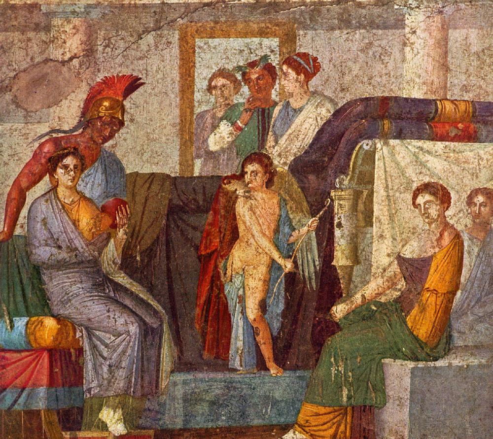
"The relationship between the onlooker and the pictorial world implied in such masterpieces of figure-painting as the "The Initiation to the Rites of Dionysus", in which the action leaps accross the intervening real space of the room, is established with meticulous care in many of the finest architectural compositions."


It's too bad White was not as willing to digress from his focus on rectangular solids here as he occasionally was in discussions of 15th C. painting.

The Pompeian sense of space feels like none other -- with it's linearly connected heavy volumes set into an impossibly shallow space.

It feels so menacing - while the characters feel so gentle.


The importance of the architectural friezes in this room ( tablinum of Marcus Lucretius Fronto) in relation to the spherical field of vision and the artist's moving eye has been recognized for some time


That upper section certainly is complex - as White puts it:
"The simulation of a single curve by means of two short chords"

...as well as a higher POV for the upper register (the floor rises upward) than for the lower register.

Which leads to his summation: "lateral diminuations, splaying wings, steepening recessions.. accompanied by a sophisticated attack upon the problems of visual appearance and pictorial space"

It all feels quite stage-like to me, as a place where nothing real is ever supposed to happen - everyone is just playing an assigned role - creating a space that is socially, as well as visually, claustrophobic.


The probability that several artists, each with their own spheres of activity, collaborated in this decorative scheme is not difficult to establish. The likelihood is greatly increased by the treatment of the pair of mythological scenes which form the centre-pieces of the two main walls. In both of these delicately coloured compositions the planar contraction of the space depicted is very marked, and at times gives rise to uncertain relationships between the rather stiff little figures that have been gathered with eclectic zeal from extremely varied sources. The furnishings of the interior in the scene of ‘Ares and Aphrodite’ nevertheless discloses another aspect of the very approach to visual reality which is indicated by the more delicate construction of the miniature scaenaefrons upon the wall above it. The large couch that fills the middle ground is actually oblique in setting, even though the down, slope of its receding surfaces is so gentle that they scarcely seem to leave the plane at all. The rectangular central block, on which Eros stands, reveals an almost equally soft oblique construction, with its long and short sides both inclined at the same gentle angle to the horizontal. This even recession is no longer used for the block-like seat upon the right, or for the drapery-covered chair upon the left. Instead, the oblique construction is used in such a way as to approach a foreshortened frontal rather than a complex frontal setting. The long forward face of the block upon the right is almost, but not quite, set in the plane, while the short inner face runs much more sharply into depth. This pattern is repeated in reverse upon the left side of the picture. Here are essentially the same design, and the same approach to visual reality that were later to be exploited by Maso and Ambrogio Lorenzetti, by Fouquet and by Paolo Uccello, and which, finally, was to gain a theoretical basis in Leonardo’s system of synthetic perspective.


Should this painting really be considered "an approach to visual reality" ?

And why doesn't White mention the POV anomaly between the two couch seats, to the left and right?

The seats are about the same height, but we are looking down at the one on the right, but up at the one on the left.

Making an uncomfortable social setting feel just a bit more uncomfortable.

Who is that lady on the right, and why is she so uptight?

Mars and Venus truly seem to have come from different planets.

And Cupid feels like such a truculent little brat.

This picture seems to have been in the back of the mind of whoever did the scenic designs for the HBO series, "Rome", that was set in about the same time period as this painting was done.


One of the best, and most typical of the surviving transitional, late Third-style scenes is that of Orestes and Pilades before Iphigeneia’ from the House of the Citharist. The character of the spatial design is set by the slight, yet firm upslope of the evenly receding faces of the temple steps that dominate the centre of the composition. All the minor solids: the altar standing at the top of the steps on the right-hand side; the seat-blocks in the right foreground; the low stele on the extreme left, or the small altar in the central foreground, with its more sharply jutting forms; all of them are fully coordinated with the dominant oblique construction of the temple steps. It is only in the internal structure of the foot of the foreground altar, with its slightly overaggressive solidity, that there is a certain confusion in the drawing. The more gentle outwards recession at each side of the composition is a feature which was already noticed in the ‘Ares and Aphrodite’. The concern for the pictorial surface, another major characteristic of the mythological paintings of the Third style, revealed in the careful closing of the wings by foreground figures, and in the use of steps to create a level platform which, at the same time, is made to carry the figure composition upwards over the whole pictorial surface, is equally typical of such works.


Just as in the architectural view from the Fronto house, the upper platform is seen from a higher POV than the lower - making for a rather, dizzy, unsettling effect.


In the late Thirdsty1e painting of ‘Thetis in the Workshop of Hephaestus’, formerly in the house IX.I.7, the composition from the House of M. Lucretius Fronto is essentially repeated, but without the same degree of spatial crowding and contraction. A similar screen of architecture closes in the background, and the visual focus of the scene, in the polished shield held slightly to the left of the geometric centre, is stressed by the simple, heavy column. The spacious foreground is measured out by the work’blocks and the piled-up armour, and by Thetis’ throne and footstool on the right. Yet the busy confusion of the ground plan is less real than apparent. The majority of the stone blocks on the left are quite strictly in alignment with each other. All the faces nearer to the centre of the composition once again recede more steeply both in the blocks themselves and in the footstool on the right. The alignment of the forms upon the left is only buried to the casual glance by the oblique direction of its axes, just as it is buried also in the crowded towns and villages of San Francesco at Assisi. Here is no confusion, but the curving composition which both organizes and expresses in artistic form the everyday experience of the turning head and roving eye.


Designs such as these prove that the popular assertion that the artists of antiquity never achieved the spatial co-ordination of isolated solid objects has no valid basis. It is refuted by surviving works of art, as well as by the literary remains.


O.K., they're achieved spatial coordination -- but still, most of these spaces feel awkward -- and that aesthetic feeling was probably as irrelevant as it is in a lot of popular art, like this hand-painted movie poster from Ghana:


As White immediately notes, it's fun to have a little window onto a lost world -- but let's face it, these are not great paintings, probably because the client did not demand it.

And the stakes were not as high as they would have been in the church buildings where Giotto painted.


It is occasionally possible, where there is a series of like compositions, to obtain an actual cross-section of the numerous graduations in the interest in structural and spatial clarity visible within the hierarchy of Pompeian art. The four copies of the scene of 'Admetus and Alcestis’ in the museum at Naples make up one such sequence. A small, table-like seat, which appears in every version, starts out as a firmly constructed piece of furniture with the principal receding lines of its extreme oblique construction all converging clearly. Step by step it is transformed into a clumsy concoction of warped planes and tilting, uncertain members receding from each other in disorganized divergence. The more important elements of the composition show an equal range. There could be no clearer warning of the danger of asserting the limitations of antique pictorial art on the evidence of paintings which must represent, in many cases, only the lower rungs of such a hierarchy of coherence.


Unfortunately, I could only locate 2 of the 4 scenes that White has mentioned, and he did not indicate which versions he thought were more clumsy than others.

There is no convergence to the sides of either of the table-like seats shown above,
and the one below appears a bit more wobbly than the one above it.

But is that a fault -- or an enhancement to the narrative being presented?

Perhaps that character should be perched upon a wobbly seat.

Both paintings would fail to qualify for the 19th C. French salon -- but might be welcomed into galleries in the 20th C. when idiosyncrasies were sought rather than avoided. The first one reminds me of Botero.

Since these are the oldest, surviving examples of room size pictorial space in the world, there seems to be the expectation that they would succeed, or fail, as naturalism.

But maybe we should think of them as surrealists.


The increased use of the oblique construction, already noticeable in Third-style painting, is continued and intensified by the Fourth-sty1e artists. The setting attains a marked predominance throughout the entire range of quality, and is almost invariably used in the finest work. There is a similar increase in the strength as well as in the popularity of the extreme oblique construction. Often, as in the famous composition of ‘Achilles and Briseis’, a single oblique structure forms a background for the figures.


That single oblique structure certainly enhances the drama of this event


Everywhere the Fourth’ style mythological picture is highly independent of the constructional rules which govern the increasingly luxuriant framing architecture. This duality of approach can only be compared with that reflected in the fresco cycles of Giotto and his immediate followers. In all the surviving frescoes there appears to be only a single instance of a bold attempt to apply the rule that governed the small world within the picture to the architectural framework of the decorative scheme as a whole.

This unique pictorial adventure occurs in the Fourth-style decoration of the main wall of the atrium of the House of the Ara Massima. The front door and entrance passage are not central in relation to this atrium, but are situated opposite the left-hand edge of the impluvium. The visitor’s first impression of the fresco spread before him on the opposite wall is therefore gained from a position which almost exactly corresponds to that of the shield which hangs between the columns of the painted porch to the left of the central landscape panel.
The first, and most obvious peculiarity of the construction is the strong curve of the painted moulding of the lower border. This curvature is very marked, even in the short undamaged section beneath the right-hand flight of steps. It must have been extremely striking when the golden paint was new, and when it stretched unbroken from one wall of the atrium to the other, Less obvious, but still no figment, is a similar curve in the lower border of the central landscape panel. Higher yet, a further steeply hanging curve is implied by the strong up and outwards slope of the lintels of the doors to left and right. If attention is transferred from the horizontals to the verticals, it is difficult to talk with certainty of the left-hand porch, and of the nearby border of the central landscape panel. The latter is now tilted very slightly to the left, and this might well be due to the subsidence of the wall. No similar explanation holds good for the righthand porch and doorway. These must still have leaned considerably to the left when every possible allowance has been made. It is equally impossible to ignore the violent splaying of the parapet upon the right of these same steps and doorway.
There seems to be no escape from the conclusion that the painter of this fresco made a bold, and strikingly successful attempt to curve the whole design away from an onlooker standing well to the left of the centre of his symmetrically balanced composition. Pausing at the entrance to the atrium, ‘the visitor sees all the horizontals curve increasingly towards the right, whilst all the uprights start to tilt in vertical foreshortenings as his eye sweeps out and up. In spite of certain obvious shortcomings the fresco represents the culmination of the tendencies already apparent in the optical splaying of the buildings in the stage-like friezes in the House of M. Lucretius Fronto.


Definitely one strange wall!

Since we are looking down at those steps, the POV for the upper register of scenes would be at least 12 feet off the floor of the atrium.

And making the scenes curve away to the right -- that's just so bizarre.

In a large room, as opposed to a page in a book, straight lines will appear to curve anyway.

I wonder if this was the home of a man who painted scenery for the theater - or, maybe someone who loved the theater and illusions. This was a space meant to impress visitors, but not especially to be lived in.


A video tour can be found here


The story that opens with the dying reflections of an antique ‘artificial’ perspective is continued in the Third- and Fourth-style painting with the increasing popularity of freer, empirical methods. These were based upon the shifting observation of reality through the artist’s roving gaze. The vanishing axis pattern dominates the architectural framework of the wall, reflecting, not a mathematical application of Euclidean natural perspective to the realms of art, but a practical empiricism. This is equally expressed in the treatment of the inset, mythological and landscape panels. These reveal an ever more frequent use of an increasingly accentuated oblique setting. In the finest work a new degree of spatial organization is achieved, and a great advance is made along the road that finally leads, after a lapse of nearly fifteen hundred years, to the creation of a theory of synthetic perspective. Beneath the apparent welter of conflicting forms there lies a clear prefiguration of the two great strands that weave the spatial pattern of renaissance art.


White never explicitly declares that naturalism is the highest goal of painting and that its greatest achievement coincides with the invention of what he calls "synthetic perspective"


But that seems to be point behind this "great advance made upon the road"

Friday, January 6, 2012

John White: Manuscript Illumination in France

(this is chapter 15 of John White's "Birth and Rebirth of Pictorial Space".
Quoted text is in YELLOW.
Text quoted from other authors is in GREEN)


Fourteenth and Fifteenth century
Manuscript Illumination in France


The splendours of French painting in the fourteenth century are bounded by the turning of a page. A decorative balance so firmly founded on the written word could not be easily or rapidly adjusted to ideas of spatial realism. The stages of development that in thirteenthcentury Italy melted into one another with explosive force become in France a gentle disengagement from the arms of the initial and the tendrils of the decorative border.

Thirteenth-century Gothic illumination, with its patterned backgrounds, and flat, architectural or lettered frames, is both less three-dimensional in itself and less ready for translation into spatial terms than the Byzantine forms and antique reminiscences which played so great a role in Italy. The dominance of the flat frontal and complex frontal patterns is far more complete. The very rare exceptions are provided by the surfacestressing foreshortened frontal settings, and oblique constructions are almost non-existent.

The first movement in the new direction seems to take place at the end of the first quarter of the fourteenth century. This is the Parisian Jean Pucelle’s adoption of the foreshortened frontal setting for consistent use. The new construction is predominant in the Bylling Bible of 1327, and is accompanied by occasional use of the oblique setting for such things as stools.


In the more or less contemporary Hours of Jeanne d’Evreux, it is equally important, sharing the honours, in this instance, with small open-sided structures that reveal their one-room, centralized interiors.’ Despite the survival of purely frontal, and, more rarely, of complex frontal structures, it is clear that the new ideas of space have gained their first firm footing on the manuscript page.


The impulse for this new departure is derived, as might be expected, from the initial impact upon French artistic consciousness of the new ideas that had held Italy in ferment for some fifty years.3 Apart from the general evidence of Italian leavening in France, Pucelle’s own work reveals at least one definite connection with the art of Duccio and the Sienese.


This clear link, confirming an impression often less amenable to proof, is his adoption for ‘The Annunciation’ in the Hours of Jeanne d’Evreux of Duccio’s composition for ‘The Annunciation of the Death of the Virgin’ in the Maestà. The single substitution is the standing Virgin also used by Duccio for the first ‘Annunciation’. The resulting design was so successful that it was not only repeated by Pucelle and his atelier, but actually survived essentially unchanged into the fifteenth century.


There are other differences in the stage, and also in the posture of the annunciating angel, who is more forceful, and less reverent in Duccio's version.


The tie with Italy is underlined by the fact that such a boxed interior is otherwise extremely rare so early. Moreover, it alone amongst the textual illustrations is divorced from any patterned ground, and stands directly silhouetted on the parchment. This second feature stresses the Italian reminiscences amongst the small, freestanding buildings that are used in calendar scenes and for the marginal illustrations at the bottom of the page.
Another reflection of Italian influence is the use of a normal viewpoint. This is not very noticeable at first in Pucelle manuscripts, since small objects like chairs or tables so often stand in isolation. These are naturally seen from above without in any way detracting from the normality of the down-sloping roof-lines in the majority of the buildings.

Despite this budding naturalism, Jean Pucelle, or possibly an intermediary, has transformed Duccio’s true interior into a little open-sided house, and so reverted to the earlier pattern of the object set in space. There is, as yet, no feeling for an enclosed void divorced from all description of the outside of the box that shuts it in.


Yes.. I feel no sense of space within, as I do with Duccio and Giotto.

Rather than inviting the viewer into an imaginary space, the page asserts itself into the space of the viewer.


The tendency for naturalist innovators to begin by concentrating on the individual solid object that was noted in connection with the frescoes at Assisi and Padua, here recurs in far more drastic form. The visible ground plane was a well-established feature of late thirteenth-century Italian frescoes. In Pucelle’s early fourteenth-century miniatures, on the other hand, it sometimes extends no further than the limits of a one-roomed house, and it is usually represented by the narrowest of strips, or even by a mere line.6 Pictorial space is, therefore, in a real sense an attribute of the individual solid; both created by it and unable to extend beyond its borders. These solids are, moreover, held to the very minimum necessary for the setting of a scene or for the illustration of an action. The borrowing of Sienese patterns carries with it no awareness of the complex and continuous pictorial space so typical of Duccio himself, whilst the dominance of the surface is even further stressed by the everpresent text.


The isolation of the individual solid remains a characteristic of most of the miniatures painted by the Maître aux Boquetaux, who was active in the middle and third quarter of the century. Although the ground plane is by now established, and at times a quite extensive landscape is developed, there is, as yet, little effort to relate the viewpoints of the various structures occupying a single scene.


The great, pagewidth illustration of ‘Love Presenting Three of His Children’ on Folio D of the Poesies de Guillaume de Machaut, which together with the similar scene on Folio E is probably his greatest achievement, reveals his capabilities and his limitations. In the mass of smaller, less ambitious miniatures from his hand and workshop, he remains almost completely faithful to the simplified Sienese constructions taken over by Pucelle. The patterned background is also retained, stressing the decorative qualities of the centralized and foreshortened frontal structures which provide the major spatial accents. Throughout contemporary French illumination these constructions are completely dominant wherever the frontal and complex frontal systems do not still maintain their hold. Until the final quarter of the century the oblique construction remains, in comparison, unimportant, whether in quantity, in quality, or in function.


An insight into the creative processes that seem to be so typical of early experiments in spatial design, yet tend to stay for ever in the realm of mere assertion, is provided by The Coronation Book of Charles V.In this manuscript of 1355, scene follows scene, each with its gaily patterned background, each with figures standing on a narrow plane of equal gaiety beside an altar in foreshortened frontal setting.


Folio 63 , however, reveals the little group of personages in the act of climbing up some wooden steps into a draped, rectangular pulpit standing on four columns. The scene is then repeated on the following page, with the difference that king, prelates, and attendant nobles have all reached their ceremonial places. The steps that bore their weight so sturdily in the previous illustration are no more in use. Immediately, they are swung back into the picture plane, flattening upon the surface as if no one ever did, or ever could, climb up them.


Seldom is the creation of pictorial space so graphically tied to the demands of action. No subtleties of analysis are needed to reveal the seemingly most important motive in the making of the early forms of space; a space which clings, expanding and contracting, to the figures, and to the simple solids that are indispensable to them in the playing of their parts.


The fact that an unusual effort or achievement may occasionally arouse a new, if momentary, ambition, even in a craftsman miniaturist, can perhaps be seen in the succeeding illustration . Suddenly, caution is forgotten in the placing of the figures that are usually set so carefully to one side of the altar, or else overlap it slightly without spatial explanation. Now, not only do they stand partly in front of it, but space is cleared for them. The altar pivots back upon its outer corner, and becomes, for the first and final time, softly oblique in setting. The figures walk for a brief moment in the thin wedge of space which is left free before it is squeezed out again by the flat pressures of the page.


Here's a very similar scene.

But unlike White's example, the throne is not oblique and there is no space on the floor.

Which might suggest that those spatial features are as likely to be inadvertent variations as much as momentary ambitions.


The actual invasion of French manuscripts by the oblique construction sets in slowly during the early ‘seventies. An unusually bold example of the intermediate stage, which was seen in Italy in some of Cavallini’s frescoes and mosaics, can be recognized in the dedication page of The Polycratic of John of Salisbury, given to Charles V in 1372 . Here the extreme oblique construction of the lower sections of a throne appears in combination with a horizontal upper line that implies a foreshortened frontal setting. There seems to be an element almost of illusionism in the bold sign of this great throne. The angular base which juts across the border, and the canopy which stands completely in front of it, appear to show a sense of purpose that distinguishes them from the earlier overlappings in which figures, or else minor details such as spires and pinnacles, were usually involved.

There is, however, some uncertainty in the relationship between the upper and lower parts. It therefore seems impossible to tell whether the overlapping is dictated by a wish to have a more imposing throne than that allowed by the dimensions of the decorative field, or whether it reflects a truly spatial purpose. Such uncertainties seem to be the rule in the first stages of the introduction of the oblique setting into French illuminations. They reflect the great role played by the purely decorative considerations which, when coupled with the desire for greater realism, contribute to each innovation.


The penetration of the oblique setting into the established workshops is revealed by manuscripts such as the Bible of Charles V, illuminated in the circle of the Maître aux Boquetaux and completed in the year 1371.


Similarly, one of the earlier manuscripts in which the many fine examples of the new design outnumber the foreshortened frontal settings is the Missal of St. Denis, decorated by the Pucelle atelier, or by his followers.” The extreme oblique construction on Folio 261 is of particular interest, as it shows the strains and stresses to which longacccpted patterns were subjected by the intrusion of realistic space. The way in which the letter 0 is woven into the design, part before, and part behind the foremost pillar, creates visual excitement. The new existence in a world of space is underlined at the same time by the hounds that leap diagonally through the letter just as circus dogs leap through a hoop.

The motives of the painter are again uncertain. He may have been intrigued by the new possibilities of spatial interweave, or have actually exploited the plane-stressing qualities of the capital to control the thrusting force of his design. Perhaps, on the other hand, he merely did his best with what was, after all, a mandatory element in the composition. Of these three solutions, the latter seems, in the end, to prove the least promising. It is possibly significant that this particular little building, so securely set upon deeprunning greensward, is at once the most firmly constructed, and spatially the most aggressive structure in the missal. Moreover, in the two additional miniatures in which the initials cut into the composition in a similar way, a simple planar pattern is created, forming no such complex interweave. In all the other scenes the letters function as a mere surrounding border. This, combined with the least possible emphasis on any part of an initial which cannot be kept entirely clear of the representational field, is the most common solution of the problem for those artists who were pioneering fresh conceptions of pictorial space during the fourteenth century.


It's fun to imagine White pouring through 14th C. manuscripts in search of spatial innovations, and then his excitement upon discovering this "O" that is interwoven with the corner column of a building set in the oblique. Eureka!

But does this exemplify an artist making a brilliant technical innovation -- or just the fact that a deeper pictorial space is so easily available to artists that it can be created on a whim.


The special case of the historiated letter is important simply because it represents, in extreme form, the varying yet everpresent problem of adjustments characteristic of those periods of history in which a desire for greater spatial realism is first felt. The old, impartial intertwining of figures and initials raised no conflict, since the element of realism was hardly appreciable. It is only with the advent of the new realistic space that the old balance is upset, and new pictorial combinations must be generated even where the earlier forms are not entirely superseded.


It is the last quarter, and particularly the last decade of the fourteenth century, which sees both the rapid development of the interior and the extension of the influence of Italian ideas of pictorial space from the building and the individual object out into the landscape. It is now that the Northern manuscript illuminators start on their Italian travels, seeing for themselves the source of so much inspiration. Simultaneously, even in their native city, the stars of the Parisian masters begin to wane before the Franco-Flemish supernovae.

In this time of ferment an increasing number of manuscripts reveal the extreme oblique setting impartially intermingled with the foreshortened frontal and centralized constructions. In many of the most important examples, such as the Brussels ‘Très Belles Heures’,’ extreme oblique and foreshortened frontal settings are to be found in almost equal numbers. In other cases there is a closer dependence upon earlier prototypes, at times amounting to actual repetition, and in these the oblique construction is much less common.’ Nevertheless, a survey of the few surviving panel paintings,15 or of the manuscripts illuminated by the leading artists at the turn of the century, reveals the increasing, and now widespread use of the extreme oblique construction as a new, and striking feature of pictorial design.


The highwater mark of this trend occurs in the output of the de Limbourg brothers during the first two decades of the fifteenth century. The extreme oblique setting becomes the dominant motif throughout their autograph work, appearing far more frequently than either foreshortened frontal or centralized constructions.
--------- The anatomy of the human figure; loving observation of the details of plant and animal life; the continuity of deep’running landscape; delicate architectural portraits of identifiable localities; there is no apparent end to an enumeration of the achievements of these artists


There is even a fullpage interior which, with its truncated, barrel-vaulted ceiling, with the sharp cutting of the figures at each side, and with the abbreviated left wall balanced on the right by an indefinite extension of the room-space through the cutting of the banqueting table and the fireplace, is, in general structure, comparable to Donatello’s great ‘Dance of Salome’ .


The vividness of this comparison and contrast is enhanced by yet another detail. Where Donatello, the Italian, carries his hall into depth through the repeated, arching planes of monumental architecture, the de Limbourg uses the softer, more pictorial, and typically northern medium of a hanging tapestry that sweeps the eye into a landscape of indefinite extent, the placing of the figures so blurring the transition that one scarcely knows where free space ends and woven space begins.

In such a manuscript the predominance of the extreme oblique construction amongst all the major foreground structures is of interest in itself. More striking still, however, is the fact that the softest conceivable oblique settings are used in most of the detailed architectural portraits in the backgrounds.


I don't feel any volume of space in the De Limbourg at at all - and I feel just a little tipsy/dizzy looking at it, with that odd porch protruding from the rear wall behind the seated figure of the duke.

Why doesn't White mention the large serving vessel on the right? In contrast to the rest of the scene, it definitely recedes into space.


In the Calendar scene for June, the construction takes a form in which the main face of the building is almost, and yet quite definitely not, set in the plane. It is a subtle application of a method similar to that habitually used by Giotto in his mature works. In other miniatures it is the extreme oblique construction itself that is transformed. The evenness of recession upon either side remains. But now the slope of all the architectural horizontals is reduced until the sharp, and jutting, angular effect is lost, with each line scarcely moving from the horizontal, yet no line maintaining it.’ In the de Limbourg architecture it is patent that the very buildings which disclose the greatest evidence of direct observation are those which reveal the greatest subtlety of oblique construction.


White does not mention that the depiction of the distant buildings beyond the moat and the wall follows an entirely different set of rules from the depiction of the figures and objects in the foreground where size does not diminish with distance.

Are different kinds of perspective appropriate for different social classes, the nobility and the peasantry ?

He also does not note that the castle to the left has a different POV from the Cathedral to the right - a cathedral whose facade is resting squarely upon the shoulders of the hard working peasants.


During these same years the application of the setting to the problems posed by the interior is likewise extended and refined. The dedicatory miniature of a manuscript of ‘The Poems of Christine de Pisan’, dating from between 1408 and 1413, even reflects the transference to an indoor scene of those same visual principles and compositional devices which had been developed in Italy by Maso di Banco and Ambrogio Lorenzetti.’ Here, the beds to left and right are each obliquely set. Although the straight back wall reveals quite clearly that the room is actually rectangular, the artist recognizes that as head and eye are turned in order to survey each individual object, each in turn recedes obliquely from the onlooker—as in nature, so in art.


All of the receding orthogonals meet in the vicinity of the back window -- except for that big, goofy red bed on the right, and the green pole in the center of the ceiling.

Has a real room actually ever looked this way, even accounting for the turning head of the viewer?

Only in a mind that has been chemically altered -- which seems to have been the case with these courtly ladies.

Christine of Pizan is celebrated as the first European woman to be a professional writer and as a proto-feminist.

So it's quite appropriate that she gives the lades their own intense, very special world.


In an interior this arrangement intensifies the problem of the alignment of the side walls which had always faced the artists working on the basis of tradition and experience when they turned to the observation of individual appearances. In the north, particularly, there is a persistent tendency for the baselines either to be insufficiently inclined towards each other or to be inclined so much that they cut into the chequerboard pattern of the floor. It seems probable that one of the underlying reasons is that it is in observing just these lines that the artist turns his head furthest. As a result, the conflict between what he sees in each individual glance and the known structure of the room as a whole is at its most intense.


But the artist, or viewer, does not need to turn the head at all when looking at the walls of a room depicted in a book-size illustration.

And I really doubt that the these illustrations were based upon on-site drawings of actual rooms.


The more firmly he makes up his mind to set his walls according to his detailed observation of their surfaces, as in the miniature of ‘Isabel of Bavaria and Christine de Pisan’ , the greater are his troubles at the centre of the picture. This is often, like the side orthogonals, covered up in artistically effective embarrassment. It remained for Jean Fouquet to face the issue, and draw in upon the floor the curves which are implied in the area that separates the beds shown in this miniature, and to do consistently in practice many of the things which Leonardo later advocated in his theory of synthetic perspective.

The Roman journey which Fouquet undertook between 1445 and 1448 was undoubtedly amongst the most significant episodes in his whole life. The importance of it is increased by the lack of any agreement about his earlier activities. There are therefore, throughout his certain works, constant, and often very strong reflections of early renaissance art. It seems clear, more’ over, that he became acquainted with the new system of artificial perspective, although there are never more than fairly close approximations to it in his own productions.


Even these are rare, and for the most part confined to the pages of ‘The Book of Hours of Etienne Chevalier’, which appears to have been his first commission after his return to France.These approximations to the contemporary Italian theory are, however, less exciting than Fouquet’s development of the empirical endeavours of his French, and therefore, indirectly, of his Italian predecessors.


A noticeable feature of these Hours is the clear way in which the artist underlines the foremost plane of the illumination. This is seen as coinciding with the surface of a page pierced by pictorial space. The conception, therefore, of the pictured world as things seen through a window, which is common both to Eyckian practice and Italian theory, appears also to be present here.


In half the miniatures the effect is simply gained by placing at the bottom of the scene an unforeshortened strip of lettering which lies implicitly at right angles to the ground or floor immediately above it .


The change of plane is made explicit in ‘The Visitation’, where the vertical forward surfaces of the foremost row of marble pavement slabs are clearly shown.


In the remaining scenes all possible ambiguity is avoided by presenting the main action on a platform rising up behind a narrow forward space reserved for allegorical figures or for genrelike illustrations of the humble preparations for the next act in the drama. In over half of this second group of miniatures, however, it is not a straight line that divides these two spheres reality, but a curving wall or rockledge. These scenes are also those in which it is immpossible to find major reflections of renaissance architectural or perspective forms. In most of them the curved wall of the foreground, signifying final entry into the pictorial world, is accompanied also by a semi-circular grouping of figure composition or by circulation ..


Norris Kelly Smith discusses Fouquet here

Smith asserts that Fouquet's perspective was "radically informal", but I'm not sure whether he intended the curving floor to be part of that informality.

It seems to me to be an effective way to make a book-size image seem larger.

The artist of a wall size painting does not need to gently curve long, horizontal parallel lines since the the viewer's perspective will do that by itself.


***********************************************************
Beginning of the footnote digression into Netherlandish art
***********************************************************


The main reason for not considering the Flemish development fully in this study is that, as is so clearly shown by Panofsky (Early Netherlandish Painting) who has now so largely covered the field, it does not in any sense represent a ‘fresh start’ as regards spatial realism, its roots lying in the French and FrancoFlemish art of the fourteenth century. It represents a stage comparable in maturity to that of early fifieenthcenrury painting in Italy. There the ascendancy established by the new artificial perspective in its abbreviated Albertian form seems to account for the rapid and almost complete disappearance of the oblique setting. The emphasis on the squared pavement as the starting point in effect reduces all oblique forms to the status of interlopers cutting across the essential rectilinear network. In the north the monumental polyptych emerges as the dominant form. This, when combined with realistic architectural and landscape settings, puts an even greater premium on organizational factors than is the case with the typical Italian mode of expression, the fresco cycle, since the relationship between the parts is so instantaneously and insistently apparent.


White did not create a separate chapter for his discussion of early Netherlandish painting, preferring to make it a very long footnote in his discussion of France.

But the more he talks about it, the more it does indeed seem to be something of a "fresh start" with its own kind of spatial realism.

His final sentence, above, completely baffles me.

When has a good painting ever not been the result of putting a very high premium on "organizational factors" ?


Another important factor may well be the contemporary development and exploitation of the true interior as the most popular element in the new art. It is in the interior that the distortions accompanying any synthetic system are most acute and the pressure to use an ‘artificial’ method at its strongest. This is particularly so when, as is habitually the case with Jan van Eyck, the rectilinear frame itself is being incorporated in the design as an actual window, often of imitation marble.
The complexity of design that is being achieved by the end of the first quarter of the fifteenth century provides a further impulse towards the use of approximations to the system that is organizationally most suited to the plane surface. All these factors would, of course, be reinforced by knowledge of the Albertian system when the latter reached the north. Only when the artificial perspective vein has been worked out, and reaction sets in, is it possible, either in north or south, to return to an extensive use of the oblique disposition for solids and to the diagonal setting of interiors.


Are there earlier examples of this "artificial perspective vein" where the oblique disposition cannot be found?

I wish White would have mentioned them.

Melchior Broederlam, 1398

Artificial perspective is clearly absent in the above.

Robert Campin, Master of Flamalle, 1438


The above would qualify as an example -- but it was apparently painted 18 years after the example which White mentions below.


The validity of these tentative conclusions is supported by the fact that it is only in France, where manuscript illumination remains of prime importance until well past the mid century, as is not the case in Italy or in the Netherlands, and only in the manuscripts themselves that, as will be seen, a close approach to a full synthetic system is achieved during the fifteenth century. Only on the small scale of the illuminated page is such daring possible, and only in such a format are the disadvantages of the method at a minimum.

Despite the rapid triumph of approximations to artificial perspective in Netherlandish painting, the changeover is not instantaneous, and the traces of the earlier ways of seeing and composing remain visible just as they do in early fifteenth-century Italian art.


In the work of the Master of Flémalle, the oblique setting is used exclusively in ‘The Betrothal’ and in ‘The Nativity’ at Dijon.


Similarly, the extreme oblique setting is used in the Friedsam ‘Annunciation’ which is often attributed to Hubert van Eyck.


The above is now attributed to Petrus Christus, and it has always been one of my favorite paintings at the Met. Someday, I'd like to visit it again, hand my wallet, coat, and shoes to the security guard, wave goodbye, and then step right into the painting, press my warm cheek against the cool, gray stone of the doorway, and live there forever.

It has a sense of volume, without as well as within the depicted objects, that I find endlessly attractive, and is only partially accounted for by the relation of lines to vanishing points.


In the work of Jan van Eyck, a consistent softened oblique setting is used for ‘The Requiem’ in the Turin Hours, if this be by him. The viewpoint is on the right, and whilst the upper parts of the right transept are almost horizontal, those of the left transept slope downwards firmly, and the bier shares in the oblique disposition of the whole.


Distance appears to have bent those upper transepts,to the left and right. They are nearly parallel to the picture plane, but they do not fall into a straight line.

Which, I think, makes the small miniature feel more spacious.


A similar downslope is present in the transept in the panel of ‘The Virgin in a Church’.


Norris Kelly Smith discussed this painting here

I can see that "similar downslope in the transept to the left" -- but it is so slight, I can't imagine it making much difference, one way or the other. It is nearly parallel with the horizontals in the screen to its right.


In many of his panels with their illusionistic window frames, sometimes, as in the Van der Paele altarpiece with the perspective of the floor continuing the carved recession of the lower ledge, a soft oblique setting is reserved for the architectural details, particularly the capitals of columns. This is noticeable in the Dresden ‘Virgin Enthroned’, ‘The Annunciation’ and in the ‘Rolin Madonna’.


Finally, as a subtle hint of the synthetic approximation nascent in ‘The Requiem’, there are delicate curvatures in the flooring of the Arnolfini ‘Double Portrait’, with its superb convex mirror.

It seems likely that the use of convex mirrors, both in everyday life and as an aid to painting, influenced the appearance of optical curvatures in ftfteenthcentury Northern art. The peculiar ability of such mirrors to reflect wide vistas on a minute scale must have made them particularly useful to the miniaturist. The precise extent of their use by painters in this period is, however, conjectural, and cannot be taken to explain the entire range of such phenomena. The interesting question which arises, assuming the connection with painted curvatures, is why these latter were not ‘corrected’ and straightened out on the flat page or panel, and it seems probable that the answer lies precisely in the reasons suggested in the succeeding pages below.


For the life of me, I cannot see any curve to the floor boards in the above painting.

But there is a gentle curve in the line where the back wall meets the ceiling. It's higher in the center and is lower at both edges.

************************************************************************
End of the footnote digression into Netherlandish art
************************************************************************


The most convincing evidence that these deviations from renaissance practice have significance beyond that of an inherited pattern preference is provided by the scene of ‘The Annunciation of the Death of the Virgin’. Here, over the plain, lettered base-strip, part of a large, rectangular, half Italianate, half northern bedroom opens out. The back wall is set parallel to the surface of the page. The right-hand side wall, which alone is visible, is definitely straight. Despite this evidence of the normality and rectilinearity of the room, it is found that as the eye swings over to the right, away from the perspective centre, all the transverse lines of the matting on the floor begin to curve away into depth as they approach the side wall. The horizontal cross-beams of the forward part of the ceiling also start to splay, and swing into recession on the right. Fouquet has painted in the curves that were implicit in the dedication scene of ‘The Poems of Christine de Pisan’ . As the head turns, and the visual centre changes, so the room sways in adjustment, making new foreshortenings apparent.


I see the curvature in the floor and ceiling, but is this based upon a theory of optics or upon a desire to give a sense of spaciousness to a very small image?

And what "new foreshortenings" are apparent here ?


It is remarkable that strikingly original developments of such a kind should occur in that same manuscript in which the influence of Italian forms is at its peak. It is, therefore, no surprise at all that as the memories of his journey fade a little the development of Fouquet’s personal vision is intensified. The nature of this vision is abundantly confirmed in the extensive illustrations to ‘Les Grandes Chroniques de France’, which date, in all probability, from the early ‘sixties.


In the ‘Arrival of the Emperor at St. Denis’ the form of the spatial structure is set by the curved network of the flagstones, which in this case appears to record objective fact, since the imperial sedan, together with its horses, cuts across it in a definite straight line. This does not account, however, for the slight bending of the lines leading into depth. Such curving of a chequer-board pattern is one of the recurring features of the work of Fouquet, and in the majority of cases it is used where there can certainly be no question of objective curves.


In the miniature of ‘The Banquet of the Emperor Charles IV’, not only are there gentle curvatures in the chequered pattern of the floor, but the banqueting table, and also the steps leading up to it, which likewise stretch across the whole width of the scene, are delicately curved, their ends receding softly as the eye runs out to either side.


Similarly, in ‘The Coronation of Charlemagne’, represented as taking place in the nave of old St. Peter’s, the familiar curving network of the flagtones is seen again. There are altogether about ten cases of this... in each the interior is undoubtedly rectangular, although in two cases the impression of a bending side wall is obtained by rather muddled means. In each case there is also a more or less close approximation to the curving world of synthetic perspective


Muddled means?

White considers the bending in the flagstones of the floor to be a rational display of what he calls "synthetic perspective"

But there is no corresponding rationality behind the bending of the vertical walls, since that would only occur if the POV were half-way up to the ceiling.

So he dismisses it as "muddled".

But it does make the space feel larger, more imposing.

Which might also explain the curvature of the flagstones.

White is a bit ambivalent about it all.

On the one hand, "A curving world, resembling that which Leonardo was, for very different reasons, to organize in theory, still comes into being"

But on the other, "Occasionally, however, they remain as bold, contrasted patterns underlying the empirical and non-dogmatic nature of Fouquet's art "


The vertical foreshortenings, later recognized in Leonardo’s theory of synthetic perspective, which make the sides of a tall building run together when one stands in front of it, are quite well known. It is not so often noticed, on the other hand, that if one stands before a gap between two such structures, it is the two buildings that converge, leaning across the intervening space. This phenomenon was observed and substantially reproduced by Fouquet in the architectural mass which dominates ‘The Building of the Temple at Jerusalem’. Even allowing for the structural inclination of the walls and buttresses, the whole temple leans firmly over to the left. There is also a general tendency for the vertical displacement to increase as the eye moves away from the visual centre of the miniature in the figure of King Solomon. The lessening of distortion at the centre is not wholly due to the need for harmonization with the vertical of the building containing the king’s balcony, for the outline of the farthest buttress still leans to the left, whereas in true elevation it would be inclined towards the right.


There can once again be no suggestion that a theoretical system has been applied, since the objective, ruled lines of the main horizontals show a lack of interest in such things that is emphasized by the use of an optically correct curve in the feet of the buttresses. It does appear, however, that the penetrating observation which, as in the rest of Fouquet’s work, characterizes the genre scenes and the architectural detail, is reflected also in the general structure.


To which "main horizontals" does White refer? And how might any of the horizontals show a greater interest in some kind of synthetic perspective? None of them extend more than about a third of the length of the picture.

And I can't even identify an "optically correct curve in the feet of the buttresses"

Though the buttresses near Solomon do seem to be bending in response to his gesture.


The underlying truth of this interpretation can, by chance, be proved in this particular case, as the whole scene is repeated in ‘The Taking of Jerusalem by NebuzarAdan’. Here the same buildings are seen from a distance, and the temple is indeed a structure in which the verticals appear as such within quite narrow limits, while the buttresses have their normal inward inclination. This is so in yet a third view of the building found in the same manuscript.


Here, the outer edges of the temple seem to be bending in at the center, which would be reasonable for a POV that is half its height.


It is significant that these particular distortions of the vertical only appear with such strength on the one occasion on which Fouquet represents an extremely tall building seen from a near viewpoint. Optical distortions are subtle in actual vision, and, as Leonardo later realized, it is just for the wide angles entailed in such cases that they are most noticeable.


Here are some more of Fouquet's architectural views.

I've yet to find any others that share the inward bowing or dramatic leaning of the Jerusalem temple - but we might allow that the reputation of this holy structure stands apart and above anything else ever built by man.


The pattern of development that now emerges is essentially clear. It is also an astonishing reflection of the one revealed within the framework of Italian art.
The earliest stage, both in France and Italy, is marked by concentration on the individual object. In both countries the latter first attain solidity through the foreshortened frontal setting with its powerful surface-stressing qualities. In France the new construction, pioneered by Jean Pucelle, retains its dominance for fifty years, until, in the last quarter of the fourteenth century, the extreme oblique construction challenges its undisputed rule. By the end the century the two constructions reach a state of parity similar to that in Cavallini’s later works, or in the frescoes of ‘The Legend of St. Francis’ at Assisi. The development of the foreshortened frontal setting is still continued over a wide field of French and Franco-Flemish illumination, just as it was continued at the hands of Duccio a century before. The oblique setting nevertheless attains, in the art of the three de Limbourg brothers, a dominance as striking in its way as that which it had previously enjoyed with Giotto and his closest followers, and this later triumph is accompanied by a similarly rapid toning down of its aggressive qualities.


White does not speculate on how these different kinds of space might relate to different kinds of narrative intentions.


In France, even more than in Italy, the patterns which had been established by the men who looked most keenly at the natural world were casually, if decoratively, intermingled and misunderstood by their less perceptive fo1lowers.


White does suggest, in the above, that the developments are made by those who
"look most keenly at the natural world" - though he stops short of asserting that naturalism was the primary motivation, as he notes that, for whatever reason, earlier forms are frequently revived.


For example, here's a piece that came to Chicago last year.

The artist was Jean Bourdichon (1457-1521), born 40 years after Jean Fouquet, and in the above we note the use of frontal and oblique constructions, as well as a kind of grid (but no curving floor)

White would like to see an evolution of pictorial space in France, and see it as parallel to that in Italy: frontal to oblique to artificial perspective to synthetic perspective.

But with the intermingling of cultures, "no complete confidence can be felt"
-- so he will then turn to ancient Greece to discover what happened there.

Though, I continue to doubt whether it makes any sense to restrict the contemplation of pictorial space to rectangular solids.


Here, for example, in another episode of Antiquités judaïques, the volumes of the draped figures are so important to the sense of space that envelops them.

And note that the flagstones in the pavement run straight across, with no perceptible curve.

"Synthetic perspective" seems to be much more important to White than it was to Fouquet, or to the artists who followed him and neglected to use it.