This is Chapter Five of Sventlana Alpers' "The Art of Describing: Dutch Art in the Seventeenth Century", 1983
Quoted text is in YELLOW. Text quoted from other authors is in Orange
*************************************************************************** ****************************************************************************

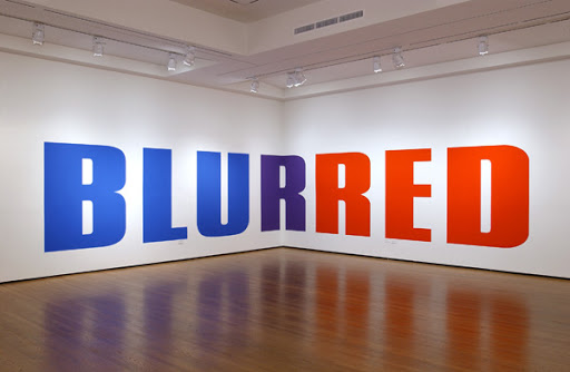
Picasso, Ma Jolie, 1911

Paul Klee, Einst dem Grau der Nacht enttaucht, 1918

Magritte, Treachery of Images, 1929

Jasper Johns, Alphabet, 1959
Alpers offers these four paintings
to exemplify how text functions
in “the modernist mode”

Christopher Wool, 2014
And here's some more recent examples
of what is now called Text Art.
Kay Rosen, 2004
In the modernist mode the inclusion of words with images has the function of celebrating the new and unprecedented making that is a picture., while at the same time, and often in the work, acknowledging the ineluctable absence of what can only be present in signs. It is an ironic and deconstructive pictorial mode.
This book is about painting in the 17th, not the the 20th century. But still, I would question whether Alpers' assertion applies to all four of her examples.
It feels like Picasso put the words "Ma Jolie" on his canvas so they might serve as - and emphasize - the title of the piece. Without them, the painting could represent a factory or large machine or maybe just a convoluted, anxious mental state. With them, the painting represents a human figure, his lover -- and so it might exemplify the expressive possibilities of his innovational way of transforming visual reality.
The words in the design of the Paul Klee watercolor appear to function much as words do in a stained glass window in a church. They are amplified, sanctified, and mystified by the design.
You could say that Magritte's piece is in "an ironic and deconstructive pictorial mode" -- but the words primarily function like the caption of a humorous cartoon. Together with what is depicted above them, they deliver a joke - not a "new unprecedented making".
Only the Jasper Johns piece really exemplifies Alpers' statement. It celebrates the newness of Abstract Expression - while announcing that something more conceptual is now even newer.
And so I also question the possible scope of whatever you might call "the modernist mode" in all of its great diversity. At what point do you acknowledge that the differences between its various directions are at least as great as their differences from what came before ?
Dutch art, on the other hand, comes out of a tradition that had long permitted words and images to join and jostle each other on the surface of an illuminated manuscript and then a printed page. Far from mistrusting or deconstructing the making of pictures, the Dutch in the 17th century grant them a priveleged place. Images are at the center of human making and constitute an attainment of true knowledge.

Pieter de Hooch, The Courtyard of a House in Delft, 1658 (detail)
Dutch
paintings, surprisingly for such realistic images, are at ease with inscribed
words…. I called this surprising because, with the exception of the painter’s
signature, we do not normally expect words to intrude on the picture itself.
Western art since the Renaissance differs
in this from other major traditions, such as the art of China or Japan.

Bartholomeus van der Helst , Five Archers of the St. Sebastian Guards, 1653
For whatever reason,
Alpers has ignored
the Northern Renaissance,
especially in Germany
and especially Hans Holbein
Alpers has ignored
the Northern Renaissance,
especially in Germany
and especially Hans Holbein
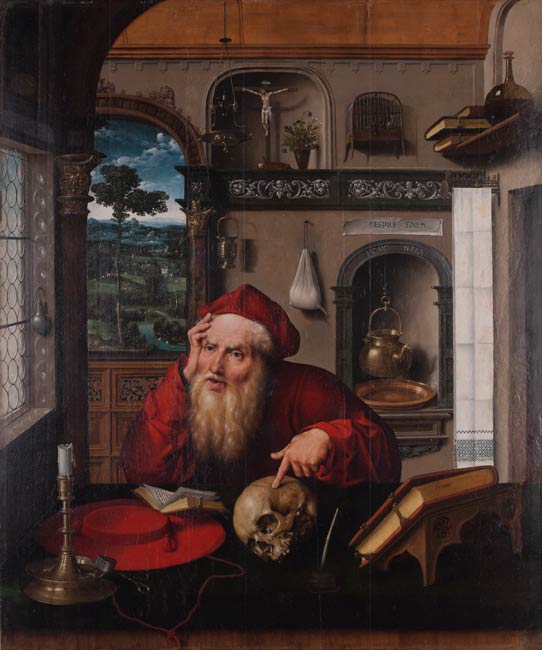
Joos van Cleve, St. Jerome, 1521

Hans Holbein, portrait of merchant Georg Gisze, 1532

Albrecht Durer, portrait of Michael Wolgemut, 1516


Hans Holbein, portrait of merchant Georg Gisze, 1532

Albrecht Durer, portrait of Michael Wolgemut, 1516


Hans Holbein, The Ambassadors, 1533

El Greco, St. Julian and Donor, (detail) 1612-14
It is a
recognized mark of art of our own
century that it disrupts the traditional Western distinction between text and image.

Jacques Louis David, Death of Marat, 1793

Vibert. Barbier Ambulent 1868

Ingres, Vow of Louis XIII (detail) 1824

William Harnett, Last Rose of Summer, (detail) 1886
It does appear that Manet, Monet, Degas, Renoir, and others
called Impressionists did not paint legible text even when the opportunity arose --
as with the labels on wine bottles in Manet's "Bar at Follies Bergere"
But the more academic painters often included it.

Pieter Saenredam, Assendelft Church, 1649


Rubens, Ignatius Loyola
Alpers contrasts the churches painted by Saenredum and Rubens.
It certainly makes the religious wars of the 17th century easier to understand.
The cathedral in the colorful Rubens painting is probably gorgeous -
but I would far prefer to visit the space created by Saenredum.
So calm, so airy, so meditative.
Those qualities seem to be enhanced by the texts presented from left to right across the foreground.
They slow the eye down as it moves back into space.
Would they be any less effective if they were not legible?
Perhaps.
Being legible, they reward intellectual curiosity -
Which slows the eye even more,
and isn’t that appropriate for a space in which a lecture is being delivered ?
Alpers was only concerned with the content of the inscriptions.


Rubens, St. Cecilia (detail), 1639-40

Saenredum , Interior of St. Bavo's Haarlem (detail), 1636

Saenredum , Interior of St. Bavo's Haarlem, 1636
We recall the small figure of a man standing in a painting of Saint Bavo and raising his eyes to the organ above. His eyes direct ours to the image of the resurrected Christ on the shutter and to the golden words inscribed below which invoke the music of hymns: "nde zangen en geestelycke liedekns" is part of a longer biblical passage reading, "teach and admonish one another n psalms and hymns and spiritual songs."
By means of his extraordinary passion for crafted desciption (the golden letters are fashioned out of gold leaf) Saenredam introduces the image and the organ music that the Protestant church had included from its worship in the form of a representation. The worship of God through music is given a singularly nonnarrative and even, one might say, a disembodied form here. This point is brought home if we compare Saenredam's praise of hymns here to Rubens, who in rich colors and glowing flesh tones presents an ecstatic saint Cecilia playing the virginal with her eyes raised toward heaven.
What a remarkable contrast between these two paintings, done three years and one hundred miles apart.
Compared with the keyboard performance by Saint Cecilia, the music in St. Bavo certainly does appear disembodied. Saenredum has put me on the floor right behind the other ordinary citizens - and like the fellow in the distance, I gaze up in wonder, like a child.
Did Rubens ever include text in a painting? If he did - it could only have been a single word or two.

Alpers draws our attention to the different colors of graffiti in the Mariakerk Utrecht - suggesting that it was executed by different hands at different times - and makes the image feel even more distant from the hand of the artist - even as it presents his own signature. As if he were something like a camera recording reality to create "a document of a particular kind". (though no camera could make an image this beautiful, inviting, timeless, and mysterious.)

Then she invites us to consider the signature included in Van Eyck's Arnolfini portrait (1434) - as an earlier example of a northern European painter whose goal was to document a real world rather than invent his own. The artist testified to his presence as a witness by both his signature and his self portrait in the mirror on the far wall. (According to the theory that the painting serves as a legal document. Though there is another theory that it was a memorial gift to the bereaved widower)
the juxtaposition of the two signs of the artist's presence calls attention to the common function of a verbal and a visual sign. It returns us to the remarkable and confidant equivalence between word and image that is our subject.

Anthony Leemans, 1655
Then we're given this unusual painting that depicts six (six!) different styles of printed or written text -
from the casual scrawls on a paper used to roll tobacco to a printed broadside declaring the naval victory of Admiral Tromp. (Despite his unfortunate name - he actually was a brave and competent commander)
The handwritten page near the center tells the story of Apelles and the shoemaker who criticized his painting - from which we have the proverb: 'shoemaker, stick to your last' (i.e don't criticize outside your field of expertise). I'm guessing that this was included in response to criticisms of Leemans' other similar painting that was done the same year:

Anthony Leemans, 1655
The disposition and placement of the news about Admiral Tromp really dominates this image - and perhaps some viewers felt that the painting suffered as a result. It does seem to have crossed genres from still life to text art. The image enhances the text, rather than the other way around. I wonder why Alpers did not mention it.

our attentiveness to the look of the words - in particular the flourish above Haarlem the left- is drawn out in the delicate outlines of the tree trunks that spread to fill the lower portion of the page.
I wonder what Saenredam was up to here. Was he musing on how the more substantial tree better fit the more substantial city? (in prior centuries, Haarlem had been larger - but after the Spanish army sacked it in the 16th century, Leiden became much more populous). The page feels like a sketch - the beginning of an idea.

As background to all this lettering, we must remember the popularity enjoyed
by calligraphy in Holland at the time. A calligraphic tribute to one Nicholas Verburch suspends letters, which are set among flowering branches and fashioned out of mother of pearl, on the bordcrline
between naming and picturing.
Alpers uses the word 'calligraphy' as if it were synonymous with 'lettering' -- but it's not, really. The English dictionaries on the internet specify 'calligraphy' as handwritten lettering - and it's important to note that handwriting is directional in execution. The 'N' would be hand written before the "i" in Mr. Vervorch's first name - but in the above panel, the individual letters were set, as a group, into the total graphic arrangement. Good handwriting is sensitive to that total arrangement, but in a looser, more spontaneous way. Aesthetically, handwriting can followed in sequence - like notes of music.
It's also odd to suggest that the above panel is "on the bordcrline between naming and picturing" --
since Mr Verborch is not pictured realistically or metaphorically at all.
And how does this formal lettering relate to the casual, free-hand script that Saenredam scrawled at the top of his sheet?


Jacob Matham, Country House and Brewery of John Claesz, 1627
A unique example of such play is the odd genre known as penschilderij or pen-painting. A board prepared as if for a painting is worked in pen and ink so that the world is rendered as a kind of written picture. We considered this earlier as an instance of the lack of a clear boundary between drawing and painting, to which we can now add writing. ... This medium actually permits the writing of what is drawn, so that the entire world might be seen as if it were rendered as an inscription. Matham's description of the brewery and country house of the burgomaster Van Loo of Haarlem, with its lengthy inscription beneath, does just that.

How is Matham's combination of picture and text significantly different
from the pages in illustrated books and manuscripts ?
(the one shown above is from the late 15th century)
What graphic medium does not permit the writing of what is drawn?
Another issue that I would raise
is the formal quality of the examples that Alpers has chosen.
The Saenredam church interiors are masterpieces of European painting,
The Saenredam church interiors are masterpieces of European painting,
the drawing of the brewery is only an illustration,
of sentimental value to the brewer and historical value to us.
If Alpers will not distinguish art from illustration,
the title of her book ought to have been:
"Dutch Visual Culture in the 17th Century"


This example offered by Alpers
is wonderfully designed and executed
with more than a touch of whimsey.

But then so is this variation
on a book of botanical illustrations
first made six hundred years earlier.
The botanical image appears placed on a page of text,
rather than the other way around -
but how important is that difference ?
I suppose it does indicate that this story
is primarily being told
by image rather than text,
though it would also imply
that image alone is insufficient.


Jeronymous Van Diest, Seizure of the The Royal Charles, 1667
The painting was made the same year as the event.
the most humiliating defeat in British naval history,
the capture of the royal flagship.
It's pleasant and workmanlike,
but not especially a great painting.

What a strange painting!
Text occupies much of the center of a comestible still life,
and the arrangement resembles the head and shoulders of a portrait.
I wonder how it feels in person.
According to one translation,
the text is profane and light hearted
telling us that herring tastes good,
makes us piss, makes us shit, and makes us fart.
in each instance word and image combine to document a claim the object has on our attention without any recourse to narrative entanglements: because of the inscription the radish is not dug up before our eyes, the ship is not embattled, the tasty herring is not eaten.
The above is nonsense.
With, or without, an inscription
nobody will ever eat that herring
or dig up that radish.

Gabriel Metsu, 1658-1660


Gabriel Metsu, 1660-1667
Alpers offers these two paintings as examples of text applied to virginals. She also notes that though the text, and the virginal, appear to be the same, the interactions they portray are quite different. In the scene above, the lady at the keyboard interacts with a small dog. In the earlier painting, she offers a musical score to her accompanist on the violin, while he, in return, offers her a tall glass of wine. What kind of music does this flirtatious fellow intend to make with her ?
What strikes me even more, however, is the clumsy inferiority of the woman's head and arm as rendered in the later painting (the one with the small dog) Perhaps it was left unfinished and someone else worked on it.

Gabriel Metsu, The Feast of the Bean King (in reverse)
Alpers also tells us that "The picture on the wall, identified as an early work of Metsu's own rendered in reverse, depicts the Twelfth Night feast. Poised above the proferred drink we find a representation of the Bean King, who drinks raucously but with the sanction of a religious feast".
It's quite a challenge finding the Bean King in the dark painting above the virginal - but it is, indeed, there.
..texts are given a separate but equal place in Dutch pictorial representations. Rather than supplying underlying meanings, they give us more to look at. They extend without deepening the reference of the works. Again and again the words stand for, or to put it precisely, represent what would in another art and another culture be pictured as dramatic enactments of self or society. Saenredam's devotion to his father or the heroic escapades of Admiral Tromp are described, not narrated. It is the artists themselves, and most particularly Vermeer and Rembrandt, who are acutely aware of the insistence of this kind of visual presence and its curious lack of meaningful depth.
Alpers shares her conclusions about the texts in paintings -- without sharing any translations of them.
Saenredum's graffiti is more like evidence of filial devotion - rather than a description of it. And she's not telling us that Metsu et al were acutely aware of the curious lack of meaningful depth in the texts that they included in their paintings--- is she ?


Vermeer, The Music Lesson, 1662-65
Vermeer confronts the limitations of the art and learns to accept them. The circumscribed nature of any representation, the partiality of what we are given to see in an inscription, a face, a picture, or mirror is basic for him.
The barely discernable text on the virginal reads : "Music is the companion of joy, the medicine of sadness"
The barely discernable image in the mirror is the turned face of the woman and perhaps a leg of the easel of the artist.
The barely discernable painting on the wall beside the mirror is a detail (Cimon's back) of "Cimon and Pero (Roman Charity)" by Dirck van Baburen 1618–1624. ( A rather perverse theme then recently revived by Rubens)
The inscription is one of four ways of representing - but also one of four versions of the relationship between the man and the woman at the virginal.
Alpers makes much of the bare discernability of these elements, and that does seem to add to the attractive mystery of the painting.
Mostly what holds my attention, however, is the delicious sense of light and space - concerning which the two human figures might just as well be fine pieces of upholstered furniture. I've never seen either Metsu's painting with the Bean King or Vermeer's painting with Cimon and Pero. As reproductions, I get much more delight from the Vermeer. In comparison, Metsu's piece, though well rendered in detail, feels claustrophobic, cluttered, and even banal as a whole.
In Metsu's piece, someone might get laid. In Vermeer's piece, a heart might get broken.

Representation here does not add up to and confirm a world, as did Metsu's picture. It rather renders the appearance of the world as ungraspable. Vermeer repeatedly thematized this truth in his works as the ungraspable presence a woman offers a man.
Yes -- everything in Metsu's world is graspable --- while everything in Vermeer's world is too precious to be touched. Nothing can stand to be moved even one centimeter.

Rembrandt, The Mennonite Preacher, Anslo (1592-1646), and his wife, 1641
Vermeer presents the image as all we have. Rembrandt, deeply the iconoclast, rejects the very conditions of such knowledge. Books, for example, appear often in Rembrandt's painting and they are painted with loving care as in the portrait of the preacher Anslo and his wife. The books
glow in a golden light with thick bindings and opened pages suggesting the riches contained within.
We do not, however, see any inscribed words or pictures.
Perhaps Alpers rejects the very conditions of text and/or picture based knowledge - but Rembrandt has presented this family as a patriarchal menage a trois: man, woman, bible - with the man in the center leading his wife towards the bible. The man and woman live in darkness - the bible has an inner glow -- it is the self illuminating source of all understanding.
You can tell that Rembrandt really loved and admired old Anslo - fourteen years his senior. He is presented as a dynamic yet gentle man. Perhaps Anslo was his pastor - at least for a while.

We might contrast in this respect a pair of portraits, probably of Rembrandt's mother. Rembrandt and his pupil, Gerrit Dou each depicted her as an old woman reading a book. Dou's woman peers intently at the illustrated page of what has been identified as a Dutch perikopenbuch - a Catholic lectionary containing
excerpts from the Gospels and Epistles. We are invited to look with her at what is clearly inscribed as Luke, chapter 19, intended for reading on the day of the consecration of the church. The reader and the surface of the page are clearly and steadily lit. To see the text is to know it. And looking at the text
is like looking at the image that illustrates it.
Wow! what a wonderful legacy of Rembrandt's early years. He was 25, Dou, his student was 18, and both were working from the same model in 1631 - which is, by the way, the same year Rembrandt painted that magnificent, if goofy,
portrait of a Man with a Gold Chain , in the Art Institute of Chicago.

Dou was quite accomplished at this point - he had studied with Rembrandt since the age of 14, and he was about to leave and open his own studio. His style would hit the sweet spot for many collectors and he would enjoy more financial success than his teacher. But I consider him an illustrator who satisfied a middle brow taste for the small, cute, and shiny.


Gerard Dou, Mother (1613-1675), 1631-2

As you may see, when Rembrandt painted the same hand -- well --- there's a lot more life flowing over its surface.

Rembrandt (1606-1669) , Old Woman Reading, 1631
In Rembrandt's version the emphasis is quite different. The text is not legible except for perhaps two letters, just enough to reveal the writing to be in Hebrew, the language of God. There are no illustrations, and the reader, cast in shadow, seems to relate to the book more by the touch of her hand than with her eyes. To generalize the differences, while other Dutch artists offer us visible texts, Rembrandt insists that it is the word within and not the surface of the texts that must be valued. Therefore, with the exception of the design for one uncompleted allegorical work, The Concord of he State (Rotterdam) and the superscription in Hebrew, Latin and Greek placed above an early crucified Christ, the only words Rembrandt inscribed in a painting are the Hebrew words transmitted by God on the tables of the law held aloft in he Moses (Berlin), and the Hebrew characters written by the hand from heaven that appear in Belshazzar's Feast (London) His art shows a determination to define and deal with what texts, as conceived in Dutch painting, normally leave out.
Yes - the words in a Rembrandt painting come from within a story - they have not been appended to the surface of the painting. Likewise, the physical features of the characters he was depicting come from their soul or spirit. He was not describing the world as seen - he was presenting a heightened experience of what is both seen and unseen. Rembrandt really should have been left out of a book titled "The Art of Describing" - as should have Vermeer, Saenredam, and a few others.

Concord of the State, 1635-41

Apparently, the actual Hebrew text has been legibly rendered

Moses, 1659
It does appear that Moses
is about bash some poor idolater over the head
with his stone tablet.
What about the sixth commandment?


Belshazzar's Feast, c. 1635-1638
The emphasis here is on the effect of an ominous supernatural event upon of the characters in the story
rather than upon the viewers of the painting -- as it is in John Martin's version
There is something strange and unpromising about paintings of people reading, writing, and receiving letters. The painter would seem to be invading the writer's territory with little hope of competing. And there is also something fugitive about considering letter paintings as the representation of texts, since the viewer if the painting is not permitted to read any of the words.
But it is just this fugitive quality that makes them of interest. They place visual attention and absence of deeper meaning in a special light and can therefore profitably be seen as a special case of the inscriptions we have just looked at.
For all the visual attentiveness required, an essential content remains inaccessible, enclosed in the privacy of the reader's or writer's absorption in the letter. As we shall see, this interpretation actually corresponds to the lore, the use, and the fascination with letters as we know it from a variety of sources at the time.

Picasso, 1938
There are many such paintings by Picasso
And it continues to be visited by some very good painters of our time
- though this kind of painting is off the radar of contemporary art museums.

Kevin Hopkins
This homage to Vermeer appears better than many of 17th Century Dutch paintings that Alpers has chosen to illustrate this chapter.
Here is a contemporary Dutchman's blog that shows more than 3000 examples - many of them from our own era.


Thomas de Keyser, portrait of Constantijn Huygens, 1627
As Alpers points out, in earlier paintings, letters often appear in portraits
- though they are not being read at the moment depicted.
Huygens was a multi-lingual man of letters,
so it's quite appropriate to show him with one.
By the way - this pictorial space feels rather odd,
as if the writing table and the man's lower legs
belonged to a different painting.


Dirck Hals, Lady Tearing a Letter, 1633
Alpers suggests that this may be a cautionary tale about the hazards of romantic love.
The dramatic angle cut by the long white apron makes it appear that the entire painting has been torn.

Dirck Hals

And as Alpers tell us,
the writing of letters had become quite fashionable at that time.
The above manual of style
was published 19 times between 1643 and 1664.


Gerard Ter Borch, Woman Writing a Letter, 1655
What is suggested in the pictures is not the content of the letters, the lovers' feelings, their plans to meet, or the practice and the experience of love, but rather the letter as an object of visual attention, a surface to be looked at.
The attention that Ter Borch's woman directs at the letter's surface replicates the way in which we as viewers of the picture are invited to attend to the various surfaces displayed: the pearl at her ear and it's blue bow; the curls of her hair; the fringe of carpet; the pillow in the corner.
There's a stately quality about this piece
made especially static by the large triangle that dominates it.
All of the furnishings are top notch,
declaring this to be the home of a wealthy person.
There's also a feeling of sincerity about the writer,
who is, herself, a triangle.
Her weight is sinking into the table through her left arm
balancing off the right hand as it presses down the tip of the quill.

Gerard Ter Borch, Woman Reading a Letter, 1665

It is this variation that replicates,
at least for me,
how I attend to the surface of a painting:
i.e. studying it while waiting (hopefully)
to receive the thrill of love.
The great triangle is bit farther from the center,
she is no longer pressing down on the table,
and there is a backstop (the screen)
to receive the energy radiating towards her
out from the letter.
You might even consider that narrative energy
a compositional element.


Gabriel Metsu, Woman Reading a Letter, 1665
In Woman Reading a Letter, Metsu frankly acknowledges and plays with the representational character of the letter by placing it among other representational surfaces. There is something of the air of a demonstration piece about this painting. Any anecdotal interests the artist might have had are overwhelmed. The work is concerned with visual attention. It juxtaposes different ways of making
present things that are absent: the letter, a picture on the the wall, and a mirror. Metsu devises ways of emphasizing the act of looking.. The lady turns her attention from the working of the embroidered surface on her lap to the letter. Her absorption is marked by her thimble, which has tumbled to the floor. She tilts the letter toward the light of the window to try to see it better; the maid lifts the curtain to get a look at the panting, and is herself looked at by the little dog. The mirror, solipsistically, is enfolded into itself, reflecting only the grid of the adjacent window panes. The partial nature of what presents itself to view - the picture half-curtained, the letter turned to the light, the mirror reflecting its mirroring capacity- increases our attentiveness but seems in no way to call looking itself into question. Seeing is specifically related to representations of what is beyond this interior. It is related to the world from which the letter has come. Indeed, the envelope is still in the hand of the maid who delivered it. But Metsu resolutely concentrates on present surfaces. The letter is a surface looked at and it leaves the woman unmoved. This is in contrast to works such as the letter picture by Dirck Hals done earlier in the century. The stormy sea in the painting on the wall refers to the storms of love which are in turn reflected in the behavior of the woman who is tearing up her letter. In Hal's handling of the letter theme, as in the painting itself, which displays none of Metsu's fine workmanship, surface is not what counts.
I am less impressed with Metsu's fine workmanship
than I am disappointed by the fragmentation and clutter of his form.
Perhaps it is much more impressive in person, but this piece feels even smaller, pettier,
and more detail ridden than Metsu's musical duo shown earlier.
He appears to have been the Norman Rockwell of his day -
far better known than that obscure dilettante named Vermeer.
Regarding subject matter.
I am going to believe that the title. "Woman Reading a Letter",
really is the intended subject -
even if it does appear that she still seems engaged in her needle work.
despite the fallen thimble on the floor.
The partially revealed painting on the wall is a nice touch.
The servant uncovers it with her right hand,
while the empty envelope dangles from her left.
And so -- the two things are connected,
and presumably the letter being read was sent by an ocean traveler.
The contrast between the quiet domestic scene and the
furious storm at sea is quite touching.
One of the ships appears to foundering.
For Alpers, the anecdote feels less important than an interest in looking.
The woman looks at the letter,the servant looks at the painting,
the dog looks at the servant.
That looking circles the canvas, holding it together.
Since one of the lookers is a small dog,
the significance of the letter is diminished, perhaps even trivialized.
So yes, looking may emerge as the primary theme.
Though I think it's inconsequential -
much like Tommy's interpretation of his mother's painting in "Goodfellas":
"I like this: one dog goes this way, the other dog goes the other".
By the way,
Alpers' suggestion that a mirror can be solipsistic is absurd.
Art historians should try to avoid crazy art talk
at least as much as they now try to avoid aesthetic judgment.


Metsu, Man Writing a Letter, 1665
It is only outside the Woman Reading a Letter, in its pendant depicting a man writing a letter to the woman, that Metsu a admits to the problem of what is absent. .. In his common sense way, Metsu reminds us of the social circumstances, the parted correspondents, upon which the letter representation depends. Separated by their frames, in their separate rooms, these lovers can forever attend to the representation of love rather than engage in love itself.
Alpers suggests that the above writer is not actually engaging in love as he writes this letter
and perhaps the lady who reads the letter in the other frame would agree. Or maybe she just doesn't like him very much. She certainly does not appear all that moved by it. Or perhaps the letter has just been opened, and her response is more like curiosity at this point.
The firm intention of the passionate writer makes a nice contrast with the reception of it.
This analysis of the treatment of the painter letters might seem idiosyncratic at best, and at worst perhaps simply unconvincing But it finds surprising confirmation in the equally idiosyncratic perception of the letter as a cultural and even a technological phenomenon at the time.

Kenny Harris
However phenomenal the letter may have been in mid 17th Century Amsterdam,
letters had been around since ancient Egypt,
and it's onslaught was nothing compared to the arrival of email 350 years later.
The above contemporary painting depicts a smart phone in use,
and yet, is not it primarily about the woman who is using it?
(by the way, I far prefer it to anything done by Metsu)
Alpers quotes several 17th century writers, including John Comenius
(Jan Komensky), the father of public education who invented the text book,
regarding the communicative power of the written word.
There is no doubt that letter writing was quite important
to the merchant class of a far flung empire
back before the telegraph, telephone, fax machine, and internet.
But I remain unconvinced that medium can ever be more important than message
for anyone other than scholars of media.

Mertsu, The Letter Writer Surprised (c. 1660)


Vermeer, Girl Reading Letter At an Open Window, 1657-9
The outsider looking in at the letter is also a theme of Dutch painting.
Alpers offers both of the paintings shown above as examples of an outsider viewing a letter. Obviously that is the case with the piece by Metsu — a young man is looking over the shoulder of a young lady to read what she is writing. But where is the nosey outsider in the painting by Vermeer? Alpers suggests that it is the viewer (assumed to be male) who has drawn back the curtain to spy on the lady behind it: "The carefully constructed foreground - a curtain partially drawn back, the barrier of rug, the table with its offering of fruit - bars our entry even as it confirms our presence."
But the viewer is in no position to read that letter is he? The only reason for bringing Vermeer into this discourse is that he is so much better known - for good reason - than any other Dutch artist of this era other than Rembrandt. Lingering somewhere in the back of Alpers’ mind must be the old-fashioned idea that great art should be the primary focus of art historians.
What contrast in the aesthetics of these two paintings! The Metsu belongs on the cover of the Saturday Evening Post. The Vermeer is like a still shot from a film by Ingmar Bergman. The one has the charm, anecdote, and mimetic detail that appeals to the general public. The other suggests the depth, passion, and mystery that appeals to those who seek challenge rather than affirmation or distraction. The woman's reaction to the letter is established by the heavy, dramatic black bars, vertical and diagonal, that build out the space in between the dangling letter and the woman's concave chest. The black bars are echoed by the vertical and diagonal folds of the drapery in the foreground. Alpers says something like that herself - but note that she refers to stagecraft rather than visual form:
Vermeer represents the absence of the letter's content as an elusiveness. And unlike Ter Borch or Metsu, Vermeer draws our attention particularly to the elusiveness of the woman. She seems less to be looking at the letter, as Ter Borch's women do, than to be absorbed in it even as she is absorbed in herself. We note the distinctive angle of her head and her slightly parted lips. Her elusiveness
is further played out by Vermeer in the invention of the reflection of her face, which is mirrored in the surface of the open window. This is a conflation of surfaces that Metsu would carefully distinguish. The window we expect to be able to look through instead reflects back. (In Metsu's painting of a man writing a letter, we look through the open window to catch sight of the world itself in the form of a globe.) Another surface of the woman's face is made visible without offering us any further insight into her. .. The relationship between surface presence and inner accessibility so characteristic of the letter pictures is acknowledged by Vermeer in these pictorial tensions and it is thematized in the viewers relationship to the woman. While Metsu used pendants to classify the male and the female with a distinct space for each and the letter as the go-between, Vermeer deals instead with a complex and uncertain relationship between a male observer and a female observed.


In the great Woman Reading a Letter in Amsterdam ( or Woman in Blue), a later work, Vermeer resolves the tensions of his Dresden picture. The monumental figure of the woman poised in her absorption in the letter now dominates. She assembles the world of the picture around her.... No longer a product of the tension between viewer and woman viewed, the woman's elusiveness is now simply granted her as her own. It is a sign of self possession. In this resolution of his art, Vermeer still remains true to the presence of the letter as a text that absorbs attention while remaining inaccessible.
Yikes! This is even a greater painting by an artist who was then 31 years old. Alpers pays her respects by calling it "The great" - an honor she seldom bestows. I felt no tension "between viewer and woman viewed" in the Dresden painting -- but I did feel that it was a tense moment for the woman reading the letter. Her destiny might be at stake -- while it appears that her destiny has already been resolved in this painting: she is now a housewife with an upscale domain. The letter she reads is inaccessible to us -- but I am not curious about the contents anyway. There's surely no drama there - just standard husband stuff: "Miss you - and don't forget to have the chimney cleaned" etc. Yet still it went straight through her heart - as does the horizontal pole behind her that stretches out the map. The fact that she got a letter at all was what was important. The heartfelt presence of an ordinary domestic moment is what this painting has to offer. I suppose it's too serene for a Bergman film - but it's so quiet, I can hear a clock ticking, regularly, and ominously in the background.

Rembrandt, Bathsheba, 1654, (56" X 56")
I began with the admission that there was something fugitive about considering letters as texts. The seriousness with which Dutch painting took this issue can be measured by the reactions of the two greatest talents. While Vermeer meditates and pursues the implications posited in the letters as representation, Rembrandt objects.
The power and nature of Rembrandt's critique is stated in his Bathsheba in the Louvre. The work was painted in 1654 at the peak of the popularity of the epistolary manuals and just when Ter Borch was engaged in his paintings of the subject. I would not dispute the Italian connections that have been claimed for this picture. The great, monumental female nude clearly reveals Rembrandt's ambition to rival the Italians by engaging in a central image of their art. But it should also be seen among the familiar women with letters of the north.
Did Rembrandt intend to critique the "women with letters" trope
or did he borrow it to create a unique narrative?
It's the thrill and intensity of that drama (if you can feel it)
that would point toward that latter.
This is, however, a letter painting with a difference. It is precisely the implications of the letter's contents that are at issue for Rembrandt. Bathsheba has read the letter in which David declares his love for her. It rests in hand as she turns from it, lost in her thoughts, ignoring both maid and viewer. What does she feel, graced by a beauty that has already made her beloved of a king who will send her husband off to death in battle? The letter is presented not as visible evidence of a social transaction, nor as the representation of feelings that are absent . Its contents are the object of Bathsheba's meditation and, by extension, of ours.
One could say that all of the letters being read in the paintings shown above
are visible evidence of social transactions, the representation of feelings that are absent,
and objects of meditation by the readers as well as us, the viewers.
Rembrandt's Bathsheba is significantly different because we know the contents
and the consequences of the letter she has just read.
And depending on your engagement with a Christian or Jewish faith,
that narrative could be very important to your own spiritual journey.
The "Son of David" became such through Bathsheba.

Or --- one might suppose that this was what got Rembrandt
thinking about the depiction of letters.
Lastman was Rembrandt's teacher.

What a charming and inventive scene.
A black robed crone has presented David's declaration of love
to a fully, and colorfully, clothed Bathsheba
who faces the viewer and shows him the note.

So we don't get to ogle a naked young body,
Instead we are meeting the lady socially
as she shares her unexpected opportunity/predicament.
With a look of concern, she seems to ask us:
"well - should I ?"
An honorable woman would prefer death --
but her flashy clothing might suggest otherwise.
This is the human comedy,
completely at odds with Rembrandt,
almost all great art,
and the serious piety of that age.
By the way, Jan Steen painted a nude and voluptuous
Bathsheba in her bath (without a letter) several times.
But they are way less fun.
It cannot be argued that this manner of depicting is given in the choice of the theme. Jan Steen, after all, produced a Bathsheba that easily accommodated the scene to the Dutch letter works that we have been looking at. If it were not for the words "Most beautiful Bathsheba - because" inscribed on the letter, we would take this for another "genre" scene. It is important evidence for the way we perceive Rembrandt's Bathsheba with the letter. The painting by Steen proves that Rembrandt was not alone at this time in seeing a connection between the popular letter theme and Bathsheba.

Jean Bourdichon, 1498
It also cannot be argued that the depiction of a letter
is given in the choice of this theme.
Looking through dozens of examples on the internet,
Rembrandt and Steen painted the only two Bathsheba's with letters that I could find.
Steen's version came two to six years after Rembrandt's.
Is that where he got the idea ?
The story told by the above image is typical.
A beautiful young woman is bathing nude
while an old voyeur with a crown is viewing her from afar.
(a beautiful piece, by the way, it came to Chicago about ten years ago)
Rembrandt's picture is not only a Dutch letter painting with a difference, it is also Italian painting with a difference. There were essentially two pictorial traditions connected with Bathsheba, neither of which Rembrandt draws on here. One depicted her with her maid before David's letter arrived on the scene. This is the subject of Rembrandt's painting in New York.

It was made in 1643 before the letter fad had begun. The other depicted David's letter being delivered. The bath scene enabled the artist to emphasize Bathsheba's beauty, while the letter scene added narrative interest to this. Rembrandt instead presents Bathsheba as a letter-reader. But he rejects the epistolary surface valued by the other letter painters for a characteristic emphasis on interiority. The setting is somber. Is it a bedspread or a robe that lies beside her? Where is she, inside or out? Details of appearance are not recorded. The woman's body is exposed to our view. The firmly modeled flesh of the solid limbs and fine face is worked not to make appearance visible, as in other Dutch paintings, but to suggest thoughts or feelings. Interiority is here bound to Rembrandt's insistence on the contents of the letter. It is one more example of his disaffection from the Dutch way of looking at words.
It is the semiotics of late 20th Century art historians
that wants to explore "the Dutch way of looking at words"
and then query Rembrandt's affection for it.
The painting, literature, and political history of his time
would suggest that educated people, like Rembrandt,
were more concerned with the spiritual destiny of mankind
as presented by one or another Christian tradition.
Rembrandt's 1643 version of Bathsheba presents the beautiful wife
and the lecherous king much as it had been presented for several centuries.

In some variations, Bathsheba appears to be innocently bathing.
In others, like the above, she appears to be aware, and glad, that men's eyes are
attracted to her naked body

- and that's how Rembrandt presented her in 1643.
She is looking back at the viewer in a way that might encourage some men,
including myself !,
to ask her out for a cup of coffee.
It's a small, nice, somewhat damaged painting of its time.

The 1654 version, however, is a much different story.
For one thing, it's four times larger,
while the voluptuous nude figure itself is even larger than that.
It's thrust into the foreground and there is no discernable background.
It's fleshiness dominates the image,
just as it has come to dominate Bathsheba's destiny.
So, she's not especially joyous or satisfied with
having attracted the attention of the most powerful man in the kingdom.
Her future son will become the most glorious, and last,
king that the united kingdom of Israel will ever have.
Eventually, one of her distant descendants will
become the savior of the world.
But her current husband will be murdered,
and what is she
but a fleshy hunk of attractive livestock?
Her face is contemplative;
her knees are crossed.
It was certainly something for her, as well as the rest of us,
to think about.
I suppose this theme could be presented by a less magnificent painting.
But who would be fool enough to try?


(34 " X 40")
Well -- we can't really call Drost a fool,
he was 21 years old, studying with Rembrandt,
and obviously quite talented.
This is a sweet, sexy, melancholy nude.
But it's more about cheesecake for the male viewer
than a spiritual encounter.
(that one breast is begging for a pair of 3-D glasses)
*************
We have been considering the problem of what happens to words in a pictorial world that privileges sight. In Dutch pictures we frequently find texts assumed into pictures as inscriptions or as letters. They take their place among other objects represented in the pictorial world and like them are to be seen as representations rather than as objects for interpretation. Instead of interpretive depth we are offered a great and expansive attention to specificity of representation. An obvious question remains, however: What happens in such an art when it actually does present narratives? Must we not then speak of a prior text that is evoked in a picture and conversely of a picture that must be interpreted or read with reference to a prior text? The answer to this question is nor an unqualified yes. To an extraordinary extent the Dutch artist did not evoke his text but believed he could carry it along with him in the picture. He often did this by means of a device that I call captioning.
Alpers restates the overall theme of her book: Dutch painting elevates the world as it is seen over the world as it is known from canonical literature. Now she wishes to carry it over to those paintings to which it does not obviously apply: those paintings that illustrate some biblical, mythological, or historical narrative. How can such a painting be primarily about the world as it seen?

Come to think of it, there have been many paintings and sculptures
that appear to have been based on the artist's attraction
to the appearance of a particular model.
The association with a mythological character may have been an afterthought.
But Alpers chose her examples
from what she calls "the Amsterdam history painters":


Pieter Lastman, Abraham and the Three Angels, 1616

Francois Venant, David and Jonathan, 1630
It is curious how many works of these artists present conversations. Once this feature is called to our attention, it is hard not to be aware of the number of figures in any image with heads bent, mouths open, hands flung out. The figures are not, in the accepted Italian manner, acting out inner feelings through their gestures. With arms characteristically and awkwardly flayed out they are busy gesturing in accompaniment to spoken words.


Rubens, Susanna and the Elders, 1636-1639
A particularly striking example of this phenomenon is Lastman's Susannah and the Elders. Rather than sneaking up and leaping out at her with lust straining and tensing every limb , these elders stop to talk.
We might compare this painting with a work by Rubens, whose Italianate bent can serve as a use foil to the Dutch. In contrast to Lastman's conversing figures, a leap over the garden wall and face thrust between the branches of the nearest tree dramatize the desire of the elders and the urgency of their demands. Rubens expects the viewer to interpret bodily gestures as signs of invisible feelings. Lastman, on the other hand, expects the viewer instead to supply the missing words, to imagine a caption or a visible text.
Daniel 13 tells us that all the wicked elders do is stare and talk. They don't jump on top of poor Susanna, they just proposition and threaten her. The Lastman illustration is more to that point - and the Dutch preachers and public of that era were serious about their scripture. It's a speech based painting based on a speech based story. Even if the artist expected his viewers to imagine a caption or text balloons - it's quite a stretch to assert that this painting is more about the world as seen rather than as known through scripture. And the same could be said about the other examples of painted conversations that Alpers has offered.
A few pages later Alpers any refutes any religious motivations as she states: "I find little that is gripping about the Lastman and Venant that we have looked at, and I think that here the attitude toward the pictorial representation of narrative is the cause." But that would seem to just be her secular, late 20th century self talking.

Guido Reni, Susanna and the Elders, 1620 - 1625
Here is an Italian painting from that era that also focuses on conversation
In making this comparison between Lastman and Rubens I chose a scene that is canonical. It should be remembered, however, that the majority of the scenes painted by these Dutch artists are not familiar through repeated, independent representations. They suppose a different relationship to the text on which they are based than would a canonical scene. Rather than serving as a mnemonic device to recall well-known texts, they come out of an illustrative tradition that assumes that a text in some form will accompany them on the page. The notion of what is representable is thus different. While in the Italian tradition artists assume that there are certain significant moments that call for representation, the northern artist assumes that the number of possible illustrations for any text is infinite. Bathsheba's bath exists in the midst of the rest of the things that happen in the Book of Samuel: David giving the letter to Uriah, the prophet Nathan admonishing King David over Uriah's death (drawn at least four times by Rembrandt, and. much else. The aim is to make the entire surface of the text visible. It is essentially an additive or serial notion that seeks to describe (or illustrate) everything that goes on
rather than trying to narrate in depth a few significant events.

Rembrandt, Nathan Admonishing David, 1654-63


Above are Rembrandt's four variations on the theme of Nathan admonishing David. Was he trying to "make the entire surface of the text visible" --- or was he mining the poignancy of one special moment of judgment, guilt, and realization for one who considers himself above the law.


Here's the other Rembrandt drawing on this same theme.I can't imagine how any text balloons would be appropriate.The gestures and expressions say it all.
Regarding the scenes shown by Lastman,
none of them feel like "significant moments",
possibly because he could not make them so.
Who can say whether he was missing intention or ability?
He was not self taught. He had been to Rome.
He had been shown some great paintings.

Rubens, Massacre of the Innocents, 1638
To make clear what I mean by the difference between descriptive surfaces and narrated depth let us contrast the Dutch illustrations with the Italian Renaissance recipe for pictorial narrations: through the visible actions of the body, through gesture and facial expression, the artist can present and the viewer can see the invisible feelings or passions of the soul. This notion of pictorial narration had its roots in the art of antiquity and drew in time on an established vocabulary of bodily movements and gestures familiar to artist and viewer. The massacre of the innocents was considered a showpiece for this kind of pictorial narrating. It gave the artist the opportunity to display the heightened feelings of multitudes: cruel soldiers, despairing mothers, and dying children. In his Massacre of the Innocents, Rubens calls on established figures-types such as the dying Laocoon (in the put~upon soldier at the left)-to assist him in the articulation of the passions. To "read" such a picture is to imagine the passions suggested by it. The use of expressive figure types, but more basically the very notion of the expression of invisible feelings, does not obtain in the north. It is important to recognize this factor when attempting to explain the frequent awkwardness displayed by figures in northern works. We should try to explain them not by making an appeal from art to nature, as is commonly done, but by an appeal to a different notion of art. Their awkwardness is not due to a naturalistic bent, or to the personal view of the artist (through this may play a part), but to a different notion of a picture and of its relationship to a text.

Pieter Lastman, Massacre of the Innocents, 1607-8
The better comparison would call for
Lastman's version of the same story.
It offers us "cruel soldiers, despairing women, and dying children" much as Rubens did.
His despairing women are not less gestural.
Alpers does not connect figures to their place in the composition, that effect apparently does not interest her, but Lastman's despairing figures are no less central to his composition. This piece would contradict Alpers' statement that: "the very notion of the expression of invisible feelings, does not obtain in the north."
Rubens shows us well-muscled dynamic male torsos because he's good at drawing them - but not really because the story needs them. How strong must a man be to kill babies ? The real monster here is the man who ordered the killings. Lastman highlights that murderous, aloof self as the apex of a triangle-- Rubens leaves him out altogether - possibly out of political sensitivities related to recent Spanish massacres.
The Rubens piece is like the glorious climatic scene at an opera
-- so I want to applaud and stamp my feet shouting "Bravo Bravo !"
The Lastman piece is more fitting as political agitprop -- the central wailing woman reminds me of a famous photograph from the Kent State shooting of an anti-war protester 50 years ago.
And no dogs wander into the Rubens painting because, of course,
dogs are not allowed in an opera house.
" A different notion of a picture " does indeed distinguish these two paintings
but not as Alpers would have it.

Rubens, Apollo and the Python, 1636
Alpers then tells us that Rubens took on the "northern illustrative mode"
in the sketches for the Torre de la Parada, the hunting lodge of King Philip IV.


Titian, Bacchus and Ariadne, (1520-1523)
Rubens's Torre de
la Parada sketches, fresh from viewing the
Dutch works it becomes
dear that a number fit into
our category of captioned
conversations: Apollo answering Cupid's
verbal challenge ; Minerva
chatting
with Cadmus; or most surprising, given
the precedent of Titian, Bacchus talking to Ariadne on the shore.
The representation of
such
speaking figures introduces a particular tension into these works. Rubens's accustomed use of established
figural motives is visibly
disrupted. We see the graceful Apollo Belvedere,
poised as he releases his
arrow, appearing awkward as he turns to argue with Cupid. Developing my previous interpretation of these works further, I would now say that the comic (Ovidian) view of
the gods in this series is achieved by combining a southern cast of characters with the illustrative mode of the north. If we ask why Rubens
woke up
the northern mode on this occasion, the answer must surely
lie in the
demonstrable
relationship
between these works and the
tradition of illustrated
printed editions of Ovid. Though destined to
hang
in a hunting lodge, they were designed on the model of
works made to accompany a printed text. These works by Rubens offer confirmation
of the illustrative intent of
the captioned
narrative mode.

Italian Master of the Die,
episode from the story of Apollo and Daphne, 1530-1560
Here is one of the illustrated editions to which Alpers may have referred. Apollo is shooting the Python in one scene and arguing with Cupid in another. Meanwhile, Cupid is at the top center, preparing to shoot his arrow straight into the heart of the triumphant Apollo in the upper left corner.
Rubens has conflated these three scenes into one. Cupid is not just arguing with Apollo, he is aiming an arrow at his heart - while Apollo is pivoting from having shot the monster to facing the assailant who is about to shoot him. If he appears awkward - it was an awkward moment for him. May we distinguish between awkward expression from the expression of awkwardness ?
Regarding Ruben's rendition of Bacchus and Ariadne -- it certainly is sedate when compared with the amazing painting by Titian. What painting would not be ?

Rubens, Fall of Icarus, 1636


Rubens, Rape of Ippodamia, 1636

Alpers is rather mischievous in her limited selection of Rubens' sketches for the Torre de la Parada
to exemplify "the illustrative intent of the captioned narrative mode" Most of them can stand alone as among the most exciting, dynamic figurative expressions that he or anyone else, has ever painted.

Ferdinand Bol, Fabritius and Pyrrhus, 1654
The penchant for what I have called captioned conversations continues in the next generation's painters, in particular among students of Rembrandt such as Ferdinand Bol. A sketch that Bol made for the work in the burgomaster's room in the Amsterdam Town Hall represents the Roman consul Fabritius gesturing in conversation as he tells King Pyrrhus that his elephant will not scare him into surrendering . And in a painting for the Leper's House in Amsterdam, Bol presents Elisha at the door explaining to Naaman that he cannot accept his gift A painting could, and in another tradition would, show Fabricius standing fast as he confronted the monstrous elephant, or Elisha (in the next scene) punishing his servant with the curse of leprosy because he had accepted Naaman's forbidden gift. Even in major works designed for public view such as these, the opportunity to depict a dramatic scene is not taken up. Instead, Bol has recourse once again to depicted conversation, to a form of narration that does not dramatize an absent text but rather seeks to carry its word into the work in implied captions, much as a cartoon does.
At first sight, I could not even see the elephant in this room.

The beast is much better depicted in this drawing. But still the artist wanted the primary focus to be the confrontation between the desperate oriental king and the steel-nerved Roman consul - as it also is in the painting that Alpers has shown us.
Both painting and drawing lack the power and mystery of great art -- but at least the drawing could become an amusing cartoon if it were published in the New Yorker and readers were asked to provide their own clever captions. The reproduction of the painting suggests that it is just a pointless mess. As in his other history paintings, it looks like Bol was trying to follow Rembrandt's lead in presenting an intense psychological moment-- but he lacked the imagination to carry it off.
The practice of captioning assumes a parity between image and text. We began this chapter by setting this notion of a visible text against the assumption that a text invokes depths beneath the surface offered by the image. It was a commonplace at the time to speak of the picture as the body, the text as the soul of an invention. This anatomy of an emblem was in effect a hermeneutic strategy for interpreting all images. But in Holland emblems also were different.
Rubens' Torre de la Parada sketches, as shown not far above, might be seen as setting something else both above, and beneath, both text and image. Knowing the story of Ippodamia and recognizing it in the image of Rubens' painting may not really have much to do with the experience of seeing it - or with why Rubens has been recognized as a much greater painter than Lastman. For at least a hundred years, that special something has been called "form". It may also be exemplary in paintings, like Rembrandt's Bathsheba, that enhance, and are enhanced by, a known text like the Bible. And we might notice that, at least in the case of Rembrandt, excellence in form was something of an anomaly. It was absent from both his teacher, Lastman, and his students like Bol. i
Apparently "form" is recognized by some different part of the human brain than the part(s) that process text and image. Some people are utterly obsessed by it (myself); others could not care less. (Alpers)

It has been noted that Dutch emblems differ -not the least in their domestic settings- from the tradition in other countries. But the particular way in which some of them depart from the assumed relationship of word to image has not been noted. It provides an appropriate coda to our discussion of the captioned picture. As far as I can discover, Cats is alone among European emblematists in presenting the text accompanying the image as if it were spoken by one of the figures in the image. Let us take the emblem with the motto "Elck spiegelt hem selven," meaning each one mirrors himself. A woman is pictured seated in her room at a dressing table, her face reflected in the mirror, with an old man standing at her side. The motto is above the image. Underneath, extending onto the next page, is a lengthy text explicating the meaning. But the text underneath is introduced in the margin by the words "De Oude Man spreeckt." And if we look back at the image we see that the man is indeed represented in the now familiar stance of one speaking. The words of the explanatory text are being spoken by the man represented in the image. In other words, the picture within the emblem is also captioned. It is not a unique case in Cats's book. The implications of this for the parity assumed between a text and an image are no different from what we found in the biblical paintings. However, it does make a difference that this parity is inserted into an emblem, because emblems served as a model for the relationship of word and image. Rather than treating the text as the soul of the emblem, implying that the text contributes a deeper level of meaning than the superficial image, Cats treats the text as a caption to the image. Even in the case of emblems, the text and image are treated as equals.
The fact that some images were captioned in books of emblems - does not mean that we should pretend that captions are present in paintings when they are not. The more effort that Alpers expends to prove her case, the less credible it becomes. And I do hope that I will never again be shown a print by Jacob Cats.
We are far from accounting for the nature of all Dutch history painting in this discussion of those paintings I have called captioned. There were, however, enough such pictures assembled in the recent international exhibition of Dutch history paintings to make the staff of the sponsoring museum stage a witty (and appropriate) contest to see who could provide the best caption
I am beginning to doubt there were any Dutch history painters, other than Rembrandt, worth looking at.

Rembrandt, Abraham and Isaac, 1645


I would like to let Rembrandt have the last word, or perhaps better, the last picture. Rembrandt was a student and follower of the Amsterdam history painters. But he disputed their trust in visibility, their trust that the world and its texts were known by the eye. Julius Held has argued in a powerful essay that Rembrandt introduced a new way to represent the spoken word in art. Common practice had been to show either two people speaking at once or a subsequent action taking place even as words were spoken. Rembrandt characteristically represents someone speaking and being listened to. Held's prime example among many is Rembrandt's etching Abraham and Isaac, which shows them stopping on their journey to the mountain. Isaac has asked his father a question and is listening attentively, unmoving, as his father, with his hand raised in address, speaks to him. Held is surely right that Rembrandt is trying to represent an actual conversation. What is at stake for him is his deep respect for the power of words and the previlege that he gives to the sense of hearing. Rembrandt shows the spoken word to be a prime way of bringing or binding people together.
Alpers' reading of this etching is rather tangential to what it is presenting. Isaac has just asked his father why they have all the components for a burnt offering but are lacking a sacrificial victim . Abraham replies by pointing upward as if to say "heaven will provide" . Isaac sees that pointing hand, just as we do, and his face tells us that he is troubled. He also appears to be leaning a little backward, away from his father (the man with the big knife hanging from his belt), and if he took one step backward he would fall off the rock beneath his feet. The heavy bundle of sticks that he is carrying (and that we know is intended to fuel the fire beneath his corpse ) points directly at his sad, shadowed face. On Abraham's side, the background marks are florid and elegant. He is a smooth talker. On Isaac's side, the background marks are clotted and confused. He is terrified. The dramatic effect of this etching reflects not the power of words - but the power of expressive visual design and mark making.
In view of what we have seen of the captioned conversation of Rembrandt's predecessors and followers, we could put this in slightly different terms. Rembrandt's interest in represented conversations follows from he works of his teacher Lastman. But Rembrandt in effect takes our eyes off all captions. He effectively does away with them. He dwells on the human relationship before us by suggesting words that cannot be seen. Rather than depicting gestures used in accompaniment of speech, "speaking people", which focus our attention on what is being said, Rembrandt in the Abraham and Isaac etching focuses our attention on the relationship between speaker and listener.
The attention of anyone familiar with this story - especially if they are practicing one of the three Abrahamic religions (Judaism, Christianity, Islam) - will be on the relationship between Abraham and God. It was foundational to their faith. It was Rembrandt's innovation to make us feel more concerned for Isaac. So I suppose you might call him a humanist.
Here are three more etchings or drawings
that Rembrandt devoted to this story:

This one is the most violent -
Abraham is butchering his son while clasping his mouth
to keep him from screaming.

In this one, Isaac is more of a passive victim.
Wonderful contrast between the peaceful face of the angel
and the tortured face of Abraham.


Here is a peaceful scene of paternal affection

But look at those eyes !
and the short electric lines in the beard.
This interplay between speaker and listener is studied in an extraordinary number of his works. Even when the subject of the conversation remans unidentifiable (Rembrandt also followed his teachers in this), we can make out the intricacy and complexity of a human exchange. Indeed, one can measure Rembrandt's distance from the captioned conversations of the other artists by looking at those scenes of instruction or preaching in which it is the aura of the word rather than any particular wisdom imported that Rembrandt represents. We shall never know what is being said by Anslo to his wife in the portrait in Berlin, nor what is being said by Christ to the small circle of assembled listeners in the etching known (for want of a specific occasion ) as Christ Preaching.

Rembrandt, Christ Preaching, 1657

These preaching figures, with their hands in motion and their heads turned to attendant listeners, speak out of the fullness of a knowledge that we must trust without its being visible. Rembrandt accepts neither the high Catholic miracle of the Word made flesh nor the low Dutch trust to the look of the world. His obsession with the nature of the invisible Word that related God to man plays a major rule in his understanding of both the nature of faith and the nature of pictures. In keeping with his dismissal of inscribed words and epistolary surface, it represents a rejection of the Dutch trust to looking at words.
************************************
