Georges Michel
1836-37
Georges Michel (1763-1843) restored, copied, and improvised in the style of 17th Century Dutch landscapists - primarily Jacob van Ruisdael. He worked in obscurity until discovered by Jacque and Dupre. They applauded him as their forerunner - though he was discovered too late to have influenced the development of their style.
I assume that if someone wanted an old master Dutch landscape, and did not care when it was made, he was your man. So far as I can tell, his pieces were unsigned, un-titled, and undated. Attribution is problematic.

These pieces found on the internet look especially promising.
The Met owns two paintings but neither is now on view.
I’m doubting I will ever see his work.
*****************
Millet
My
first question is:
why are so many of Millet's figure
paintings
included in this exhibition of the "Rise of Landscape Painting
in France"?
The
text answers it by telling us that Millet lived in Fontainebleau and
was good friends with Dupre and Jacque. And he might be considered the
inverse of Rousseau ( Millet painted figures that invoke the natural world, Rousseau. did the reverse). But that only explains why he would be included in
the exhibit - not why so many figure-centric paintings were chosen for display.
The text connects Millet’s figuration with that of Daumier - but doesn’t give it much more attention. Isn’t Millet the forerunner of the noble peasant in the social realism of the 20th century? He’s more idealistic than predecessors like Courbet and Greuze.
Man turning the soil, 1847-1850
( one of 42 Millet oil paintings at the Boston Museum. )
Feels almost biblical -
after the Fall, Man must live by the sweat of his brow.
Maybe that's how Millet's American collectors saw it.
Summer, The Gleaners, 1853
This sort of painting
possibly inspired Winslow Homer
and other American rural scene painters of
the following decades.
The present exhibition brings together a highly characteristic grouping of Millet's significant peasant images from the 185os and early 1860s. Perhaps most remarkable is the small Summer, The Gleaners. In this image, figures and the landscape of haystacks form a complex of powerfully rhymed shapes which seem to grow "naturally" from one another in a heavy, almost decorative choreograph. The color too is remarkably elaborated - not so much in hue as in the extended value range of red-oranges and in the enlivening complement of blue. The combination of graphic and coloristic control of rhythm apparent in this painting in particular demonstrates the emergence in Millet's works of an aesthetic individualism that from this point on will move parallel with that of Corot and Rousseau without in any sense being directly aligned with the works of either in form or In feeling.
This text seems well put,
and the painting seems a cut above the other Millets I’ve seen in person.
Farm at Gruchy, 1854
More about man and nature
than an invitation for personal reverie.
Millet Family home at Gruchy, 1854
If one looks at the comparatively rare attempts Millet made at pure landscape imaging in the 1850s, his Family Home at Gruchy for example, one finds a weight of vegetation, topography, and architecture stressed. The sense is of an impacting of adjacent elements. Millet seems to want a kind of figural bas relief to join every. thing; he wants, in other words, the landscape to behave figurally, even when it is not figural.
The same thought crossed my mind: this is landscape treated as solid volumes rather than feathery lines or atmospheric smudges. This is in the tradition of sculptural bas relief.
Washerwomen, 1855
Water Carrier, 1855-62
If she looked younger and more vulnerable,
this could be Bouguereau
End of the Hamlet at Gruchy, 1856
We're told online that this is a scene from the artist's boyhood.
He was quite taken by that lone, bent tree persistently facing seaward.
The Knitter, 1856
This one's in Cincinnati,
but I can't remember ever seeing it.
Apparently it didn't grab me -
and still doesn’t.
Peasant Woman Guarding her Cow, 1857
In the Auvergne, 1866
This one is in Chicago - so I've studied it often lately.
It feels folkloric.
Old Woman with Flock of Turkeys, 1872-3
.. might be still from a horror movie.
The old crone is certainly looking ominous.
Millet's images increasingly move at a tempo which is uniquely theirs; that tempo and the expression it convevs are, somewhat remarkably, most intricately manifested in the artist's post-1865 landscapes, in which the gravity of works from the 185os gives way to a whole range of surprising, and by traditional standards, off-balance motif constructions that push the spectator's eye back and forth, up and down, in a highly animated, nervous way. As has often been noted, Millet and Rousseau had by the mid- 1860s become avid connoisseurs of Japanese woodblock prints, and while the effect of that taste in Rousseau's work remains somewhat elusive, it forms an exceptionally significant part of Millet's late landscape imaging practices. Where but from Japan could Millet have gained the inspiration to use asymmetries, disproportional spacings, and decorative conversations between silhouettes and "open" areas with the abandon he ultimately manages?
These two post 1865 pieces do feel weird - maybe experimental - and different from the earlier work - but don’t see an obvious connection to Ukiyo-e.
Millet’s move away from the figure to the decoratively "figural" landscape, influenced by the Japanese print, seems at first inconsistent and discontinuous. Yet it is possible to interpret the operation as one of replacement. The Japanese woodblock print's continuous schematic decorativeness is readable, and was (one might argue) read by Millet as pictorially mythic. Standing in a controlling posture between ornamental convention and incidental representation, the Japanese printmakers had the means to calibrate expression precisely through alternating stress and gloss and through manipulative surprises for the spectator. This kind of control, in degree if not in type, had been an essential attraction of the monumental figure in Millet's works in the 18gos. With the parallel Japanese demonstration seen operative in landscape as well as in figural motifs, landscape takes on a kind of safe attractiveness for Millet which it had never had before.
"alternating stress and gloss"
might be a good insight,
but I have no idea what it means.
The later Millet landscapes would exercise a considerable effect on Monet's work in the aesthetically turbulent years of the early and mid-1880s. Numerous references, of varying degrees of directness, appear from Millet in Monet's many paintings executed (as so many of Millet's were) on the Normandy coast. Millet references combine with equally frequent ones from Japanese prints in Monet's work of this period, restating their recognizable expressive/decorative relationships in no uncertain terms. In the same years, the young Seurat is looking at carefully at Millet, too, and not at the Japanese Millet. Rather, in his ambition to produce paintings with the complex structural precision of system characteristic of music, in A Sunday Afternoon on the Island of the Grande Jatte as a prototype of what Seurat felt painting might aspire to be both as structure and symbol.
Examples of Monet referencing Millet would be appreciated!
The reference to Seurat must be purely speculative
. (otherwise some evidence would have been offered)
******************************
Monet
Haystacks near Chailly at Sunrise, 1865
In Haystacks near Chailly at Sunrise and The Pointe de la Hève at Low Tide, one sees the extremes of Monet's early imaging modes - the former broad and schematic in both color and surface construction, the latter composed of an extraordinarily wide range of brushmarks which trace the complex of (distant) coastline, beach, and water both as contrasting zones of color and of color elaborated by natural texture.
Pointe de La Heve at Low Tide, 1865
I see these two paintings (or, actually, the reproductions of them) as mostly about pictorial space. Space sweeps dramatically backward in the Haystacks, while it steps back incrementally in La Heve - all with an intensity of organization.
Walk, 1864
Bazille, Studio on Furstenberg St., 1866
Note: Monet’s "Walk" leans against the wall on the right.
Fine evidence of the artist community to which Monet belonged.
What are the historical precedents
of young artists painting for each other?
Street in Saint Andresse, 1867
Two years later in c. 1867, the Street in Sainte-Adresse combines the extremes of the schematic and the intricate. A broadly distributed complementary color contrast of various blues and autumnally yellowed greens works along with high value grays in the middle of the image to strike a very bright and resonant chord that seems guided by carefully constructed relationships of shape that proceed differently to the left and right of the central church steeple. Without looking highly contrived, the image delivers its feeling through a judicious balance of believable natural incident and arbitrary decorative control of color and shape. The paint structure remains comparatively neat and finished in a work which was likely intended for submission to the Salon.
Can’t we find both the broadly distributed and intricate in most landscape paintings ?
What’s unusual here is that that a narrative confrontation inhabits the center: mother and child facing off against a man who might be the father.
Bridge at Bougival, 1869
All traces of neatness or any other manner of concession to a conservative viewing public vanish in the aggressive vibrancy of both color and paint structure in the 1869 Seine at Bougival. Paint marks and what they represent compete for the viewer's attention. Solid shapes, shadows, water, and foliage blur representationally (in spite of the existence of a "welcoming" road on the right side). Pictorial space is largely siphoned out in order that the tapestry-like intensity and the variety of hue are displayed at every point. Not one but several color chords are struck simultaneously.
It does seem that "paint marks and what they represent compete for the viewer’s attention" .. and "pictorial space is siphoned off’’ on behalf of surface intensity. And yet — we are invited into the image by a mother and child, front and center. They are crossing a bridge - we must follow.
And the composition is rather daring: a path in the exact center, turning neither right nor left burdens the design with a symmetry that must be defeated.

Village Street, 1869-71
This exhibit only includes examples of Monet’s work from his mid to late twenties. His primary concern appears to be a thrilling arrangement of pictorial space. The more colorful pieces begin to appear in his thirties. So the following assertion might better apply to later paintings and a different exhibition;
The primary concern of Monet's landscape imaging would be to make pure color relationships stand for broadly defined nature-based sensations. The process would never be one of simply matching painted color to natural color as it had largely been in Constable and late Daubigny. Instead, color relationships in Monet's works combine in an ultimately endless variety of ways the experience of viewing nature and painting directly from it in the out-of-doors with the differentials of feeling induced by the simultaneous activity of looking and painting. Simplifications of various descriptive sorts and exaggerations of color intensity and color contrast (until they are made to match seeing and feeling) - in other words, all manner of schematic artifice - can be considered up to the outer limits of something like representational plausibility. A loose and highly variable paint structure, alternating regular and irregular brushmarks, serves Monet in two ways: first, to theatricalize representational plausibility through technical assertions of spontaneous response to an "actual" moment of nature (here, he invokes the predictable viewer tolerance for the exclusions and inclusions of the traditional sketch); and second, to allow the artist the freedom to tighten or loosen color passages at will. A virtually absolute freedom of stress is what Monet wants and what he miraculously manages almost from the first. His stresses come from himself. They come from within the maker and are deposited in the forms of the painting.
This discussion of "freedom of stress" seems both promising and puzzling. Perhaps it’s another way of saying that the pieces feel light, upbeat, and breezy as compared with most of the earlier landscapes in the exhibit. Perhaps that’s because the artist appears to be painting reflected light rather than objects.
Nature, or more concisely, the spectator's understanding of it, would never be the same after Monet had finished imaging it. His willful persistence in making nature behave in accordance with his color feelings caught a science-gullible public unaware. That public came to believe and continues to believe in Monet the researcher, rather than in Monet the magician and aesthetic conjurer. Smartly, Monet never said anything to contradict his public's belief, and he managed by keeping quiet to make the world willingly believe that nature looks like an Impressionist painting. There were a few disbelievers at first, but their complaints soon faded against the collective desire of spectators to be lusciously deceived by works that were truthful only in the radical beauty of their original feeling which was authentic in a creative sense rather than a descriptive one.
Cliff Walk at Pourville, 1882
The above text would apply much better to this piece from ten years later.
However, I do appreciate it’s assault on conventional art history.
on behalf of aesthetics as opposed to scientific progress.
(By the way, the above composition is similar to "the Bridge at Bougival" in that we are invited to move directly forward into the center, cutting the canvas in two, with water sinking to our left and land rising to our right. Something like a yin-yang symbol)
Over the next five decades, Monet would learn great deal technically both about color and supporting painting construction, but he would never lose the taste for aggressively spectator-challenging freshness that he developed even before 1870. His art would never be any more or less original, and the basic character of the originality would remain constant. Once he had accomplished his great forward mutation of landscape imaging, all that was left for him was to cultivate ingeniously what was in essence a post-Realist terrain that he had in fact invented and over which he remained absolute master.
Once again, the text confronts a canonical art history that primarily celebrates the originality of Monet’s haystacks, cathedrals, and water lily ponds.
And this is as good a place as any to remark that this exhibit is NOT really about
"LANDSCAPE PAINTING IN FRANCE COROT TO MONET’
…..it’s about observational French landscape painting from 1830-1870
-- except that it does not include Cezanne.
Does "post realist terrain" refer to paintings where "paint marks and what they represent compete for the viewer’s attention" ? If so I’m puzzled because that is usually the case in paintings which I’m enjoying.
BTW, Monet occasionally painted in the style of other French artists -
******************
Pissarro
Path Near the River by La-Varenne -Saint-Hilaire, 1864
Already by 1864, in small paintings like Path by the River, the essential character of Pissarro's imaging process is evident. There is a composite gesture toward Corot in the setup of the motif and toward Courbet in the physical density of the paint structure and the earthbound quality of the color. What IS distinctively Pissarro's about the picture is, first of all, the desire to graft Corot's atmosphere to Courbet's material weight, and, second, the carrying out of the grafting with a studied, craftsmanlike deliberateness that attends simultaneously to the broad structure of the whole image - the major pictorial incidents - and many more minor graphic and coloristic ones as well. The paint construction literally looks serious and, by implication, attentive to caretully studied appearance. Yet the serious look has a strictly aesthetic side as well - a side that theatricalizes the handmade and the original. Pissarro's feeling (his emotion) is expressed with a dignified worker's accent, but also demonstrates a considerable degree of material sophistication about the sensuous attractiveness and expressiveness of painting per se. In its deliberate tempo, Path by the River displays Pissarro's temperament (as Emile Zola enthusiastically termed it) as much as it displays nature, and one realizes that there is considerably more to the artist's seeming truth to nature than simple passive description. Works such as this one, while independently complete and pictorially resolved in their complexly developed two- and three-dimensional signals to the viewer, ultimately served Pissarro in the mid-1860s as models for larger works destined for the Salon. Path by the River was one of probably several models used to produce Pissarro's masterpiece of the period, his 1866 Banks of the Marne, Winter (Chicago, Art Institute).

Banks of the Marne (not in this exhibit)
Here is what the Artic.edu website says about this piece
Exhibited at the Salon of 1866, this landscape was made by Camille Pissarro in deliberate opposition to the pastoral scenes of his mentor and unofficial teacher Camille Corot. Instead of using various brushes to create a beautifully crafted and refined surface, Pissarro loaded his paint on heavily, often with a palette knife, in emulation of Gustave Courbet. The subject, an empty rural winter landscape, is resolutely unpicturesque and purposefully devoid of the great oaks and ancient ruins of traditional Salon landscapes.
It’s picturesque in that it has a kind of beauty — even if a terrible kind - a grim, cold, wintry day
I love this painting - it’s ferocity always captures my eye whenever I enter its gallery.
The "Path Near the River" feels half baked emotionally if not technically. I am quite ready to accept the implication that it primarily served as a testing ground for the greater painting that followed.
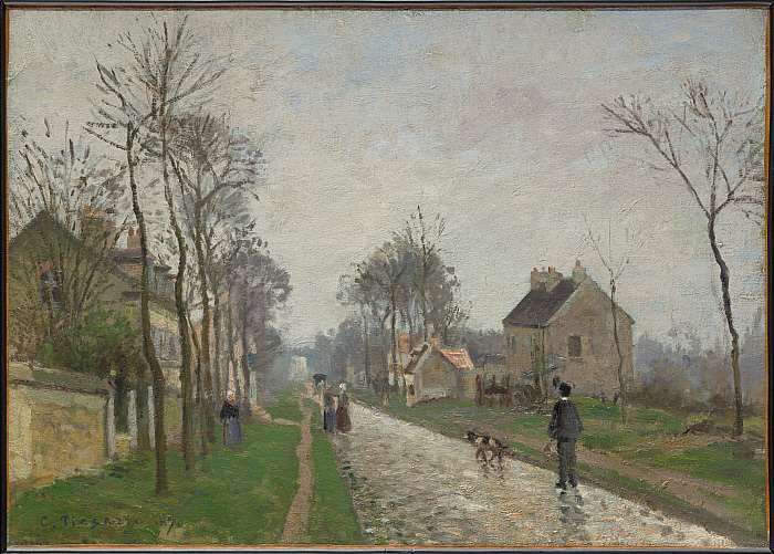
Route de Versailles, Louveciennes, Rain Effect, 1870
By 1870 it is obvious that Monet's representation of nature in terms of hue has begun to affect Pissarro's work strongly. Working first at Louveciennes and then in London, the artist applies Monet' exciting demonstrations of schematic color into what appear to be motifically appropriate places. Pissarro uses complementary color relationships in response to particular motifs and moments of nature, and overall, he adjusts the color scale upward in terms of value. Motifs remain unspectacular, even everyday, in views of roads, fields, and valleys with some vernacular figures included, but the painting structure is anything but everyday. Grids, webs, and geometrically forceful perspective shapes become decoratively active, and in doing so, a nervously animated, purely pictorial rattle against ostensibly simple, natural images is produced. Similarly, Pissarro's touch becomes looser and more variable. It is accountable both to descriptive and decorative emphases almost equally.
This rainy piece contrasts nicely with Monet’s sunny "Bridge at Bougival" (1869) - and I see a personal confrontation on the road as central to both paintings - though here it’s more casual and a bit humorous: the man’s dog will serve as intermediary. The catalog text ignores any possible narrative.
The forms feel broken as if from raindrops on a window or the surface of the eye itself.
It’s a delightful, atmospheric ambience.
Near Sydenham Hill, London, 1871
Pissarro's early work, that which is of the most importance to the present exhibition, derives a good deal of its special character from the length of Pissarro's student experience as well as from the somewhat discontinuous nature of that experience. Born in St. Thomas in the then-Danish Virgin Islands, Pissarro had his formal grammar schooling in France between 1841 and 1847, but practiced landscape painting first in St. Thomas and, traveling with a Danish friend, in Venezuela. Only in 1850s did Pissarro commit himself firmly to an artistic career in France. When he did so, he undertook (besides some brief Beaux-Arts-type instruction) to learn by eye the composite landscape achievement of the generation of 1830 supplemented by that of Courbet and Daubigny. While obviously respecting Corot enormously (even listing himself as a Corot student in several Salon catalogues), Pissarro seems from the earliest of his truly professional works, those produced after 1862, to have been unable to accept the personalisms of late Corot - the improvisatory, "musical" effects that had become so predominant. Both aesthetically and politically, Pissarro was committed to remaining closer to nature, and he seems to have considered the persistent practice of working out-of-doors with constant access to the real motif, characteristic of Daubigny, Boudin, and the young Monet, a mandatory one. A lifelong socialist, if not a particularly noisy or radical one, Pissarro would never be ideologically comfortable with anything that smacked of romantic conjuring. Even while permitting his pictorial taste to be stretched by Japanese prints, Monet's art, and later, Cézanne's, Pissarro would never fully abandon his commitment to and his belief in the material reliability of the effects he built into his landscapes.
Like Watteau and Claude, Corot summons the viewer to a happy place of retreat ( and I do like to follow them). Like Greuze and Courbet, Pissarro confronts rather than withdraws. Monet offers the possibility of doing both simultaneously - perhaps by being happily self centered.
It is the realist/naturalist side of Pissarro's early work that so distinguishes it from that of Monet. Pissarro's career in the 1860s traces by degrees the metamorphosis from mid-century landscape practice to something much closer to the decoratively emphatic, forcefully colored work of post-1865 Monet. What Pissarro manages is to make the metamorphosis seem inevitably natural rather than willful. In his 1870-71 work, there is always a feeling of discovery through observation to counterbalance the increasingly radical character of effects developed via color and paint structure. Pissarro believed that his effects meant something different from Monet's, that they were more true to life rather than just true to his creative selt. Whether they were or not is beside the point; Pissarro thought they were and this belief that they were is what made it ideologically possible for him to participate significantly, even enthusiastically, in the freewheeling color-spectacle that was mid-1870s Impressionism.
Though it's only an unsubstantiated speculation, I agree that. "Pissarro believed that his effects meant something different from Monet's, that they were more true to life rather than just true to his creative self’. As I opined above, Monet was a bit more self centered.
The combination of coloristically emphatic decorative stresses and the apparently ordinary moment of vision that develops in Pissarro's work is uniquely confusing, seen in the company of works by Monet and Sisley. The schematic arbitrariness in matters of color that the latter two artists feature leaves the viewer reassured as to the fact that a painting, rather than a rendering of nature, is being offered up for scrutiny. Pissarro never quite permits this degree of reassurance, and the viewer is kept excitingly off-balance, not knowing whether to look at a picture as an artifice or some sort of record of seeing. Pissarro hangs art and science on the same thread. His durability as an artist of both a generic Impressionist and personal sort rests in his sustaining a high degree of ambiguity regarding what, precisely, his pictures are about. Being the great painter he was, Pissarro probably had no more certainty in this respect than did (or do) his spectators.
Having tried this theory [ a variant of pointillism ] for four years and having then abandoned it ... I can no longer consider myself one of the neo-impressionists ... It was impossible to be true to my sensations and consequently to render life and movement, impossible to be faithful to the effects, so random and so admirable, of nature, impossible to give an individual character to my drawing, [that] I had to give up."... Pissarro
This quote lifted from Wikipedia would confirm the catalog text above it. Whatever techniques he would try, the artist always wanted to be faithful to nature.
*****************
Renoir
Portrait of Jules Lecouer at Fontainebleau, 1866
The Portrait of Jules Leoeur at Fontainebleanmfrom 1866 is Renoir's first serious attempt to do a modern figure painting out-of-doors (or at least begun out-of-doors). In certain respects it is a more conservative effort than Monet's roughly contemporary Women in a Garden or his slightly earlier, unfinished Déjeuner surnl'herbe (Paris, Musée d'Orsay). On the other hand, it is a highly compelling demonstration of the maturing of Renoir's manner of pictorial construction. The impacted combination of the figure, the dog, and the heavily overgrown forest setting, enterable only by a path, is developed in an equally impacted, almost impenetrable, fashion by Renoir's color and his application of paint. Without reference to Monet's schematically intense hue changes in comparable images, Renoir deploys a fairly wide range of values in natural greens, blue-greens, and yellow-oranges. The blue-orange complement is softly stated, so that the color stays closely bonded to the elaborate figural and landscape character of the motif and to the equally elaborate paint structure. Working with brushes of various sizes and with a palette knife, Renoir constructs a pictured form of continuous low relief (in the sculptural sense), merging elements identifiable as bits of three-dimensional figuration (trees and figures per se), space, and apparently flat or semi-flat surfaces. The whole image moves across the picture plane almost without focus. As it does so, a very abstract condition of unity - a half-tactile, half-visual one - develops. This condition is powerful and as idiosyncratic as Monet's clearly shaped, emphatically two-dimensional chromatic unity, but it is very distinctive in its effect. It is tempting to call it more informed by music in the sense that it features varieties of technical stresses and voicing operating simultaneously and that it requires more spectating time to be penetrated.
Monet’s 8-foot “Women in a Garden" visited Chicago a few years back and I was surprised at how awkward, silly, and banal it felt. The above reproduction of a Renoir is far more engaging. I like the suggestion, made above, that it’s been composed as a continuous low relief - though with its emphatic threads of color, it feels to me more like a tapestry. Either way, pictorial space is not an issue.
As with many Renoir paintings, the emotional content feels like a big, wide, beaming smile. Some viewers may that too shallow or ordinary — but I’m just fine with it - and smile back.
Clearing in the Woods 1865
Given his passion for music, it seems likely that Renoir sensed, if only subconsciously, the important role that concert music, acting as an aesthetic model, had played in the art of the great landscape painters of the generation of 1830 and of Delacroix as well. In his own 1865 Clearing in the Woods, his taste for the musically ingratiating, rhythmical and lyrical softness of Diaz's work is evoked in a way to mitigate somewhat more forceful aspects of the paint construction,executed with the palette knife and obviously emulative of Courbet. In addition, this picture develops a comparatively extended value range in green particularly and adds small-scale but quite intense accents of a complementary red. The color structure seems vaguely responsive to Monet, while the setup of the motif recalls, in its open foreground and horizontal emphasis, the contemporary work of Sisley as well. Yet the painting has a recognizable personality of its own. Its complex weave of various paint textures and innumerably soft-edged shapes give it a pictorial density, distinct from anything in the works of Monet or Sisley. This density is, in musical terms, polyphonic or multi-voiced in character. The eye is made to follow parallel but different sensuous paths in the color and the paint construction and to proceed at different speeds in comprehending the pictured space of the motif at various points.
This could be a good description of the actual piece. The reproduction feels more prosaic. It’s a hot sunny day in the forest, and I’m beginning to get sleepy.
1893
In contrast, these later pieces ( not in this exhibit) feel rapturous
1893
Every bit as intense as Cezanne - just voluptuous rather than angular.
The hills are singing.
**********
Rousseau
Bridge at Moret, 1828-29
Old Park at St. Cloud, 1831-2
Rousseau's taste for the tragic/dramatic seems to have been with him from an early point in his career. The consistency of what he seeks out to feel with and through landscape is as remarkable as Corot's. And similar to Corot's work, Rousseau's does not really develop - rather it is refined. In works such as this exhibition's The Bridge at Moret (c. 1828-29) or The Old Park at Saint-Cloud (1831-32), Rousseau tested the post-Constable picturesque aspect of both image and technique practiced at the same time by Corot and Isabey, but already his motifs are idio-syncratically grave and emphatic in the manner of their presentation.
Rousseau, Hoarfrost, 1845
By the mid-1840s, particularly in works like the Morning Frost, Uplands of Valmondois (Effet de givre), Rousseau's personal accent is absolutely clear in the almost unearthly, barren prospect of the land that seems virtually inflamed by the coloristically complex, yet at the same time almost iconic, sunset. What Rousseau will alter in his works (often very large in scale) of the 185os and 1860s is what he found increasingly disturbing about the confusion of expressive signals between paint construction (as an expression) and motif and color organization (as a counter-expression). He systematically abandons the former (as did Friedrich in his later work) so that a regular, seemingly envisioned rather than manually executed, deposit of the image parts is made to deliver all feeling, unimpeded by the material traces of manipulated paint.
The Oaks, 1852
Dagneau Pond, 1858-60
Both The Dagneau Pond (La mare à Dagneau) and Clearing in the Forest of Fontainebleau demonstrate the technical impersonalism of his mature manner of imaging. What he obtains through de-emphasizing his constructive trace is a sense of definitiveness and finality of expressive effect. All voices are exceptionally clear in an evocation of nature that seems absolutely certain of its emphases and its content. The spectator is usually held far back from the most imagistically animated parts of the paintings by the device of an uninviting and usually rather deep fore-ground field. Off and away from this, the many moods of landscape drama, more or less tragic, more or less epic, develop in front of the spectator's eyes, but out of his or her physical reach. There is no materialism permitted to be felt, because there is none permitted to be seen. Dancings and soundings, collected and dispersed by colored light, generate the entire expressive message in a narratively unspecific yet musically pure and intense fashion.
I certainly agree about the deep, uninviting foregrounds.
I’ll have to think about the ‘musically pure" next time I see it.
This is one of the dark, grim, soggy, severe Rousseaus that I grew up with in Cincinnati’s Taft Museum. They were definitely not my favorites there ( I adored the Constable and Corot), but I always stopped to gaze as I made my rounds. They presented nature as I often experienced it: cold, uncomfortable, unforgiving. They were reality — Corot and Constable were fantasy.
Clearing in the Forest, 1860-62
Trees Before a Rise, ( no date given )
In his greatest pictures, Rousseau presents landscape worlds which seem uninhabited, uninhabitable, unapproachable, and unknowable by anything but what the German philosopher Arthur Schopenhauer would likely have defined as the active human "will." Rousseau aims to construct a kind of metaphor for the space of the feeling mind. That mind is engaged both emotionally and meta-physically in images of apparently natural nature that at the same time seem open to totally nonrational signals of the incipiently surreal. This is the Théodore Rousseau that Henri Rousseau would later come to cherish.
"Incipiently surreal"?
O.k. - especially for "Clearing in the forest.
In " Trees before a Rise", however, my word is "Gothic"
Possibly Rousseau balanced the one with the other.
Or perhaps he could not depict nature convincingly
unless it was cold, damp, and dreary.
Much of the text in other art history texts was apparently written by those who can neither see nor feel.
This catalog is so much better.
************
Sisley
Hill Path, Ville d’Avray, 1879 ( not in this exhibit)
Confined to 1830-1870,
Champa’s exhibit does not include the ecstatic kind of Sisley paintings
that I seek out.
The two pieces that were included feellike they could have been done by others -
and not especially Monet.-
But the catalog text would disagree:
Chestnut Trees at La Celle Saint-Cloud, 1865
Just how well Sisley used Monet is evident in the two mid-1860s masterpieces included in the present exhibition. Both the Chestnut Trees at La-Celle - Saint-Cloud and the Village Street in Marlotte emulate Monet's recent work in a composite fashion. The landscape recalls several of Monet' nearly contemporary Fontainebleau works, while the view of Marlotte is reminiscent of Monet's 1864 Farmyard in Normandy (Paris, Musée d'Orsay). Where Sisley's two works differ from Monet's is in the greater elaborateness of their motifs. Both are more representationally intricate, more topographically informative, and far less decisively schematic in terms of color and shape. Sisley's viewing aspect seems wider than Monet's. The middle of the paintings are less the focus of attention and the motifs extend generously outward to the edges of the canvas. This tendency to expand, rather than focus, looks like a residue from the mid-century landscape practice of Corot, Daubigny, and Rousseau. Sisley's preference for it is somewhat conservative in the mid-1860s, but certain pictorial emphases are made possible by holding to this tendency and those emphases are clearly of some importance to the artist. Individual decisions relative to color, paint structure, and shapings within a particular image carry less weight than they do in comparable Monets. Sisley is free to deal more gently with the spectator. He allows his images to unfold slowly, even prosaically at certain points. The numerous individual topographical features in the Saint-Cloud painting are comparatively clear. Trees are varied and distinct in type and position. The blue-green, red-orange color chord is struck lightly by Monet's standards, and it moves evenly through the entire image rather than pulling it together decoratively around emphatic shapes.
This carefully written text reflects so much careful observation, it’s a pity I can’t dagree with any of it. beginning with the assertion that these two paintings are "masterpieces". But I might feel differently if I had been spending weeks with all these paintings.

Village Street in Marlotte, 1866
Many of the same characteristics appear in the Marlotte picture. Even though the motif is predominantly architectural and composed of buildings at different angles to the picture surface (as well as occupying different locations in the pictured space), the effect of Sisley's view is emphatically lateral. The foreground reduces to a horizontally stretched triangular area. The architectural middle ground simply elaborates in scale and number several shape variations on the distended triangle, and the same is repeated in softened form in the foliage background of the painting's left side. The sky shape is then a rambling inversion of the foreground. The intricacy of Sisley' shapings seems to respond again to a desire for variety in the distribution of texture and tone as well as for more informative detail overall. There is a good deal to look at in the picture, and the specific conformations of motif elements are reasonably clear. Again Sisley seems to alter Monet's more abrupt simplifications in favor of a greater diversification of pictorial incident, including a complexly fore-shortened (frontally viewed) woodcutter, who, besides being interesting in a sort of picturesque way, also serves via his blue-gray smock to introduce the blue-gray, yellow-orange color complement that threads its way throughout the picture.

Monet: Farmyard in Normandy, 1864
Renoir, Clearing in the Woods, 1865
Sisley’s "Chestnut Trees at Saint-Cloud seems to have much more in common
with the above scene by Renoir - and both feel 100% Barbizon.
Corot, Village in Normandy, 1865
This late Corot seems to have much in common with Sisley”s Marlotte,
and was done only a year earlier.
************
Troyon
View of Saint-Cloud, 1831

Perhaps the most distinctive Troyon in the present exhibition is the earliest one, the View of Saint-Cloud of 1831. Besides being highly informative topographically in terms of landscape and architectural elements, the painting manages to join this informativeness to a broadly dispersed group of variously costumed figures in the foreground in such a way as to evoke a distinctly eighteenth-century fête galante ambience. Information is combined with loose, poetic feeling easily, even brilliantly, as Troyon unifies the image with a consistent treatment of rather bright natural light and a comparatively uniform scale of brushmarkings. The latter are sufficiently small and delicate to accept clearly drawn edges when such are necessary, and the painting as a whole shows, as clearly as any Troyon ever will, what broadly informed taste and technique alone make expressively possible.
"Highly informative" ? — without doubt. — visually exciting ? —- not so much.
But then many Golden Age Dutch scenes are the same way.

Descent from Montmartre, 1850’s
Troyon even manages to approximate a seventeenth-century Dutch edginess in his treatment of light. Descent from Montmartre reflects Delacroix and Jacque, depending on what aspect of the picture one examines.
This is the only piece in this exhibit that makes me think of the 18th C. French academy you - it’s theatrical with actors, dramatic lighting, a stage, and a painted backdrop.
I find it tiresome.
Pasture at Touraine, 1853
Troyon grew fond of the 17th C. Dutch painters of cattle - like Paulus Potter.
A convincing representation - but as somnolent as the cows.
The Game Warden, 1854
Seems to have come from the world of Chardin.
Belongs above the fireplace in a hunting lodge.