It is improbable that more nonsense has been written about aesthetics than about anything else: the literature of the subject is not large enough for that (Clive Bell)

Index

*********************
*********************
The Index is found here
*********************
*********************

Monday, August 26, 2024

Carel Blotkamp : Dutch Symbolism and Early Abstraction


One of 19 essays in the catalog of "Abstract Art :  Abstract Painting 1890-1985" ..for the  1986 exhibition at the Los Angeles County Museum of Art

 **********


Jan Toorop (1858-1928) , Organ Sounds, chalk and pencil on cardboard


Jan Toorop, Song of the Times, pencil and chalk on paper,  30 x 38", 1893


Apparently the organizer of this collection of essays thought that Symbolism had something to do with the emergence of abstract painting.  And so we have this essay about the Dutch Symbolists - as well as the adjacent essay about some French Symbolists.  Neither  essay goes so far as to  assert that the one emerged from the other - but still it’s regrettable that so much attention is given to artists who did not make abstract paintings.


Whether or not Kandinsky, Delaunay, and Mondrian ever thought of their geometric shapes as symbols, obviously they strongly felt them visually. Though, perhaps, that's not so obvious to the art historians of today.


I  can’t stand Jan Toorup’s Symbolist pieces.
The first one is too blurry to feel anything but goofy.
The other is just horrible.
I appreciate the element of ornamental Javanese  (he was born on Java)
But the stiff anorexic figures and claustrophobic, tangled design repel me.

Blotkamp discusses the " Song of the Times" at length,
but it’s too painful for me to view.
Obviously, I could never be an art historian.

It would be a mistake to get really serious about the essence of any so-called art movements.Toorup’s Symbolism may be unviewable,  but  "Isle of the Dead", sometimes said to exemplify Symbolism - is one of my favorite paintings.

Toorup, an otherwise good painter, apparently decided to prioritize idea over visuality in his Symbolist work. That led to visual disaster - and it’s happened  regularly throughout art history - from Old Kingdom Egypt until today.


Jan Toorop, Lady in White, 1886, 39 x 28

Here’s one of his earlier works that delights me.
The weird sense of space under the chair,
the tastiness of the white cloths.
It’s much like the work of his contemporary, Anders Zorn,
but quirkier.


Piet Mondrian, 1908, Devotion, 37 x 24"

Mondrian spent the summer of 1908 in Toorop’s little art colony,
but obviously the 34 year old artist was following his own inclinations.

This essay will mostly be about Mondrian, but before we go there, there are a few other artists under discussion.

Johan Thorn Prikker and and R.P.C. De Basel don’t interest me.

But Jacoba Van Heemskerck(1876-1923) —- Yikes!


Jacoba Van Heemskerck, Composition  1914, 29 x 42"


Jacoba Van Heemskerck , Composition  1922, 24 x 37


One website says she influenced the early work of Georg Muche. (the Zehn Leuchtperpendikel shown in my post about German abstraction) 


She’s practically  a footnote in this essay - which essentially covers Mondrian’s early years as a painter -  but she had such a range of style and feeling - all of it powerful.  A large selection of her work is now online at the Kunstmuseum The Hague.
Relevant to the theme of this book, she practiced Anthroposophy.


Watercolor, 29 x 19, 1917-18

The primal forces of creation.


Composition 107, 1920

As complex as any hour in my day.


Fun on the water.

Composition 13, 1916, 5 x 6 "


resembles the stained glass of a medieval cathedral - except that there is no recognizable narrative.

Could easily become a Jonah and the Whale.

Some of her designs actually were put into glass:


Stained glass window, 1920 , 42" high


Landscape 2, 1913-14
 
a night scene laden with the mystery of a beckoning path

1906

Jacoba Van Heemskerck  was even good at that precise kind of portraiture for which Northern Europeans, like Jan Van Eyck, have been noted since the fifteenth century.


Jan Van Deen (1886-1977) Painting 2, 1913, 23 x 35"

This kind of work was not accepted by critics and the artist  opened a gallery selling the work of others.  Today its understated mystery might have been better received.


Jacob Bendien (1890-1933) Composition 1913, 58 x 137"

Jacob Bendien. Self portrait, 1910

Like this youthful self portrait much more than anything else I’ve found.

Jacob Bendien, Self portrait, 1930


Janus de Winter (1852-1951), Aura of the Egotist, 1916, 22 x 30"

Janus de Winter, Musical Fantasy on Wagner,  1916, 26 x 33"

Janus devWinter , Imagination of a Feeling of Willpower, 1916


Both the paintings and the titles are intriguing - though I can’t see much connection between them. 


He did this work in his sixties and though he lived to 99,  little of his later work can be found online.


Mondrian's adherence to Theosophy was also an important issue in his relationship to van Doesburg, painter, theoretician, and propagandist of De Stijl. In terms of spiritualism van Doesburg's early diaries and literary work are often rather exalted and contain numerous esoteric notions. 58 It is not certain whether he was ever a member of the Theosophical Soci-ety, but he definitely sympathized with Theosophy. In 1914-15 he replaced his naturalistic way of painting with an expressive, semiabstract style, influenced by Wassily Kandinsky and in particular by the Dutch painter de Winter (examples shown above) Van Doesburg was very impressed with the latter's work and per-sonality. His own work of that period (examples below) shows aural images and "spiritual por-traits" similar to de Winter's. Drawings


Theo Van Doesburg, Cosmic Sun, 1915, 9 x 12",  pastel on paper 


Theo Van Doesburg, 1915, 12 x 9, pastel on paper

Here’s a few of his cosmic pieces, they’re simple and small - but quite appropriate for a book about art and spirituality.

He’s more like a visionary than a seeker.


Van Doesburg


Van Doesburg


I really like the drama between these truncated triangles.
I’m guessing the golden section has been applied more than once.


Noel Martin, 2006, 28 x 22

By way of comparison, here’s a much later piece from an American graphic  designer.

Similar in their extreme precision in size, temperature, placement, and tone,
yet quite different in effect.

Much less drama in the Martin piece
but it’s also much more enjoyable.
It’s both relaxed and lively,
Perfect for the office of an optometrist.


Stanley Dean Edwards, 2024

While here’s a contemporary piece that’s more hectic than dramatic.
Nothing profound here - unless you appreciate the importance of chaos.
Way too intense for my gentle temperament.


Van Doesburg, Composition Decentralized, 1924,  11 x 11"

Wow! Kinda like Mondrian - but you know it isn’t.
Feels heavier - with less sense of playful mischief.
Unstable, it wants to rotate clockwise.


Van Doesburg, Counter Compoition XIII, 1925,  19 x 19"
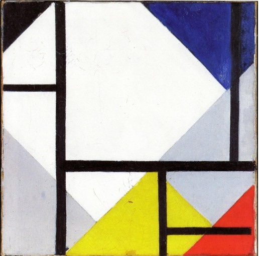
Van Doesburg


These are some really delightful geoforms - simple and quite different from those of his friend, Mondrian - even when he uses similar elements.
His pieces are more assertive and less subtle.

The author has documented how all of the artists mentioned were involved in some kind of metaphysical practice - though he also tells us:


The extent to which these artist expressed their Theosophical convictions in their artwork, is difficult to determine.

***** Mondrian*****


Composition with Colored Planes,  1917, 18 x 23"

A weird, puzzling, understated dynamic where the center of the design is an empty space.
I wonder how it looked when first painted.  I don’t trust the reproductions.


Mondrian, Evening on the Gein,  25 x 33", 1906-7


Earlier in his career he had painted, mainly peaceful landscapes (the above is given as an example)  and a few vaguely symbolic figurative Works, which generally suggest an artist of contemplative nature


Mondrian, Spring, 1908, 27 x 18"


In 1908 Mondrian’s style changed radically, and became more outspoken in content.
(The above as well as "Devotion" were given as examples)

Certainly reminds me of Munch’s "The Scream" of 1893..


Church at Domberg, 1910-11, 44 x 29

Before knowing the title, I assumed this was a university building or even a warehouse as designed by a retro-architect like H.H. Richardson - with some kind of important meeting  taking place behind those really tall windows on the third floor.  More like an illustration than a painting for me. 


 With few exceptions Mondrian stayed away from the use of fanciful occult images of the kind that can be found in Besant's and Leadbeater's work, images in which aural appearances play a large role. Mondrian's point of view is reminiscent of Thorn Prikker's fifteen years earlier, when he rejected the affected symbolism of his fellow Symbolists. Mondrian's opinion was that one could obtain higher knowledge within visual reality, a view that Rudolf Steiner had advocated during his lectures in the Netherlands in 1908. The booklet in which these lectures were published was treasured by Mondrian for the rest of his life. Even Mondrian's ordinary themes could hold a deeper meaning for the already initiated. 

For example, one is able to perceive in Mondrian's series of high-rising towers on a flat ground (example given above)both a traditional Christian reference to God and a non-Christian symbol of the combination of the male and female principles.

Neither of those references occurred to me.

But they certainly do in the piece shown below:

Constable, Salisbury Cathedral, 1825


Sea After Sunset, 1909, 16 x 29"

His series of coastal scenes could be interpreted as the unity between water, earth, fire, and air, or in their poorest state, with only water represented as an image symbolizing the beginning of things.

A  piece that I interpret the same way.
The wonderful miracle of planet earth.


Evolution, 1910-11, each panel about 70 x 33


A foray into figurative religious-like art that I would call brave but goofy.
He may have felt the same way since he did not continue in this direction.
It reminds me of Klimt’s Beethoven Frieze of 1902.


 An important change occurred in Mondrian's art at the end of 1909 and beginning of 1910. The loose brushwork is replaced by a more controlled design, in which colors are evenly applied in clearly defined fields. Without a recognizably strict system, the paintings show a strong preference for symmetry and geometric division of the surface along its horizontal and vertical axes, further defined by a grid of oblique lines. These characteristics are most strikingly present in the monumental triptych Evolution, 1910-11 Mondrian's clearest confession of his theosophical conviction and as such quite exceptional in his entire oeuvre because of its unnatural character and overt symbolism. The triptych represents the theosophical doctrine of evolution, man's progression from a low and materialistic stage toward spirituality and higher insight. One can easily follow the process from the left panel, then to the right panel, and finally to the center panel. Virtually everything plays a part in Mondrian's symbolization of evolution: the position of the figure's head, the eyes, the shape of the nipples and navel, the flowers - all details supported by subtle changes of color.


Large Nude, 1911, 55 x 38

I would call this another failure - it’s dull  as both a figurative and non-figurative painting. 


 Mondrian was very receptive to the influence of Cubism, when in 1911 he encountered the first real examples at an exhibition of the Moderne Kunstkring (modern art circle) in Amsterdam, which he assisted in organizing. ……Mondrian developed his work into a radical Cubism within a short period of time, while maintaining his theosophical concepts of art and life. 

Steenhoff recognized this when he described Mondrian's new paintings at an exhibition in Amsterdam in October 1912: "I perceive a favorable development now, in spite of very daring abstractions, in terms of spiritual self-containment and introspection. The work is less pretentious; the painter has found himself in a purer sense; even if it seems to me that he groans naively under the constraints of the preconceived notion that art should totally negate matter. "


I agree with Steenhoff . (BTW, he was a big fan of Van Gogh, and highly critical of Cubism)


Oval Composition, 1914, 44 x 33"

Why were viewers left to guess at its obvious  name:  "The Egg of Life" ? 


 Mondrian also deviated from orthodox Cubism by making line and color, his visual means, absolute (example shown above). In his evolutionary thinking line and color, reduced to essential contrasts between horizontal and vertical and between the three primary colors, were supposed to express the unity that was the final destination of all beings, the unity that would resolve harmoniously all antitheses between male and female, static and dynamic, spirit and matter. This all-encompassing visual system, of the utmost importance for the future evolution of his work, is already rudimentarily indicated in a few sketchbooks with annotations. Thus the foundations for Mondrian's Neoplasticism were laid in Paris from 1912 to 1914. Back in the Netherlands during World War 1, he further developed his concept in a critical, but stimulating dialogue with the artists with whom he started the magazine De Stijl in 1917, particularly Theo van Doesburg and Bart van der Leck.

This is what I would call a successful piece of religious art - and yes, it does deviate, in a good way, from Cubism.


Composition, 1919, 33 x 41

Perhaps a Go master would appreciate something subtle.

Is it really any more compelling that the Ellsworth Kelly pieces that were arranged by chance:


Ellsworth Kelly, Spectrum Colors arranged by chance, 1951

Not as tedious as the example shown below - but almost.


Agnes Martin, untitled V,  1981

For an infinity of variations, AI could certainly do the job.


*********

Here’s some more early Mondrian that appealed to me:


Mondrian, Nude, 1908, 33 x 16"

Very good at figure drawing

Mondrian, self portrait, 1918

Very good at portraits, too.

  Mondrian, Irrigation Ditch with Cows, 1901

Smells cold, damp, and lonely - as well as like cows.

Mondrian, Sea after Sunset, 1909

A love song to our planet. 
A piece I would like to own.

********

We can’t deny that Mondrian identified with Theosophy as Heemskirck did with Anthroposophy.

The author of this essay  notes that a only a few Dutch abstract painters did not.

Erich Wichman ( 1890 - 1929), Small landscape 1912

No dimensions were given - I’m guessing that it’s the size of a postcard.

Apparently this artist struggled to make a living , and his pieces still sell for little.

Wichman, lithograph, 1918


This essay has examined only a narrow aspect of early Dutch abstract art, a major part of which was esoterically oriented, particularly toward Theosophy. There were only a few exceptions, the sharp-minded Erich Wichman, for example, a painter of extremely interesting abstract works, who never had anything to do with the high ideas of most of his colleagues and made fun of them. 


Note:  the author, Carel Blotkamp, is an artist as well as critic and historian.. I think I’ll follow him on Instagram

Saturday, August 17, 2024

Rose-Carol Long : Expressionism, Abstraction, and the search for Utopia in Germany

One of 19 essays in the catalog of "Abstract Art :  Abstract Painting 1890-1985" ..for the  1986 exhibition at the Los Angeles County Museum of Art

 **********

Vasilii Koren ( woodcarver), Third Trumpet Sounds, 1696, Koren Picture Bible
( Gury Nikitin Kineshemtsev, designer)

The author, Rose-Carol Long, shows us this woodcut 
- though she does not claim that Kandinsky ever saw it. 

Nevertheless, it sure looks like he did.

The entire Koren Bible is in Wikipedia Commons.
It’s all good - with  the above piece really standing out.


Kandinsky, Sound the Trumpets, 1911, 9 x 9"

Kandinsky made many similar pieces at that time that also include 
angels, trumpets, mountains, villages, and towers.
These visions  feel more personal, and child-like than the one from 1696.

Long points to the apocalyptic fervor c. 1900 - and shows us the Kandinsky paintings that share it. 

But now we might ask —- what does this have to do with Germany ?  The title might lead one to expect an essay about early Modernist German art - but reading it more carefully, it’s about art "in Germany" - and, indeed Kandinsky showed in German galleries and later joined the Bauhaus in Weimar.  And one might note that the author of this essay is better known as an expert in Kandinsky rather than German art.

So let’s just follow what she had to say about him and his paintings:


Like other intellectuals, the Russian-born Kandinsky, who had moved to Munich in 1896, interpreted his age as one dominated by a struggle between the forces of good, the spiritual, and the forces of evil, materialism. In 1911 he wrote, "Our epoch is a time of tragic collision between matter and spirit and of the downfall of the purely material worldview; for many, many people it is a time of terrible, inescapable vacuum, a time of enormous questions; but for a few people it is a time of presentiment or of precognition of the path to Truth. Because he felt that abstraction had the least connection with the materialism of the world, he believed that abstract painting might help awaken the individual to the spiritual values necessary to bring about a utopian epoch. In his effort to involve the spectator, Kandinsky chose vivid colors, amorphous shapes floating in indeterminate space, painterly, directional brushstrokes, and remnants of apocalyptic and paradisiacal images. Geometric forms and flat patterning were too closely connected with the ornamental designs of applied art to be the basis for his paintings; geometric ornament could seem too much like a "necktie or a carpet* to be a stimulant for social change. 


Kandinsky, Paradise , 1911-13, 9 x 6"


In a watercolor called Paradise, Kandinsky suggested the original paradise, the garden of Eden, and the one after redemption by using the sign of a couple with Eve like figure, holding an apple, and by using pale amorphous colors to suggest the heavenly spheres, that’s such theosophists as Steiner and such poets is Paul Scheerbart , had described as filled with floating pastel colors.

This Paradise is more airy than earthly - and the stage props are as minimal and suggestive as those in traditional Japanese theater.  One such prop being the big black lump suspended above them. Even paradise is not free from menace.


Kandinsky, Improvisation 27, Garden of Love, 9 x 12", 1912

In improvisation 27 three couple motifs, which can be seen more clearly in the study, warm yellow, orange, pastel colors in the center of the painting, and the use of the subtitle garden of love, evoke the theme of Paradise, contemporary Dionysian beliefs in the transcendence of sexual love, including those of espoused by Stanislaw Prxybyszewski, Erich Gutkind, and D. S. Merezhkovsky, also influenced Kandinsky’s  depictions of Paradise.


A wonderful composition that swirls around a disc that’s been made to  appear leaning back into space.
One of the black splotches does seem to suggest a labial opening.


Kandinsky, Black Spot I, 1912, 39 x 51"

A number of large paintings, including Black Spot,, done  between 1911 and 1913 have motifs of destruction, primarily derived from the last judgment paintings on one side of the canvas and motifs of paradise, usually represented by images of a couple on the other side.  This arrangement reinforces Kandinsky‘s belief that redemption emerges from struggle

Taken all together, these pieces show a wide range of emotion from joy to fear, bliss to anxiety.


Kandinsky, Light Painting, 1913,   30 x 39"

In a few Works of 1913 and 1914 Kandinsky  tried to suggest a heavenly paradise without employing recognizable motifs. Instead, he used color to signify themes and define space. In Light painting, he again used the colors of the water color paradise arranging them, so that they advance and recede to make the painting "a being floating in air".   Kandinsky  had written that, although flatness was one of the first steps away from naturalism in painting, the artist had to go beyond this superficial approach to destroy the tactile material surface of the canvas. He advised the construction of an ideal Picture plane not only by using color, but also by using a linear expansion of space through "the thickness or thickness of a line, the positioning of the form upon the service in the superimposition of one form upon another ". Light painting reflects all these processes 

Of the Kandinsky paintings shown so far, this is the first one I’d like to view every day. Things seem to be moving faster than I can follow.  So whimsical and light hearted.


Johannes Molzahn (1892-1965),  He Approaches, 1919, 43 x 74 "

 A vision that seems more social than personal, like riding a fast train into the heart of a big city’s commercial district.  Would certainly work as the backglass of a pinball machine.


Johannes Molzahn, Mysterium, 1920, 13 x 10"

Quite explosive - just beginning to fly apart.
Again the center is important - but this time as a source rather than destination.
Would make good art  for the cover of an album of Buddy Rich  drum solos.


Johaness Molzahn, 1920, Homunculus, 30 x 39"


 Writhing, rather than exploding outward.  If tripled in size, it would look good on the wall of a dance club.  Suggests a wild and swingin' female nude.  Party life.


Johannes Molzahn, August 1931, 49 x 49"

A travel poster for a beach resort?
I can’t connect to this one.


Johannes Molzahn

I’m guessing this was an early work.
Though nothing can be recognized,
it’s like a figure in front of a cityscape.

Reminds me Inca textiles;


Molzahn is an example of an abstract Expressionist painter who had turned briefly to architecture during the euphoric period after the November Revolution. At the time of the Exhibition of Unknown Architects, he was also exhibiting paintings at Walden's Sturm Gallery. His mystical utopian interpretation of Expressionism is evident in the subjects of his paintings and in the highly emotional tone of his essays. In "The Manifesto of Absolute Expressionism," ' written for a Sturm exhibition in October 1919, Molzahn demanded that the artist's work reflect the pulsating energy of the universe so it could become a symbol of the "cosmic will." He wrote in incendiary language, "We want to pour oil into the fire - spark the tiny glow - make it flame - span the earth - make it quiver - and beat stronger - living and pulsating cosmos - steaming universe. 'Molzahn's belief that art must manifest Earth's cycles of creation and destruction is revealed in his predominantly abstract paintings of 1918-20, in which arrows and swords partly obscured by painterly colored circles radiate from diagonal axes at the centers of the paintings. Titles such as HE Approaches and Mysterium - Man  evince his mystical disposition. Like many artists caught up in the utopian optimism of the time, Molzahn was attracted to the radical politics of the Sparticists. When the Sparticist leaders were murdered, Molzahn's memorial in oil bore a trinitarian title, The Idea - Movement - Struggle; the dedication "to you Karl Liebknecht" was later painted over. 


After that utopian optimism faded, 
it’s  hard to find Molzahn work after 1920 that appeals to me. 


Although Molzahn lived in Weimar, he never joined the Bauhaus faculty. He did contribute a graphic work to the third Bauhaus print portfolio and is reported to have recommended other young artists such as Muche for appointment to the school. 


Georg Muche (1895-1987). Composition, c. 1914

Quite a painting from a 19 year old artist - or any age for that matter.

Quite thrilling and delicious.
Full of wonder.


Georg Muche, watercolor 1916
Love these small 8-12" pieces.


Georg Muche, Surrealist Landscape with Snail and Spider, 50 x 31", 1950

Thirty years later,  still kind of thrilling - but not as spacious.


Georg Muche, Totentanze, photograph, 1967

Ouch!  Dead bird photography.
Apparently not happy about his life anymore.

Like Molzahn, the most appealing work from this artist came early - when so many exciting, idealistic, innovative artists were pulled into the circle of Walden’s Der Sturm.

Long connects one of his pieces to a painting by Kandinsky,
but since a color image cannot be located, I’ve left out that commentary.
Molzahn seems closer to several other artists of Der Sturm.


Muche, who arrived in Weimar in April 1920, is another artist whose quest for metaphysical truths led him to a painterly abstract form of Expressionism and then to experiment with architectural design at the Bauhaus. Like many of the painters appointed to the faculty, Muche came from the Sturm circle. 

Muche had become aware of the group of artists around the Sturm Gallery when he attended an exhibition
of the anthroposocially inspired painter Jacoba van Heemskerck in March 1915. He began working at the gallery as Walden's exhibition assistant and displayed paintings there early in January 1916. By September Muche had become an instructor in the newly founded Sturm Art School. He admired the works of Kandinsky, Marc, and other members of the Blaue Reiter. His paintings of 1916, some with biblical titles, such as And the Light Parted from the Darkness , and others with titles descriptive of the shapes used, such as Painting with Open Form, resemble in their textured use of amorphous colors such Kandinsky paintings of 1913 as Red Spot.   In a 1917 book on Der Sturm, Muche was praised along with Kandinsky for dispensing with objects and using only colors and forms to create "absolute painting.  It was during this period that Muche met Itten, with whom he would develop a close friendship at the Bauhaus, and Molzahn and first became involved with the teachings of the Mazdaznan sect. His fiancée, Sophie van Leer, another of Walden's assistants, reportedly introduced him to the theories and practices of this esoteric philosophy. 


 After the war Muche's interest in mysticism intensified as he moved away from Sturm and Expressionism. A number of letters written in 1919 indicate that the year was one of crisis for him. In one letter to Ernst Hademan he criticized Berliners for their materialism and superficiality but praised the Sturm circle for their "honest passion" about Expressionism. In another letter to van Leer he complained that he felt alone and had found only one other student, Paul Citroen, with whom he could discuss Mazdaznan and other "religious things"; he was torn between his search for "divine truths" and his sensual enjoyment of color in his painting. By the time he arranged to move to Weimar, Muche had decided that Expressionism, Cubism, and Dadaism belonged to the past. He continued to paint abstractly, sometimes using grid patterns within the painterly texture, until 1922, when he began to paint objects and more hard-edged geometric forms in his oils. 


Johannes Itten, Ascension and Pause, 1919, 90 x 45

Feels quite close to Molzahn’s "He Approaches" done the same year,
and it would also make a good pinball backglass.

Intensity for its own sake.
Seems to be erupting like a fountain.


Itten, Dictum, 1923, lithograph

This piece feels too confusing for me
to make me care about the text.


Johannes Itten, Moonlit landscape, 1958, 20 x 26"

Pleasant - but hardly as thrilling as work done 40 years earlier.


Johannes Itten, untitled, Silk screen print, 1965
Coinciding with the psychedelics of Peter Max.


When Muche settled in Weimar in the spring of 1920, Itten had already established himself at the Bauhaus, having arrived the preceding October. Of all the painters whom Gropius invited to teach at the Bauhaus, no one has been more closely associated with mysticism and Expressionism than Itten. Accounts of Itten's attempt to establish a Mazdaznan regime at the Bauhaus often obscure his achievement as an abstract painter and his originality in organizing the preliminary course that all students had to take as their introduction to the school.

 Like Muche, Itten had been acquainted with the Expressionist circles around Walden and had exhibited at the Sturm Gallery in the spring of 1916. He remembered attending the First Autumn Salon in Berlin in 1913, where he saw the works of Marc and Kandinsky. 89 Also in the fall of 1913 Itten began studying with the Swiss painter Adolf Hölzel, 9 through whom he met Schlemmer. Itten's interest in and experimentation with abstraction intensified during 1915 and 1916. He explained in a letter to Walden that his paintings would become closer to "primary mat-ter" through his search for crystalline shapes; he referred to the crystal as "fermenting mother's milk. *91 Itten, like Scheerbart, used the crystal metaphor to convey his own commitment to communicating spirituality through the purest means.

 In Resurrection, 1916 (pl. 20), Itten simplified figurative and landscape motifs to flattened geometric shapes. The figure that appears with a cross in the center of the study for Resurrection (pl. 21) is no longer visible within the elongated, flat triangle that dominates the center of the painting. To convey the sensation of ascent so crucial to the meaning of Res-urrection, Itten placed the smallest point of the triangle close to the bottom of the painting and used a number of diagonal and circular accents to convey an upward motion. For Itten, conveying the feeling of movement in painting would continue to be a crucial theme during later years (pl. 22). He explained that movement was evocative of vitality, of life: "But movement, movement must be in an artwork. Everything living, existing lives, that is, it is in movement. "

In the fall of 1916 Itten moved to Vienna, where he remained until he was invited by Gropius to teach at the Bauhaus. During his Vienna period he read Indian philosophy and grew interested in theosophical teachings to which Gropius's first wife, Alma Mahler, is said to have introduced him.93 In 1918 he noted that he found Thought Forms (1905) by Annie Besant and Charles W. Leadbeater in a theosophical bookstore, and after comparing their charts with his paintings he was impressed by their color equations. 

Itten was interested in a wide variety of mystically inspired writers, including Böhme ar the Bauhaus, however, Mazdaznan principles of purification and regeneration were central to his life and painting. Schlemmer, appointed to the Bauhaus in December 1920, reported: "The Indian and oriental concept is having its heyday in Ger-many. Mazdaznan belongs to the phenom-enon. . . . The western world is turning to the East, the eastern to the West. The Japanese are reaching out for Christianity, we for the wise teachings of the East. And then the parallels in art. The goal and purpose of all this? Perfec-tion? Or the eternal cycle?  After Itten and Muche attended a Mazdaznan congress in Leipzig, Itten tried to convert much of the school to the dietary and meditative principles of this esoteric group. Schlemmer wrote that the congress had convinced Itten that "despite his previous doubts and hesitations, this doctrine and its impressive adherents constituted the one and only truth"97 and that Itten created a crisis at the Bauhaus with his insistence on following these principles. Schlemmer explained that it was not the conversion of the student cafeteria to vegetarianism but Itten' favoritism toward students who followed Mazdaznan ideology that split the Bauhaus into "two camps. " This was one of the major issues that eventually led to Itten's resignation from the Bauhaus in the fall of 1922. 


While Itten was at the Bauhaus, he created a very distinctive persona. His shaved head, monk's robe, and the very intensity of his methods both attracted and repelled students. His insistence on meditation exercises before working, his urging students to feel a certain movement before they drew it, his exploration of free abstract drawing, and his emphasis on experimenting with unusual materials affected not only the instruction at the Bauhaus but much of art education since that period. Some of Itten's exercises can be traced back to his studies with Hölzel100 and to reform theories in education, but Itten was also greatly influenced by mystical practices. The process of releasing the student's innate energies and feelings into art was a liberating methodology. The preparatory breathing, basic movement exercises, and rhythmic stroking of the brush helped the student's hand follow directly the impulses of the mind. 101 The numerous free abstract drawings found among Bauhaus student portfolios are indicative of Itten's influence. 


In several prints and notebooks Itten left visual testimony to what he felt was the positive impact of Mazdaznan principles. In the print Dictum, 1921 , Itten used words and amorphous shapes to create a colorful tribute to Dr. Otoman Hanish, the modern founder of the Mazdaznan sect, and to the illumination and hope that Mazdaznan principles could bring to the individual. The words greeting, heart, love, hope, and heaven are set in flowing, cursive script against a background of floating, colorful shapes. 102 Itten's spiral sculpture made of colored glass, the Tower of Fire, 1919-20, stood outside his studio and is but one mark of the Bauhaus artists' faith that they were working to create a cathedral of the future. 


Regretfully, Resurrection could not be found online.
Like Muche, Itten soon became more of a teacher than artist.
Perhaps the art market for abstract painting had cooled off.

I’m not that excited by the minimalism of the Bauhaus.
But it’s worst crime might be how it affected the art of those who taught there.


When Kandinsky arrived at the Bauhaus in June 1922, Gropius's emphasis had changed. He had been defending the Bauhaus against attacks from numerous directions, including assertions that all Bauhaus students were communists, foreigners supported by state


Kandinsky, Circle Within a Circle, 1923 34 x 37"


In Weimar Kandinsky continued to believe his work would bring about the "Epoch of the Great Spiritual, but he aimed to disassociate his art from the criticism that abstraction was merely a "pathetic gesture" or "cosmic swirls." Instead of using the amorphous shapes and painterly textures that were associated with Expressionism, he worked with precisely drawn geometric forms. He had begun to experiment with such forms in Russia; the exposure to the theories and works of Kazimir Malevich, Ivan Kliun, and other members of the Russian avant-garde contributed to his growing belief that geometric forms could become a universal language for abstraction. At the Bauhaus Kandinsky changed aspects of his style, but he did not turn away from his mystical and utopian goals. He continued to experiment with different methods to create the illusion of cosmic infinity on the flat plane of the canvas. He had begun this process before the war, and his exposure to the avant-garde in Russia reinforced his use of space as a metaphor for a utopian world.

Nothing against geo-form (Mondrian!), but Kandinsky’s geo-form is so dry and disappointing compared to his earlier figurative visionary and abstract expression.  Maybe he was just burned out by the time he reached fifty. 

Hurray for his "cosmic swirls" !


Makes me more nostalgic for this earlier work.